Monday, February 18, 2013

Secret Garden with Razzleberry

Hello all.  Hope you're enjoying your Monday.  Some of you might have had the day off and got a little stamping in.  That's a wonderful way to use your time off.  We didn't have the day off from watching our grandkids,  though I did find a little time to stamp anyway.  Woo Hoo!  Going through my stash of Designer Papers, I found I hadn't used two different prints from the Sycamore Street DSP  pack.  Now I couldn't let that happen, could I?  So I sat down with the express purpose of using one of these paper prints, then I'd move on to the other one.  Well, the first one was giving me fits and nothing (I mean nothing!) was going right with it.  What can you do at that point, but eat some chocolate and put the first one aside and tackle the second print.  And that's what I did.  Now, I've got a card to share with you, but I'm not sure about it.  Please give me some input as to what you think about it.   I'd really appreciate hearing your thoughts...

Stamps:  Secret Garden, Papillon Potpourri, and Teeny Tiny Wishes
Ink:  Rich Razzleberry, Summer Starfruit, and Island Indigo
Paper:  Rich Razzleberry, Whisper White, and Sycamore Street Designer Series Paper
Accessories:   Secret Garden Framelits, Big Shot, Bitty Butterfly Punch, Word Window Punch, Modern Label Punch, Itty Bitty Shapes Punch Pack, AquaPainter, Delicate Details Lace Tape, Pearls Basic Jewels, Glue Dots, and Dimensionals
Whew, feels like I used half of the tools I've got and my stamping space looks like it too with everything strewn about!  But I think it was worth it.  There are a few things I'd like to point out for you.  The largest flower was both stamped and watercolored with the Rich Razzleberry ink.  When I needed some little filler flowers, I did a wash of color to match on a scrap of white cardstock before it was punched.  Each of the flower petals on the card were slightly curled to give more dimension to them.

Did you notice the pearls on the butterfly?  Nice little accent to draw attention to it.  I also added a little pearl in each of the tiny punched accent flowers to give them some love and attention too.

The lace tape is new in the Spring Mini.  You've got to get some of this!   It's wonderful to work with - so easy, and adds such a pretty touch to the card.  I thought it softened the dark geometric print on the background a bit.


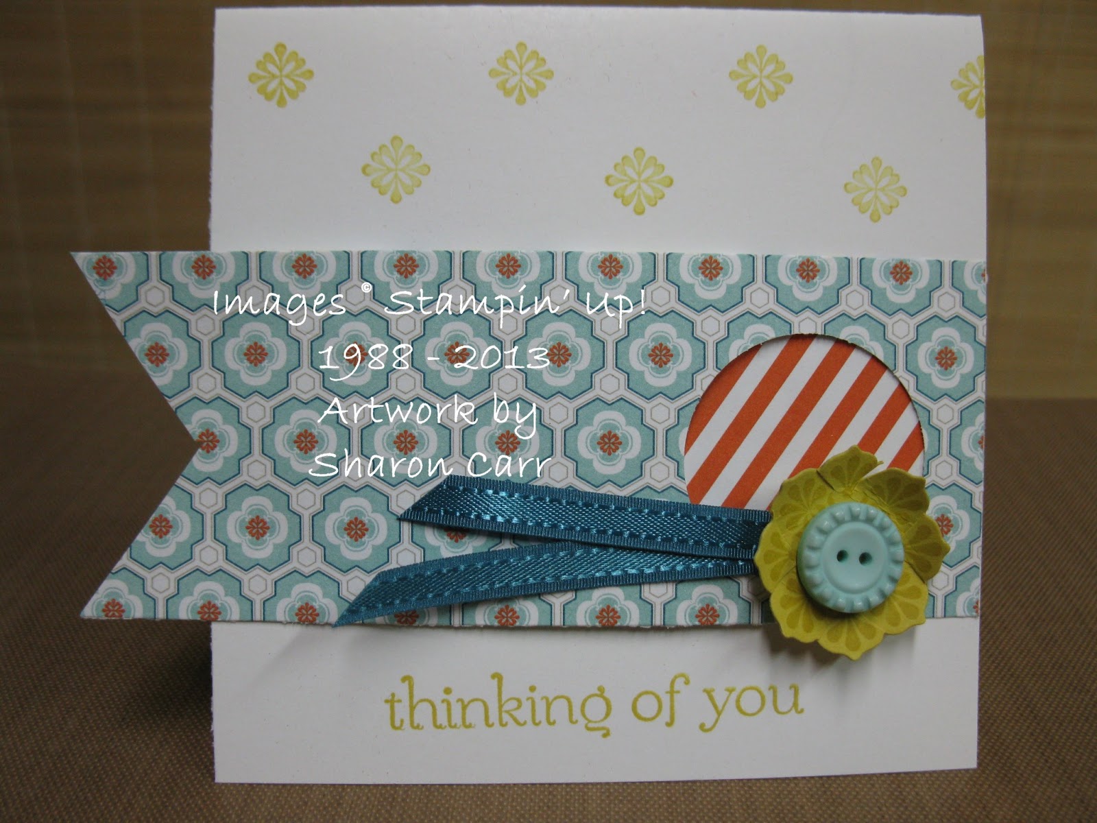
Ok, that's it for today.  Let me know what you think about this card.  It's really darker and bolder than what I usually make, but I need to get out of my comfort zone every once in awhile, don't I?  Thanks for stopping by.  And thanks especially if you leave a comment!  grin    Sharon

Sunday, February 17, 2013

More Sycamore Street Ideas

Well, I did warn you that I'd be posting more ideas with the Sycamore Street DSP and also the Ribbon and Button Pack that are two of the free items you can get during Sale-A-Bration.  I'm finding these two items are turning into my very favorite supplies when I sit down to stamp lately.  Whatever will I do when Sale-A-Bration is over March 22nd??  Definitely be having withdrawals, that's for sure!  (Maybe I just need to get another pack or two before they're gone.....)  sigh    Ok, enough pining away, let's get on with the ideas.....

Stamps:  Perfectly Penned 
Ink:  Basic Black
Paper:  Whisper White, Island Indigo, and either Summer Starfruit or Pool Party along with Sycamore Street DSP (SAB)
Accessories:  Sycamore Street Ribbon and Button Pack, Island Indigo Baker's Twine, Glue Dots, and Dimensionals
 Isn't this just the cutest card ever?  Love the ribbon and buttons with the Baker's Twine little bows on them.  Is the Summer Starfruit card base too much of a good thing?  I keep second-guessing myself on whether it's too much or not.  I almost used a Whisper White card base and just a layer of the Starfruit.  What do you think?
This card still uses the same idea with DSP and the strip of buttons on the ribbon, but changed it from portrait to landscape and used a much larger layer of the printed DSP.  Since the card was using Pool Party, I changed the middle button from Tangerine to the Pool Party to match.

I really haven't decided which one I like better.  They both are so fresh and happy looking to me.  I think one of the very best things about this DSP is that it's forcing me to step out of my comfort zone of pastels and start embracing these amazing bright and lively colors!  And that's been a really good change for me.  I'm lovin' it!!

Happy stamping to you.  Get out there and try something new today!!  It's fun - Sharon

Saturday, February 16, 2013

Sycamore Street CASE

I know, I've been checking out other blogs again, and boy did I get inspired!  Selene Kempton is a very talented stamper and I always find some idea on her blog that makes me grab my stamps and ink.  You can find her blog here.  I'm sure you'll be amazed at her talent too.  Anyway, I did CASE one of her cards the other day.  I made some adjustments to fit what I wanted and this is what I made...

Stamps:  Bloomin' Marvelous (SAB)
Ink:  Island Indigo and Rich Razzleberry pads, and markers to match
Paper:  Whisper White, Tangerine Tango, Rich Razzleberry with Sycamore Street Designer Series Paper (SAB)
Accessories:  Sycamore Street Ribbon and Button Pack (SAB), Pearls Basic Jewels, Bitty Butterfly Punch, and Dimensionals
I love the clean, crisp look of this card with lots of white space and bright splashes of color.  I wasn't too sure about all the colors of this print, but on this card I've totally fallen for them!   Maybe it's just this print, or maybe it's the whole pack of the Sycamore Street DSP that I just can't get enough of!!  And getting these items free with a $50 order through March 22nd is just the icing on the cake.  Doesn't everyone like freebies?!? 

Did you notice the little strip of pearls on each of the butterflies?  They add just the perfect touch of class to the card.

That's it for today.  I think I'll be sharing a few more Sycamore Street ideas with you soon.  I haven't put the paper away yet.  It's still laying on my table just tempting me to come play some more.  What can I do?  Think I need to get back down there for a little more stamping, don't you? 

Happy stamping - Sharon

Thursday, February 14, 2013

Similar, but...

How often do you see an idea and really love it, but...  Yeah, it's that but... that gets me every time.  When I first saw the Sale-A-Bration flyer, I loved the card sample shown using the Sycamore Street Designer Series Papers and Ribbon & Button Packs.  You can get either of these items free when you place a $50 order.  Considering that I love the colors these items were showcasing, I had to get them!  You know how that goes, don't you!  Well,  I finally got around to CASEing that card sample with my take on it, and that's what I have to share with you today.

Stamps:  Madison Avenue and Sweet Essentials
 Ink:  Summer Starfruit
 Paper:  Whisper White, Summer Starfruit cardstock and Sycamore Street DSP
Accessories:  1 3/8" Circle Punch, 1 1/4" Scallop Circle Punch, Sycamore Street Ribbon and Button Pack, Mini Glue Dots, and Dimensionals

I started out with a 4 1/4" square card which is larger than the original sample, so that was the first change.  Next I added a sentiment on the bottom of the card with Summer Starfruit ink.  Then I stamped the tiny floral stamp from the Madison Avenue set on the top portion of the white card because it just seemed like too much white going on.   Other than those few changes, I think I followed the idea pretty closely.

Have you checked the great patterns and colors in the Sycamore Street DSP yet?  They are so user-friendly and I've been having lots of fun using them.  And from the looks on other blogs, I think that's pretty much the sentiment out there.  I've been seeing many, many great ideas and they've inspired me to get stamping with more of these papers while I still can!   I'm surprised that I've already used up 90% of my pack of DSP and all of the Pool Party ribbon and buttons.  Must be about time to place an order and get another pack free!!  If you'd  like to place an order to get yours free, either click on the button on the right to order online, or contact me to place the order for you.  Either way, I know you'll love these papers, ribbons, and buttons.
.
Well, that's it for now.  Kids are stirring so free time  nap time is just about over for today.  Hope you'll find time to stamp and come back again soon.  Any comments would be appreciated.  I love to hear what you think about my ideas.  Take care...   Sharon

ps -  Happy Valentines Day to you!  Can't believe I almost forgot.  Oh my, and not even sharing anything with hearts on it either!  I'm really slipping here!!

Sunday, February 10, 2013

A Twitterpated Elephant

Hope you all enjoyed your weekend, since it's almost gone as I'm writing this.  Where does the time go?  I had all these great ideas of what I'd get accomplished this weekend, and most of it never got around to happening.  Of course, there's always a good reason for that, or so it seems at  the time.  But still, it's impossible to cram 4 days worth of "busyness" into a two day weekend!  So instead of posting both days, there's only one little post tonight.  Maybe I'll get the other one posted tomorrow if all goes according to plans.  Now, don't go holding your breath waiting - I don't want anyone passing out, you know?!!  Ok, here's my slightly 'twitterpated'  post for today...

Stamps:  Patterned Occasions and Curly Cute
Ink:  Basic  Gray pad, Basic Black, Real Red, and Lucky Limeade markers
Paper:  Whisper White, Real Red, and Twitterpated Designer Series Paper
Accessories:  Lucky Limeade Ruffled Ribbon, Decorative Label Punch, Eyelet Border Punch(ret), and Dimensionals
This is a fairly simple card, but it still has a lot going on.  I love all the prints here between the two DSP prints and the elephant itself.  It just looks so happy and friendly.  Wish I would have thought of making this card for the baby shower I went to this afternoon.  Wouldn't it have been cute?

This little elephant is part of the Patterned Occasions stamp set that you can earn for FREE during Sale-A-Bration - my favorite time of year!!  All the stamps in this set are just so dog-gone cute and are very versatile.  The wording on this one is for a thank you card, but why stop at that?   Think of all the other times you might need this little guy, not to mention the rest of the stamps in the set!

The little chunk of Real Red punched with the retired Eyelet Border Punch was just sitting in my scrap stash.  Thought it worked out nicely framing the little elephant.  The Lucky Limeade ribbon was the end of the spool and didn't quite make it around the front, so I just angle cut it and taped it where it is.  Normally I would have attached it in back and added on another small piece for the tie.  But this way looks nice and uncluttered instead.  (What is that old saying about necessity being the mother of invention or something like that???)

Well, that's it for my Sunday musings.  Thanks for stopping by and seeing what's happening here.  Have a creative week!  Sharon

Friday, February 8, 2013

One for the Guys

 
I know this doesn't happen very often, so I thought you should be warned about it.  I actually made a masculine card today, woo hoo!  And I'm even going to get it posted today too!  Wow!  Hope you appreciate how incredibly unusual this is.  And  don't go expecting this to happen all the time now.  That would take away from the specialness of it all, and that wouldn't be a good thing now, would it?  Anyway, I was checking out a few blogs to get my mojo working late this afternoon, and I came across a card by Carolyn Lindemayer at this blog - www.papecraftcrew.com  They were sharing their Sketch Challenge #28 and Carolyn's card caught my eye.  I needed to change a few things around to use what I had on hand, and I love the finished card so much!  If I had enough of the materials needed on hand, it would probably be one of the cards for February's classes next week.  But... not enough of the needed materials, sooooo on to other creating.  But, just wanted to share this card tonight. 

Stamps:  On The Seas and Apothecary Art
Ink:  Basic Black
Paper:  Basic Gray, Lucky Limeade, Whisper White with 2011-2013 In Color Patterns Designer Paper Pack
Accessories:  Big Shot with Labels Framelits, Argyle TIEF, Silver Soda Pop Tops, 1" Circle Punch, Lucky Limeade Ruffled Ribbon, Silver Embellishment Kit(ret), Corner Rounder Punch(ret), Mini Glue Dots, and Dimensionals


I had fun playing with all the texture and layers on this card.  At first it was a stretch to consider making a seafaring card in anything other than a blue of some sort.  But after getting it done, I must say this is one of my favorite cards that I've made lately.  The silvers and grays compliment the Lucky Limeade very nicely.

And really ladies, you need to try out these Soda Pop Tops - so cool!  They're such a bright, shiny accent on your cards.  I know I need to order me a small truckload for all the ideas that are rollin' around in my head.  he he

Well, that's it for tonight.  I need to get some sleep so I don't catch any of the germs the grandsons are spreading around again.  Yeck!  This has to be the sickest winter I've lived through in quite a few years, and I'm getting reeeeeealllllly tired of it!!!!  So, nighty, night all...  Sharon


Monday, February 4, 2013

Honeycomb Happiness

One of the new products in the Spring Mini Catalog is the Honeycomb Texture Impressions Embossing Folder.  How cool is that?  It's a great background for so many different types of cards just the way it is.  But why stop there?  Have you seen it used with little hexagons of DSP tucked into some of the design?  I loved the look, but wasn't sure how to do it.  After giving it lots of thought, (and wondering why SU! didn't have a punch for this!!!) I finally figured it out.  It was one of those 'duh' moments.  Come on now, you know what I'm talking about!  Anyway, here's my card and afterwards I'll explain how easy it is to do!

Stamps:  Patterned Occasions
Ink:  Island Indigo, Pool Party, and Calypso Coral markers
Paper:  Whisper White, Pool  Party, and Calypso Coral with Sycamore Street DSP
Accessories:  Big Shot with Honeycomb TIEF, Decorative Label Punch, Calypso Coral Ruffled Ribbon, and Dimensionals

Now for unveiling the secret of getting the DSP just the right size to fit inside those little hexagons.  Have a strip of DSP and run it through the Honeycomb embossing folder and your Big Shot.  Just follow the embossed lines and cut out as many of the little hexagons as you need and attach them to your card.  How easy is that?!  It was so simple and I was trying to make it so hard by cutting and measuring, etc.  Oh, why do I always try to make things harder than they have to be?

Anyway, now that I know this trick, I'm sure I'll be using it often.  It's just so dog-gone cute!  Oh yes, I've got to remind you that the DSP I used and the stamp set too are items you can get free when you order $50 from either the yearly SU! Catalog and/or the Spring Mini.  Isn't it great to have such fabulous products you can get free?  If you're interested, you can order directly from my website by clicking on the icon on the side or contact me and I'd be happy to host a party for you or just help you place your order.

Back to the card, you can see I've opted for my favorite go-to colors again.  These three colors and also Primrose Petals seem to be what I've been grabbing to use every time I sit down and stamp lately!  I think 'pastel' might be my middle name or something.  Ok, that's it for today.  There's a ladies meeting at church tonight that I don't want to miss.  It's the ladies group's birthday party with dinner and Bunco following, so it's going to be lots of  laughter and fun.  I'm outa here til tomorrow.  Hope to see you then.  Sharon

Sunday, February 3, 2013

Recycled Stuff

If you're a purist and only use SU! products on your projects, you might want to leave right now.  If you're like me and just can't help yourself once in awhile, well, stick around.  I've used something on my card that's just a little different from my norm, but why not?!  I had to stop in at the drugstore to pick up a 'script' and also a box of Kleenex too because the sniffles and coughing are still hanging around.  When I saw this packaging, I loved the retro look and colors.  I knew I wanted to use it to make something.  So I came home and this is what I pulled together.  What do you think?

Stamps:  Posy Punch
Ink:  Pumpkin Pie
Paper:  So Saffron, Old Olive, Whisper White, and Naturals White
Accessories:  Old Olive Satin Ribbon, 5 Petal Punch, Dazzling Details Glitter Glue, and Dimensionals

Can you tell what my secret ingredient is?  The blue and multi-color print paper came from the top of the Kleenex box.  Isn't it an interesting addition to the card?  I thought the colors were fabulous -each of the little rings was another color that matched nicely with our cardstock colors.  It was fun trying to decide which colors to choose to accent it. 

Hope you like my little recycling project today.  You never know what you might find that triggers your creative imagination.  Have fun looking around and let me know what you find to create with!  I'd love to hear about what you've made.  Isn't stamping and crafting fun!!

Thanks for stopping by today.  Hope you'll be back tomorrow to see what's been cooking over here.  Have a blessed Sunday and a creative week ahead.    Sharon