Ok, I need to calm down now. It must be time for Pepsi and chocolate. Ahhhh, that's a little better now.... Nice and easy....
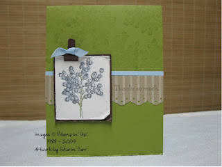
I wanted to share two versions of a card today and get your opinion. I was in an Occasions Mini Swap and this is the set I chose to use. The images and coloring is identical (if that's even possible when something is hand made!), but one has an extra layer of cardstock. That's the only difference between the two. One is a much more softer look and the other has a punch of Ruby Red from the cardstock layer. I'm trying to figure out which one I prefer - the softer or the bolder. Please let me know which you prefer.
All images are by Stampin' Up!
Stamps: Scene is a Garden and Really Retro
Paper: Kraft, Baja Blue, Ruby Red (on one!), Chocolate Chip, and Whisper White
Ink: Basic Brown, Close to Cocoa, Ruby Red, Kiwi Kiss, Baja Blue
Accessories: Aqua Painter, Word Window Punch, Sponge quarter, Silver Mini Brad, Chocolate Chip 5/8" Grosgrain, Dimensionals, and Distressing Tool.
I really enjoyed coloring the images. It's my favorite way to color. I just couldn't decide on the layering. The softer colors remind me more of spring. Let me know your opinion. It's always helpful to have some feedback when you're in a quandary.
Thanks for stopping by.
Happy stamping,
Sharon


 One of the sets we used for our make & takes was Soft Summer from the new Occasions Mini that you can order from in April (except for the Easter sets which you can order NOW!). We used the set in a couple of different ways to watercolor. This was right up my alley for sure, but I must confess something. Every time I try to stamp under a time crunch, I always make mistakes. It's so frustrating. True to form, I messed up my 2nd project, so I packed it away and took pictures instead. So much less stressful for me! Does anybody else have this problem?? Or am I the only demo around that can demo at a workshop, but can't stamp at convention, etc?


