Showing posts with label birthday. Show all posts

Monday, February 17, 2014

Starry Birthday Card

Today's card was so much fun to make that I decided the ladies that come to my classes would like it too.  It's versatile enough in the colors and images that it could work for either man or woman, and probably even any teenagers you need to make cards for.  Let me know what you think...

Stamps:  Simply Stars and Remembering Your Birthday
Ink:  Strawberry Slush, Bermuda Bay, and Crushed Curry
Paper:  Crushed Curry, Whisper White with Kaleidoscope Designer Series Paper
Accessories:  Rhinestone Basic Jewels, Basic Gray Stitched Grosgrain Ribbon or Basic Black 1/8" Taffeta Ribbon
Such a simple card to make!  It would make sense to make up a couple of these to have on hand when needed. 

I chose the star colors from the Kaleidoscope DSP so that was easy peasy.  Just stamp on a few stars both inside and outside of the card and it's finished.  (and don't forget to stamp the envelope to match!)


 I chose the Basic Gray 1/4" Stitched Ribbon to go with the card, but tried it with the Basic Black 1/8" Taffeta Ribbon too.  This change gave the card a little edgier look for teens. Both of these colors are part of the cool print, so either work quite well.

Been turning to the Remembering Your Birthday stamp set quite often lately.  It's a really good addition to any sentiment stamps you might already own.  I figure I can never have too many sentiment stamps!!  grin

Thanks for stopping by today so I could share this idea with you.  Love to hear any comments you might have.  Thanks for sharing!  Happy stamping,     Sharon

Sunday, February 2, 2014

Another Good as Gold

Happy Groundhog Day!   (or Superbowl Day for some of you)  In case you were wondering, the groundhog didn't see his shadow so there's gonna be lots more winter to come.  Oh phooey!  But I've got another card to share with you that's bright and fresh and will help cure those winter blahs.  Here's my 3rd card made from just 1 of the cards from the Good as Gold  kit.   Love it!

Stamps:  Label Something
Ink:  Calypso Coral
Paper:  Calypso Coral, Bermuda Bay, Whisper White, and Champagne Glimmer Paper with Good as Gold SAB Card Kit
Accessories:  Big Shot with Circles #2 Die, SAB Decorative Dots TIEF, Artisan Label Punch, 1 3/4" Scallop Circle Punch, and Dimensionals
Even though these cards have been using many of the same colors, stamps, and punches, they all look quite different.  Each of them has it's own feel - from modern to sweet.  It's fun to see how you use the same products but end up with something unique time after time.

Yes, I still love the Good as Gold card kit that you can get free from now until the end of March.  All you need to do is place a $50 order of any of the hundreds of  items Stampin' Up! has in the current Catalog and Mini Catalog.  That makes you eligible to choose one of the Sale-A-Bration free items!  And look at all the wonderful things you can make using just one of the items.  By the way, the Decorative Dots embossing folder is another of the Sale-A-Bration free items too!  Contact me at sharoncarr50@gmail.com if I can help you place your order.  Or you can just click on the Order Now button to the right and order online.  Either way, you should get an order in soon to get your free items too!

Thanks for stopping by today.  Hope you had fun with these last posts using the same product.  I know I had fun making these cards.  Happy stamping....       Sharon

Saturday, February 1, 2014

Happy Birthday Arrow Card

I shared a card made with the Good as Gold card as part of the card layering the other day.  I've been playing with the left over printed cardstock - you know it's too pretty not to use it!!  I love the cards I've been making with this and can't wait to share them with you.  Here's the 2nd of 3 cards made with 1 of the cards from the kit.  Hope you like it as much as I do!

Stamps:   Label Something, Remembering Your Birthday, Perfect Pennants, and Hello Lovely
Ink:  Bermuda Bay, Pistachio Pudding, and Basic Gray pads with Calypso Coral and Bermuda Bay markers
Paper:  Bermuda Bay, Basic Black, Whisper White with Good As Gold SAB Card Kit
Accessories:  Big Shot with Hearts A Flutter Framelits, Chevron Punch, Artisan Label Punch, Basic Black 1/8" Taffeta Ribbon, and Dimensionals

 Yes, I know - I used a ton of different products on this one card.  But they were pretty much all strewn across my worktable from other projects and I just kept adding little bits to the card.  Dropping any of the items just makes the card droop.  Like adding the Chevron Punch pieces to the front of the card just made it pop.  I had been trying different ideas, but when I added these - wow!!

One thing I learned with this card is that my Bermuda Bay ink pad is quite a bit lighter in color than the marker and cardstock.  That makes it frustrating to really get things to match.  Bummer.  Maybe I could get a refill and it might darken up.  At least that's my plan right now.

Ok, hope you liked this card.  I love it and I'm so happy with how it turned out.  There's just something about the print of the Good as Gold card that makes me want to keep creating with it.  The colors are so fresh and fun I can't help it!!  It makes me remember that we won't have snow and freezing temps forever.  Thank God!  It's been snowing heavily ever since I got up this morning and we've already got at least another 3" so far.  (I haven't been outside to measure, so it might be more)  Wonder when it's gonna let up?  Oh, well, might as well stay in and do a little more stamping!  Have a great Saturday.  Stay warm and cozy...        Sharon

Thursday, January 30, 2014

Tag Topper Card

I spent time last night hanging out with some friends on the internet.  First time for that experience, and it went pretty well.  At least until my internet provider kept losing a connection.  Oh well, sometimes technology is fabulous, and sometimes not so much.  Last night was a bit of both.  But it was absolutely fabulous to 'see'  some of my stamping friends that I haven't seen in two years.  We had a lot of sharing and fun together.  And that brings me to my card today.  One of my friends shared with us a Tag Topper card and gave us instructions on how to make one.  So I got busy and tried it before I forgot how she said to do it.  (It's tough getting old when the memory is shot!!)  I loved how different the card is and wanted to share with you right away.

Stamps:  Perfect Pennants
Ink:  Bermuda Bay, Pistachio Pudding, and Calypso Coral
Paper:  Coastal Cabana, Whisper White, and Sahara Sand with SAB Good as Gold Card Kit
Accessories:   Scallop Tag Topper Punch, Big Shot with Deco Labels Framelits, Whisper White 3/8" Taffeta Ribbon,  Sponge quarters, and Dimensionals
I wish you could see this in person.  The gold dots on the paper really don't show here at all, but are so pretty with this fresh color combo.  I figured I could make 3 cards using just one of the printed cards from the kit, so why not try it.

I didn't have any ribbon that I liked with the colors on the card, so I used an ink pad and sponge to color the white ribbon.  It's a pretty soft Calypso Coral color now.

I love the Perfect Pennants stamp set - quite versatile.  That little sentiment has been punched or die-cut using at least 3 different shapes on cards in the last week.  Wonder how many of those dies will actually fit this one stamp??  Did you notice the little striping of dots on the white layer inside the card?  It is also from the Perfect Pennants stamp set and is a perfect accent for this card with all the other dots going on.

Ok, my break from the grandkids is just about up.  I hear some rustling going on in the bed where the little one is napping.  Hope you enjoy this card.  I had fun making in and will definitely make more of this style soon.  Have a great day today.  Stay warm and have some fun!      Sharon


Wednesday, January 22, 2014

So Sorry...

Oh dear, it's really been over 2 months since I've hung out here in the blogosphere.  And what have I been doing you ask?  Well, it started out as a nasty cold in November, went to another cold, got more run down, got the flu over Christmas, and then another cold.  I really don't think I have any kind of an immune system when it comes to my grandsons and colds.   I'm still hacking and coughing on a regular basis, but my hubby said to get downstairs and get stamping!  So here I am (cough, cough).  I put together a card class last week. (It was in-between colds)  The ladies that were scheduled to come on Thursday night didn't want to get out in the snowy weather, so it was put off til tomorrow night.  Thought I'd get back blogging by sharing cards from class.  That's a safe place to start off new again, right?  The card tonight is actually two versions of the same card -  just a change in stamps used.

,
Stamps:  Tags 4 You  (Best of Birthdays 2nd card)
Ink:  Pool Party  (2nd card- Stazon Jet Black pad, Pool Party, Pink Pirouette, Smoky Slate, and Cherry Cobbler markers)
Paper:  Pool Party, Cherry Cobbler, Whisper White with Quatrefancy Specialty DSP, and Silver Glimmer Paper
Accessories:  Trimmer with Scallop Rotary Blade, Label Bracket Punch, Owl Builder Punch, Glue Dots, and Dimensionals
On both cards, I wanted a layer of silver glitter paper behind the sentiment to accent it.  To do that, simply cut the silver glitter paper in half after punching it out.  Then spread it a little to the sides and it give the illusion of another full layer behind the sentiment.

I love the added teeny tiny hearts from the Owl Builder Punch.  That's such a necessary punch to have on hand.  You never know when you're going to need a tiny heart or two to fill out a design.
On the 2nd card, I layered the DSP on the Cherry Cobbler cardstock in the center and then layered it in from the left edge a little onto the card.  I was surprised how much of a difference that little change made in the looks of the finished card. 

Ok, that's it for the night.  I'm beat and it's time to start heading for bed.  God willing, I'll be back again tomorrow.  Blessings and my grateful thanks for coming by to see it I'm still here!

Sharon

Sunday, August 18, 2013

Sketched Birthday in Blue

I haven't spent much time checking out other blogs and stamping venues lately.  Just not enough hours in the day to spend oodles of those precious hours surfing the web to see what everyone is up to in the creative world.  But today I was looking for something in particular that I thought I'd seen somewhere (and it wasn't there!).  I did discover a sketch challenge though.  Oh, how I miss doing those on a regular basis to keep me creative!!  I thought today would be a perfect day to try my hand at the challenge, so here we go.  The sketch is found here at the Clean and Simple Stamping blog.  I had an idea that I thought would work and gave it a try.  Think I like what I came up with...

Stamps:  Sketched Birthday, Sweet Essentials, and Hello to You (Paper Pumpkin set)
Ink:  Indigo pad, Soft Sky, Calypso Coral, Island Indigo markers
Paper:  Soft Sky, Calypso Coral, and Whisper White
Accessories:  Big Shot with Tasteful Trim Bigz XL Die, Paper Piercing Tool and Mat, Essentials Paper Piercing Pack, 1 1/4" Circle Punch, 1 3/4" Scallop Circle Punch, Rhinestone Basic Jewels,  and Dimensionals
It was fun having a starting place of a sketch to work with.  I changed around my color scheme a couple of times, but that's not surprising.  The sketch didn't call for the scalloped layer under the main layer, but it looked too plain for my taste.  Dare I say almost boring?  And we can't have that!   So it was added to go along with the scallop punch.  I had planned to use the cute little Candy Dots for the embellishments, but ended up liking the rhinestones better.

I love the little chevron  background stamp from one of my Paper Pumpkin kits.  It's been used several times to give a fun pop of pattern and color.  These Paper Pumpkin kits are really handy to have around.

Well, that's it for this Sunday's edition of the stamping news.   I've been working on a couple other things today as well.  We'll see if they work out as planned and get posted for your viewing pleasure.  Hope you all have a great week.  And get those stamps inked and ready - it's time to stamp!     Sharon

Thursday, July 18, 2013

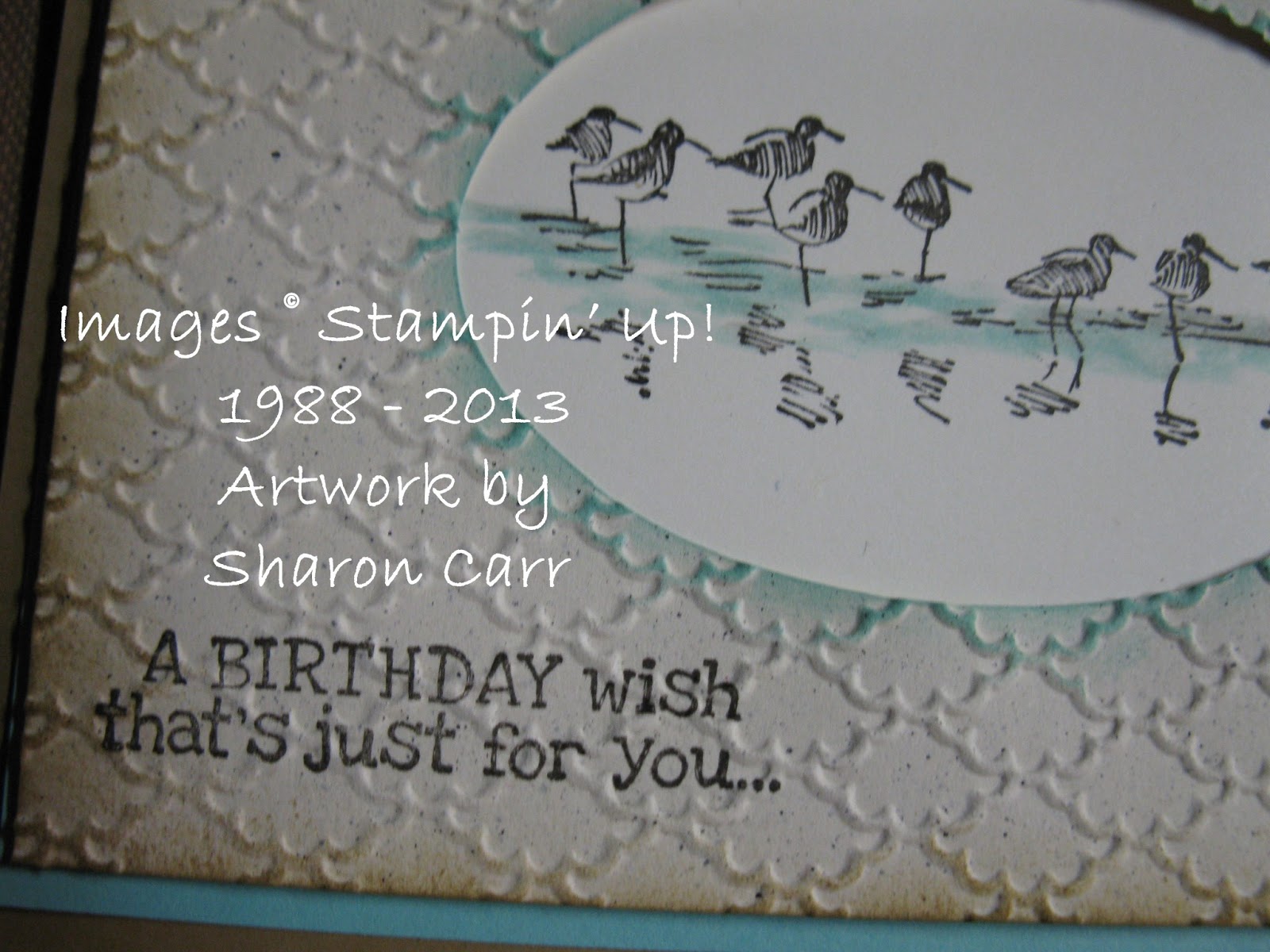
Serene Sandpipers

Okay, so I'm not at convention with my friends and I'm a little bummed out.  So I need to think happy thoughts.  And that makes me think of spending time with family at the ocean.  When I saw the Wetlands stamp set, the line of sandpipers reminded me of wonderful times visiting the ocean with my family.  I knew this would be one of the sets I needed to get.    This is a simple design that would work for many occasions, and for either male or female.  Just change up the sentiment on the card for whatever occasion you might need. 

Stamps:  Wetlands and Remembering Your Birthday
Ink:  Early Espresso, Baked Brown Sugar, and Coastal Cabana pads, Coastal Cabana marker
Paper:  Baked Brown Sugar, Cabana, Very Vanilla, and Naturals Ivory
Accessories:   Big Shot with Ovals Framelits, Fancy Fan TIEF, Aqua Painter, Sponge Daubers, and Dimensionals
I knew I wanted the sandpipers on an oval piece, but changed my mind and stamped it through the die-cut oval instead.  I chose the Fancy Fan TIEF because it reminded me of waves.  If it was embossed the other way, it reminded me of sea shells, so either way it was perfect.

The new In Colors used here are just too yummy!  I love how they go together nicely and give such a serene feeling to the card.  Fits right in with beach colors.

On this card I used an Aqua Painter to add just a bit of color to the water's edge where the birds are walking.  I thought of adding more color, but we'll just save that for another card on another day.  This has such a clean and simple look, I didn't want to spoil it with anything else.

Thanks for stopping by today.  If you're like me and not at convention right now, let's not feel sorry for ourselves, but get out our stamps and paper and create anyway!  Hugs,  Sharon

Tuesday, July 16, 2013

Washi Tape Birthday

Have you given up on me yet?  Hope not, even though sometimes I'm ready to give up on me lately!  There's been some struggle lately to balance all the areas of my life, and I think all of the major areas are suffering as a result.  Still trying to get enough sleep so there's enough energy for playing with and watching our grandsons everyday.  I love spending time with them, but it sure is wearing me down sometimes!  Add to that some quirky car problems, and I'm getting overwhelmed a bit.  Anyway, I've got a card from last week's classes that I think you'll like.  It's so bright and summery that it feels like a summer day.  So it should fit right in as it's the middle of July, right?

Stamps:  Label Love and Simply Sketched(hostess)
Ink:  Basic Black and Always Artichoke
Paper:  Daffodil Delight, Whisper White, Strawberry Slush, Island Indigo, and Cardstock Vellum
Accessories:   Artisan Label Punch, Itty Bitty Shapes Punch Pak, Gingham Garden Washi Tape, Rhinestones Basic Jewels, Glue Dots, and Dimensionals
Love the bright, happy look of this card.  This is the first chance I'd had to use Washi Tape.  I had no idea why everyone was so taken with it.  That is, until I tried it myself.  Oh yeah, it's really wonderful!  It's so easy to use, just like using regular tape.  Put it on the card and cut when you have enough.  It is translucent, almost like vellum with an adhesive backing.  And such pretty colors and prints!  Yes, I'm lovin' this new product!!

I think the little punched flowers on the stamped vellum really make the card stand out.  It's an unexpected touch.  And I'm getting lots of use out of the new Label Love stamp set with the coordinating Artisan Label Punch.  It's the perfect size for adding sentiments to your cards.

Thanks for checking in on me.  Hope you enjoy this card.  To my friends who have departed to Utah for convention, have a wonderful time!  Hugs,  Sharon

Wednesday, June 19, 2013

Mosaic Madness Card

Today's card is sort of one-of-a-kind.  Even though I've made 6 of this card so far, each card ended up being different because of the layout of the 'mosaic tiles' that are punched and added to the card.  It was fun lining them all up and seeing how different they ended up looking!  Just play around with those punched pieces and have some fun being creative.  Everyone seems to like a different layout on this card.  Give it a try and see what you come up with!

Stamps:  Mosaic Madness and Label Love 
Ink:  Melon Mambo, Elegant Eggplant,  and Old Olive with Melon Mambo, Elegant Eggplant, and Old Olive markers
Paper:  Whisper White and Old Olive
Accessories:  Big Shot with Modern Mosaic TIEF,  Mosaic Punch, Artisan Label Punch, Old Olive Dotted Scalloped Ribbon(ret), and Dimensionals


Love the  new Label Love stamp set and coordinating Artisan Label Punch.  Makes me so happy to be able to punch out my sentiments so easily and pop them anywhere on the card.  Easy peasy!  And the Mosaic Punch works perfectly with the Mosaic Madness stamp set.  Don't you just love how Stampin'Up! keeps coming up with these fabulous new stamps and punches that coordinate?!!  I can never get enough of these - oh, I'm soooo bad!  Have fun stamping!  Sharon


Tuesday, June 18, 2013

Square Little Birthday Card

Today I have a cute little square card that really is all about the Designer Paper that is used.  The paper used is from the Quatrefancy Specialty Designer Paper set.  Such pretty designs and the colors are nice and bright - just right for a birthday celebration!

Stamps:  Bring On The Cake
Ink:  Island Indigo
Paper:  Whisper White, Island Indigo,  Pumpkin Pie, Daffodil Delight, and Strawberry Slush cardstock and Quatrefancy Specialty DSP
Accessories:  Big Shot with Labels Collection Framelits, AquaPainter, Rhinestone Basic Jewels, and Dimensionls
This is a cute and quick card to make.  It's sized at 4 1/4" X 4 1/4" so it fits in the A2 envelope nicely.    The smallest Framelit from the set was used to die-cut the new Strawberry Slush cardstock piece in the center.  (Now I need to think of something to use those little die-cut pieces!!) 

I love those little flags of coordinating cardstock under the Strawberry Slush layer.  Just a little accent of the colors present in the Quatrefancy paper.   The stamped birthday cake looked a little bland, so I touched it up a little with the AquaPainter so it didn't look so flat.

Here's another card made with a different print from the same DSP.  It looks bolder than the first one, so maybe this would be the man's version??  Or maybe not...

The rhinestones were added to the corners of the Strawberry Slush layer to add a little bling.  You know you need some bling on everything, right?

Hope you like this idea - simple and fun to do.  Thanks for stopping in.  Come back again for more ideas.   Sharon

Sunday, June 2, 2013

Serene Silhouette Block Print

I have a feeling any posts this week will be just a little schizophrenic in nature.  With the new Stampin'Up! catalog here, I want to share new goodies with you.  But I don't have tons of the new goodies to play with yet.  In fact, not too many at all.  So I'll be sneaking in some old accessories on my projects until I can replace all that's been retired.  Every time I sit down to stamp, I find myself grabbing something to work with and then freaking out because it's retired and I can't show it at parties anymore.  And making up samples to share is just getting a little crazy!  So you're getting a hodge-podge of things here.  There will probably be something retired snuck in there, so you're just going to have to deal with it.  OK?  Hope so...


Stamps:  Serene Silhouettes and Label Love
Ink:  Stazon Jet Black, Daffodil Delight, and Pear Pizzazz
Paper:  Daffodil Delight, Basic Black, and Whisper White
Accessories:  Artisan Label Punch, Pear Pizzazz Seam Binding Ribbon(ret), Brights Buttons(ret), Baker's Twine, Sponge Dauber, Glue Dots, and Dimensionals
Are you wondering where the Daffodil-stamped rectangle came from?  I still purchase some of my stamps in a wood base.  For me, it just depends on the type of stamp it is.  So when I have a lot of excess rubber from a stamp set, I might keep a bigger piece for future reference. This time I cut a piece into a rectangle to stamp these blocks of color behind the black image. 

Did you notice the cool new sentiment stamp and the coordinating punch?  I just love it when I can stamp, punch, and pop it up!  So quick and easy, but it stands out so much more than just stamping directly onto the card.  And for me, sentiment stamps are an addiction.  If a new one comes out, I need it!  The top left corner of the image layer was also corner-punched with the same punch to coordinate with the sentiment (just in case you were wondering).

Hope you're having a fabulous Sunday - or whatever day it is when you read this!  The day has been simply gorgeous today and I've been enjoying it immensely.  It's been so rainy lately that this is wonderful.  Happy stamping - Sharon


Wednesday, May 8, 2013

Polka Dots and Cupcakes

The card I have to share with you today is CASEd from a fellow demonstrator, Kendra.  Isn't it wonderful having such creative friends that share ideas with you?  That's one of the very best things about the Stampin'Up! community of stampers - they are wonderful, caring, creative ladies that are happy to share what they love to do.  I thank God that I joined this company over 15 years ago.  Who knew that a love of crafting would lead to making so many friends and a business that is so much FUN!  Can't beat it!  Oops, seems like I'm digressing a bit here.  You came to see the latest stamping idea, didn't you?  Well, I certainly wouldn't want to disappoint, so here we go...

Stamps:  Create A Cupcake
Ink:  Pool Party, Pink Pirouette, and Early Espresso
Paper:  Pool Party, Pink Pirouette, Early Espresso, and Whisper White
Accessories:  Big Shot with Square Lattice TIEF, Cupcake Builder Punch, 1 3/4" Circle Punch, 1 1/4" Circle Punch, 3/4" Circle Punch,  Large Oval Punch, Scallop Oval Punch, 2 3/8" Scallop Circle Punch, 2-Way Glue Pen, and Dimensionals

"
Whew!  Did you catch all those punches?  When I got done with the card, it looked like a punch invasion on my work table!  grin  But having all those punches to use makes this card so easy peasy to make.

Have you embedded cardstock pieces into a cardstock layer before?  It's really simple and looks so cool.  Just punch whatever shapes you want to use, attach them to the white cardstock base, then emboss with the Square Lattice embossing folder.  (other embossing folders will work, but this one works the very best!!)  After embossing, the cardstock pieces really seem to be embedded and all just one piece of printed paper instead.  In fact, it almost feels like a piece of fabric!

The darkness of the Early Espresso cardstock used here really makes the two light colors look really sweet together.  Yes, I know I've never seen a cherry that color of light pink, but who cares.  That's where artistic license comes in.  You could change around the colors used to be brighter and it would totally change the look of this card.  Oh the joys of playing around with color and design.  The possibilities are pretty much endless!

That's it for today.  Thanks for stopping in again.  I appreciate any comments you might care to leave.  It always makes my day to hear from you!

Thursday, July 12, 2012

Reason to Smile in B&W

Don't you just love this wonderful stamp set - Reason To Smile?  I've been having fun playing with it while it's still available.  Yes, you can get this set for only $5 when you place an order for $50 or more.  But you can only get it during the month of July!  So if you're interested, you'd better hop on it now!!  Anyway, back to the card I have to share today.  One of my favorite color combos is any pop of color with a basic black and white card.  That's what I have for you today.  Hope you like it...

Stamps:  Reason To Smile and Wacky Wishes(hostess)
Cardstock:  Basic Black, Real Red, and Whisper White
Ink:  Basic Black and Real Red
Accessories:   Big Shot with Apothecary Accents Framelits, Bitty Buttons, Cherry Cobbler Baker's Twine, Basic Black Scallop Dots Ribbon, Mini Glue Dots, and Paper Snips
Did you notice how the die-cut tag was only partially used?  I cut off the other 'bump out' to have a straight edge.  And since there isn't another framelit to make a nicely framed layer, I just traced the outside of the framelit, cut it out, and made my own.  Great idea, right?

I wanted to add just a smidgen of red to the accent and realized the Baker's Twine would work out quite nicely.  I used Real Red ink to stamp a sentiment inside the card and added a few more daisies in the corner to finish it off. 

This was a really quick card to make, but I love how classy it looks.  And right now, any card that is quick gets my vote.   See you soon, Sharon

Tuesday, June 26, 2012

Lemon Lime Hearts

Wasn't sure how to give this one a title, so bear with me here.  I have to admit that the new Summer Starfruit color is not my favorite. But when my friend Phyllis D. showed me this card, I just had to make one.  Now I guess the color is growning on me.  At least enough to have my class ladies make this card this month.  grin  So what do you think of the color combo??  Isn't it yummy?

Stamps:  Itty Bitty Banners
Cardstock:  Whisper White, Daffodil Delight, Summer Starfruit, and Old Olive
Ink:  Summer Starfruit
Accesssories:  Big Shot with Argyle Embossing Folder and Bitty Banners Framelits, Full Heart Punch, Dotted Scallop Ribbon Border Punch, and Dimensionals
For not really liking the color, I really love the color combo on this card.  It's so fresh and tart looking,  When Phyllis made her card, she had the colors layered on top of each other, yellow on yellow, etc.  But I liked it much more all mixed up.  Really makes me think of Key Lime Pie - yummy!

Don't you love the new embossing folder?  It's another of those wonderful all-over prints that sort of looks like fabric.  This one can go either bold or delicate depending on what you put with it.  And those new little Framelits with matching stamp set are just too cute!

Hope you enjoyed this idea.  Thanks Phyllis for a fab idea!  Thanks for stopping in today.  (ps - hi Connie!)   Sharon

Friday, May 11, 2012

Goodbye Fifth Avenue Floral

There are so many stamps sets being retired that I'm going to miss soooo much.  And Fifth Avenue Floral is definitely one of them.  I had to use it one more time for a class project.  So this is one of the projects from May's classes.

Stamps:  Fifth Avenue Floral, Four Frames, and Fabulous Phrases
Cardstock:  Crumb Cake, Pear Pizzazz,Very Vanilla, and Calypso Coral on some, with Everyday Enchantment DSP (ret), and Watercolor Paper
Ink:  Stazon Jet Black, So Saffron, and either Baja Breeze or Calypso Coral
Accessories:  AquaPainter, Big Shot with Stripes Embossing Folder, Decorative Label Punch, Modern Label Punch, Bird Builder Punch, Mat Pack and Piercing Tool, either Calypso Coral Ruffled Ribbon or Baja Breeze Seam Binding Ribbon, Dazzling Details Glitter, Sponge Dauber, and Dimensionals 

After making the card and deciding to use it for class purposes, I realized I didn't have enough of either color of the printed DSP to make all the student's packets up.  So Tuesday ladies got to make the coral version, and the Wednesday group used the Pear Pizzazz version.  From what I overheard, seems like everyone liked this card.  It was interesting having the front of the card trimmed at an angle with the solid color from the inside showing at the top. 

It looks very subtle, but the Stripes embossing on the Designer Paper adds a nice touch.  Just one more touch that adds up to make something really
special.
The last picture shows another version of this card.  I had just one more piece of Designer Paper left, so figured I might as well make another card to use it up.  As you can see, this one doesn't have the angled top on the card, but I added a couple of Subtles Brads to the top corner to make it look finished.  I also changed the flower to the lily from the same set.  Just gorgeous!  I have to say that coloring on the Watercolor Paper is fabulous!  You can move the color, darken and lighten it so easily.  Don't know why I always forget to grab it when I want to add a watercolored image.
Thanks for stopping by today to see what's new.  I'll have something else to post tomorrow too, so come on back.  Have a great weekend!  Hope the weather cooperates.  We're having a christening party on Sunday for our new grandson.  It would be nice to spend some time out of doors.  See you... Sharon  

Monday, April 16, 2012

More Ice Cream Please!

That's right, I've got another 'Mouthwatering' card to share with you today. I sure hope this set makes it into the next catalog. I've made several bright and happy birthday cards with it. Only problem with working with this stamp is that I keep getting this powerful urge to grab the carton of ice cream in the freezer and make a pig of myself! Did anybody else hear that little oink in the background? Anyway, this card uses the Stamping 411 Sketch for last Saturday that you can see here. Hope this fits with your ice cream cravings...

Stamps: Mouthwatering and Teeny Tiny Wishes
Cardstock: Whisper White, Calypso Coral, Lucky Limeade, Soft Suede, and Red Glimmer Paper, with Sweet Shop Specialty Designer Series Paper
Ink: Soft Suede pad, and Calypso Coral, Real Red, and Soft Suede markers
Accessories: Owl Builder Punch, Brads & Ribbon from Sale-a-bration


Yes, I know Sale-a-bration is past, but I've got some extra ribbon and brads and they go with these colors so perfectly. Besides, the card is for a friend that loves bright, fun cards so it was just the right accessories to use. It was really hard to cover the backside of the DSP, because the rows of cupcakes look so yummy, but again, this side with all the cherries worked better for what I had in mind for this card.

I admit I changed the dimensions of the sketch card a bit, but don't I usually? This is a really great sketch that I'll probably use often. I love going back and using the same sketch and seeing how totally different the card can look. It's all about the stamps and colors you choose and how you put them together. The possibilities are endless.

Well, thanks for stopping by on this chilly, blustery day. My daughter and I were out running errands together with the kids. If it was nicer out, we had planned on a stop at the DQ. But the weather wasn't cooperating today. Oh, well. There's always another day to get some ice cream! Hope you have a great week. Make time for stamping - it's fun! Sharon

Friday, April 13, 2012

Monkeying Around

Ok, don't let anybody kid you, two kids under 2 years old are a lot more crazy than just one at a time. My hubby went out of town this week and I got to handle both grandsons by myself. Whew! Nothing like staying busy and totally collapsing when they leave. Of course, it was classes this week too, so needless to say it's been a bit harried around here. But let me add, I just love both my little grandsons to pieces!!! The 6 week old baby is so very precious, and the 23 month old is a non-stop little boy that's full of fun and curiosity. Am I bored? Not a chance!! Anyway, I do have a few class samples that I'd like to share with you in the up-coming days. The first one was inspired by the little guy whose 2nd birthday is coming up next month. I made this card for him, then thought the class ladies could probably use a card like this too. Here it is.....

Stamps: Fox & Friends
Cardstock: Bashful Blue, Lucky Limeade, Whisper White with Cheerful Treat Designer Series Paper (hostess)
Ink: Early Espresso
Accessories: 1 1/4" Square Punch, Decorative Label Punch, and Dimensionals

When I was planning this card, I went pawing through all of my word stamps to get the sentiment that would really go with the card and couldn't find anything that I thought would do it justice. There was nothing that really went with the idea of monkeys jumping on the bed - which is one of his favorite books. So after giving it alot of thought, I decided to just make up a sentiment and then printed multiples for everyone to use on their cards too. Don't you think the sentiment works for the card??

When I was making the first card, I tried using the larger 1 3/8" punch for the backing layer, but it got too big and crowded looking for my taste. Then I tried a 1" punch for the monkey layer and that seemed a little too small. So I cut out all the square at 1 1/8" for the monkeys and that worked out just right. (hmmm, maybe this should be about Goldilocks and the 3 Bears instead) Ooops, too many kids stories here!

I chose the Cheerful Treat DSP for the card because it made it more universal instead of just boyish, since some of my students have little girls or grand-daughters. And one of the ladies said she'd be giving it to her niece who is 13 and loves monkeys. Anyway, the cards made us smile when they were done, and that's what mattered. Hope you like the idea too. You're more than welcome to use the sentiment I decided on. I'm sure somebody would just love to get this card! Have a great weekend - Sharon

Saturday, April 7, 2012

Mouthwatering Ice Cream Cone

Oh yummy! Just thinking about ice cream cones makes me think of summer. I can hardly wait for those warm days of being outside with a creamy, cold ice cream cone. Doesn't that sound wonderful? But since the weather has dipped down to colder temps again, it's gonna be awhile before we're sitting outside with our cones. Until then, we just have to make do with the images in our head and the ones on our cards!!

Stamps: Mouthwatering, and On Your Birthday
Cardstock: Whisper White, Early Espresso, Lucky Limeade, and Pool Party, with Sweet Shop Specialty Designer Series Paper, also Red Glimmer Paper
Ink: Lucky Limeade pad, and Soft Suede, Calypso Coral, and Real Red markers
Accessories: Big Shot with Perfect Details Texturz Plates, Owl Builder Punch (cherry), small oval punch(ret), Sweet Shop Jelly Bean Brads, Mat Pack and Piercing Tool, and Dimensionals


There are so many aspects to this card that I really love. Everything from the embossed texture on the espresso layer that mimics the waffle-weave of the cone, to the colorful little hearts sprinkled on the brad that perfectly match all the wonderful, luscious ice cream desserts shown on the DSP. And don't forget about that sparkling cherry topping off that yummy cone.

Umm, 'scuse me a minute.... lick, mmmm.... Gee whiz, looking at all that ice cream was really starting to be a problem. But now that I've got my bowl of chocolate with chocolate covered cherry chunks ice cream I'm all set now. Mmm-mmmmm, that's just soooo gooooood!! Looks like I'm gonna be busy for awhile, so I'll be signing off now. Catch you later. Sharon

Wednesday, April 4, 2012

Another Birthday Cupcake

I don't know where the days have gone, but it's almost Easter and I'm soooo far behind again. Yikes, gotta get a move on!! I do have a soft and pretty birthday card to share with you today. And it has a cupcake on it, of course! I just love all the different cupcake choices at the bakery nowadays, so I keep stamping birthday cards with them! Yummy! Ok, so this one probably wouldn't taste too good, but it looks yummy anyway! Here's how it's made...

Stamps: Easy Events
Cardstock: Very Vanilla and Baja Breeze, with Everyday Enchantment Designer Series Paper(SAB)
Ink: Basic Black and Sahara Sand
Accessories: Big Shot with Scallop Circle #2 Die, 2 1/2" Circle Punch, Scallop Trim Border Punch, AquaPainter, Mat Pack and Piercing Tool, Baja Breeze Seam Binding Ribbon, Brights Brads, 2-Way Glue Pen, Dazzling Diamonds Glitter, and Dimensionals

First off, I need to apologize for sharing a card using the no-longer-available-but-still-gorgeous Everyday Enchantment DSP. I'm glad I was able to get an extra pack of this lovely paper, so I'll be able to continue using it for my personal enjoyment. I'm sooooo very happy about that, cuz I love it!! But you could use any two vintage-looking coordinating prints to make this card. Just keep the colors soft to get the same look.

Did you notice the paper piecing on the cupcake liner? I stamped the cupcake on a snippet of DSP and cut out just the liner part to add to the card. Cute, isn't it? To make the cherry on top, I used a Real Red brad. Easy peasy. Then to make that frosting look even yummier, I just added a swirl of 2-Way Glue Pen to it and sprinkled it with love in the form of Dazzling Diamonds Glitter. Almost good enough to eat, but not quite. I think I still prefer the real thing!

Have a wonderful week! Enjoy all the prep to get ready for Easter. Hopefully I'll be back tomorrow with an Easter card for any of you last minute ladies out there. Hmmm, or am I the only one??? Sharon

Sunday, March 25, 2012

Black and White Birthday

Today I've got a clean and simple card to share with you, but the details make it special. I love the look of black and white cards. I just think they look so very elegant! Usually I add a pop of color somewhere to really make it shine, but today's card is pure black and white. But that surely doesn't mean it's boring. Here, let me show you....

Stamps: Fresh Vintage (SAB), and Perfectly Penned
Cardstock: Shimmery White and Basic Black
Ink: Basic Black ink and marker
Accessories: Big Shot with Labels Collection Framelits, Corner Rounder Punch, Basic Pearls, White Taffeta Ribbon, and Mini Glue Dots

After several unsuccessful tries to get the pictures to show the Shimmery White cardstock that was used, I'm giving up. You'll just have to believe me that this card is just simply gorgeous in person. Not a whole lot of stamping going on here, but just enough.

I liked the added fussy linework to frame the stamped floral image to make it stand out more. And the wonderful calligraphy look to the sentiment makes it look extra-special.

Now I need to find someone with a birthday to send this to that would appreciate the look. Know anyone? Let me know!! Well, that's it for today. Hope you liked the simplicity of this card and give it a try. You'll love it when it's done! Take my word for it. Thanks for stopping by today. Hope you had a very blessed Sunday and were able to spend some time with family and friends. What could be better? Hugs, Sharon