Showing posts with label Vintage. Show all posts

Friday, May 10, 2013

Frilly Feminie card

I do love to make cards that are soft and feminine looking.  They're my very favorite kind of card to make, and you can probably tell from what I post the most of.  At least I think that's what I mostly post.  Who knows, I'm not going to go back and count.  How about you just take my word for it, ok?  Today's card is going to be one of the projects for next week's class.  It has several different elements that all together scream girlie-girl card.  Hope you like it!

Stamps:  A Round Array
Ink:  Crumb Cake, Primrose Pink
Paper:  Crumb Cake, Lucky Limeade, Very Vanilla cardstock with Tea For Two Designer Series Paper
Accessories:  Big Shot with Lacy Brocade TIEF, 5/8" Flower Trim, Primrose Petals Stitched Ribbon, 7/8" and 1 1/4" Scallop Circle Punches, Sponge, and Dimensionals
Ok, does it get very much more frou-frou than this?  I don't think so.  I am in love with the Flower Trim accents.  Just cut off as many flowers as you need and you're good to go.  To coordinate more with the flowers on the DSP, I lightly squished the flowers onto the Primrose Petals ink pad.  This gives color to the edges of the flowers, but still keeps them mostly the soft Vanilla color so they have a vintage feel.

I lightly sponged the embossed Vanilla cardstock with Crumb Cake ink to highlight the embossed design.   This also softened the harsh Vanilla cardstock to a more vintage look.

Stampin' Up! is having a Spring Special of the A Round Array stamp set and the coordinating 7/8" Scallop Circle Punch right now.  They will both be in the catalog coming out in another few weeks (I can hardly wait to see it!!!), but you can get them now bundled together for a 15% discount.  If you're interested, contact me or click on the right to order.  The set is really versatile and I've found a few things to use it on already!

Ok, I need to get back to getting cards ready for next week's classes.  Thanks for stopping in today to see what's new.  Hope you were inspired to get out your stamps and play.   Have a great day and get creative - it makes you happy!!  Sharon

Saturday, April 6, 2013

Vintage Hello

This is the morning of the big day for my niece and her fiancĂ©.  I'm so excited for this great couple and their wedding which will be the beginning of their lives together.  They are great kids and will do wonderful things together.  Salute Ricky and Caitlyn - I wish you the very best in your marriage!!  Now on to business and card-making.  The card today actually reminds me of Caitlyn, sort of vintage and elegant with a touch of modern thrown in for fun.  That's the feel I get from this card.   See what you think...

Stamps:  Oh Hello
Ink:  Basic Gray pad, Garden Green and Primrose Pink markers
Paper:  Basic Gray, Whisper White, Primrose Petals
Accessories:   Big Shot with Vintage Wallpaper TIEF, Ovals Collection Framelits, Vanilla Flower Trim, Pink Pirouette/Rose Red Two-Tone Ribbon, Distressing Tool, and Dimensionals
Isn't this a fun mix of vintage and modern?  The sentiment and chevron stamp from the Oh, Hello stamp set give more of a modern feel and the rest is girlie sweet.  With the chevron stamp, I used Basic Gray ink, but off-stamped first to give it a lighter look so the sentiment and flowers would show up nicely.  With the flowers, I inked the stamp with markers and stamped.  Then used the Primrose Petals marker to touch in some color on the Vanilla Flower Trim.  These little flowers are so soft and pretty and add a nice touch of whimsy to a card.

The background of course has been embossed.  Whatever did I do before we had all these awesome embossing folders to choose from?  The added texture really makes the difference in so many of my cards.  The last accessory to mention is the pretty two-tone ribbon.  I was worried it might be too wide and the wrong color for this, but it's worked out perfectly.  So there you have it - an eclectic mix of colors and styles that all come together to make a pretty card. 

Hope you're enjoying your weekend.  We are having a fabulous time with family and making new friends too here as we celebrate these two wonderful kids.  God bless you Ricky and Caitlyn.  Many blessings and happy years together.  Hugs, Sharon

Sunday, June 3, 2012

Vintage Anniversary Card

Yes, I know I've been MIA for quite awhile.  The only excuse I can give is that I'm getting too old and not everything gets done when it should.  Watching grandkids is definitely taking it's toll on various parts of my life.  But I love being with them every day and don't really want to give that up.  So.... that means other things fall by the wayside.  All I ask is that you bear with me and I'll keep trying to do my best!  That said, I've got a lovely anniversary card (could easily be for a wedding) that will knock your socks off.  Well, maybe not off, but they should at least fall down to your ankles!  Here goes....

Stamps:  Field Flowers, Hello Doily, and A Word For You
Cardstock:  Confetti Cream, Early Espresso, and Very Vanilla
Ink:  Crumb Cake and Early Espresso
Accessories:  Crumb Cake Taffeta Ribbon, Sponge Dauber, Paper Snips, Dimensionals, and Gold Lame' Smooch Accent(ret)


This card looks so very elegant and I can't wait to use it!  My sister and I were discussing card ideas and she was explaining something like this.  Now I'm very visual so I wasn't too sure what her card would look like.  She was planning to use Basic Black instead of Early Espresso, but I thought this was a little softer and more antique looking.  I wish I could see her card to compare ideas.  Her's are usually better as she has a great eye for color and composition.
I'm not sure if you can see the gold dots that are added to the center of the flowers.  After making the card, it just needed a little bit of bling.  I didn't think glitter would work, but then remembered the Smooch Accent Inks.  The Gold Lame' was the perfect touch to add a touch of class to the card. 
Hope you enjoyed this idea.  After seeing this card again, I wish I would have ordered more square envelopes before they retired.  Oh well, maybe I'll rework this card to be the regular A2 size.  Sure, why not!  Hopefully I'll be adding more posts soon.  Don't give up on me yet!!    Sharon

Friday, March 9, 2012

Double Butterfly Beauty

Well, at least I think it's a beauty! This is one of the most feminine cards I've made in awhile. And when I look at it and realize there's no lace or pearls or other frou-frou, it begs the question - what makes it so feminine?
It's the lovely Everyday Enchantment Designer Series Paper! The vintage-looking prints and mixture of colors on the different prints just makes it so pretty. Here, see what I mean...


Stamps: Thoughts and Prayers
Cardstock: Pool Party, Pear Pizzazz, Peach Parfait, and Very Vanilla with Everyday Enchantment Designer Series Paper
Ink: Calypso Coral, Sahara Sand
Accessories: Big Shot with Top Note Die, Beautiful Butterflies Die, Scallop Trim Border Punch, Regals Buttons, Pear Pizzazz Stitched Poly Ribbon, Linen Thread, Sponge Dauber, Mini Glue Dots and Dimensionals


Isn't it pretty? Can you see all the lovely prints on the card? Add the two layers of butterflies, ribbon, button accent with the Linen Thread making up the antennae, the punched edges. Oh my, it almost makes me swoon! (Or maybe that might be from the sinus infection still, grin) Anyway, I hope you like this one as much as I do. It was worth all the layering and sponging, etc.
Have yourself a fabulous day today. Looking forward to having more energy tomorrow. See you then. Sharon

Tuesday, February 28, 2012

Soft Vintage Look

It's been a little crazy around here with our grandson being miserable with a cold and doing some teething on top of that. Whew, keeps us hopping for sure! So that means I've got just a little time to get something posted today while he's napping. Hope I can get this finished before he wakes up. Today's post has a vintage look to it, using lots of stamp layering and tone-on-tone. Hope you like it.


Stamps: Elementary Elegance, Vintage Vogue, and En Francais

Cardstock: Early Espresso, Blushing Bride

Ink: Blushing Bride and Early Espresso

Accessories: Curly Label Punch, Vanilla 5/8" Satin Ribbon, Everyday Enchantment Ribbon and Brad set (SAB), Mat Pack and Piercing Tool, Basic Pearls, Sponge Dauber, and Dimensionals


I love all the layering of stamps for the background. Even through there's lots of stamping, it's still very soft looking because of the colors used.

Why is it that after I'm done making a card and I like the looks of it, when I take a picture and see it on the computer screen there's always something I think I should have done differently! This is getting so frustrating!! I might just take it all apart and add a layer of Very Vanilla cardstock to it. There is already a layer of it inside the card, so it would continue the look and maybe give the card a shot of brightness too. Just thinking here...


Oops, I here him already. That nap sure didn't last very long. Maybe he'll go back to sleep. Yeah, right! Have a great day. And try not to catch any of those cold bugs that are making the rounds in this neck of the woods. Sharon

Sunday, August 28, 2011

Vintage Doilies

So many demonstrators have been making vintage looking cards with the new doily stamp sets. Of course that means I had to have a go at it too! I chose to use neutral colors that would enhance the lovely, old feel of the stamps. We have a wedding coming up in a three weeks and I thought this would be the perfect card for the couple. Here's the details...


Stamps: Hello Doily, Delicate Doilies, and Teeny Tiny Wishes

Cardstock: Very Vanilla and Soft Suede

Ink: VersaMark, Crumb Cake, and Soft Suede

Accessories: Clear Embossing Powder, Heat Tool, Word Window Punch, Modern Label Punch, Victoria Crochet Ribbon, Antique Brads, Mat Pack and Piercing Tool, Sponge quarters, and Dimensionals


It's amazing how nicely the large background doily shows up when you just add a bit of Crumb Cake ink sponged over the embossing. All of a sudden you have this delicate aged doily on your paper! How wonderful! This is a perfect stamp for embossing then using the Resist Technique of sponging color over it. Then add several more smaller stamped doilies around the edges to fill in the background. Finally add the crochet ribbon and antique brads and it's just gorgeous! You really need to make one of these yourself. You're going to fall in love with it - I know I did!


So that's it for today, short and sweet. Hope you're enjoying your Sunday and finding some time to relax and recharge for the coming week.

Sharon

Monday, August 1, 2011

Soft Elements of Style

Hey, can you believe it? I'm back again today! Think this might be a cause to celebrate. And after the day I've had, I think I need to celebrate that I made it through in one piece! Our grandson is sure giving me a run for my money. Do you have any idea how wiggley a toddler can be when he wants to get out of your arms and run around a bank? For being so small, he sure is strong. And when he's twisting around and pushing away, it's really hard to keep him in my arms. After we got out of the bank, he played outside and really wore me out. After he was picked up I just flopped on the couch and got nothing else done. Hmmm.... Do you think I'm getting too old for this?? Naw, not just yet, but I'm getting close!
Anyway, today I'd like to share one of my favorite stamp sets done in a soft, Victorian style. Or is it a shabby chic kind of style? Or maybe it's a cross between the two styles. Yeah, I think that's what I'm going to go with here.

Stamps: Elements of Style
Cardstock: Crumb Cake, Early Espresso, Pretty in Pink, and Very Vanilla
Ink: Basic Brown (retired), Crumb Cake, Pretty in Pink, Old Olive, and Soft Suede pads, and Soft Suede marker
Accessories: Frost White Shimmer Paint, Sponge quarter, Aqua Painter, Basic Pearls, Color Spritzer Tool, and 3/8" Taffeta Ribbon


I love the look of the Shimmer Paint lightly sponged all over the stamped and colored images. It gives it such a pretty mother-of-pearl look to the card and makes it quite lovely. There were quite a few color layering techniques used on this card. First the stamping and watercoloring. Then the edges were sponged with Crumb Cake to give it a more antique feel. Then came the sponged on Shimmer Paint. Give it a few minutes to dry nicely, then for the final touch. Adding a spritzing of color with the Soft Suede marker. Love the very delicate overall speckling effect you get with the Spritzing Tool. Just the perfect finishing touch for a vintage style card.

For this card I decided not to put any kind of sentiment on the front. This was it can be used for any occasion that comes along.

Thanks for coming by today. Hope you find time to stamp. My evening will be finished up with getting together one more card idea for stamping tomorrow night. I've got the idea in my head already. Hope it actually comes together when I get the stamp, paper, and ink out to make it!
Toodles - Sharon

Wednesday, November 17, 2010

Peaceful Deck the Halls

Just have a wonderful quick card for you today. Have I mentioned how much I love the Deck the Halls Designer Paper? The colors and prints are so very vintage and make it soooo easy to make lovely cards. Or use just little bits for accents on cards or other projects. Anyway you use it, you'll love it! Because it's so gorgeous, it makes for a super-quick card! For this card I'm sharing today, I used one of the designs that looks to me to be made for an elegant and quick scrapbook page. I hated cutting into it because it is so gorgeous, but it makes a great background layer for a card too, so cut away!


Stamps: Peaceful Season
Cardstock: Crumb Cake, Always Artichoke, Cherry Cobbler with Deck the Halls Designer Series Paper
Ink: Cherry Cobbler, Always Artichoke, Crumb Cake
Accessories: Sponge Dauber, Cherry Cobbler Seam Tape


After adding the DSP to the card, there really is very little else needed on this one! I love the soft look of the poinsettias as a backdrop for the elegant script sentiment. About the only thing extra was sponging with just a smidge of ink around the edges. (in fact, it's very hard to tell that I even did that!) Add on the awesome shimmery seam tape along the side, and you're done.

I'd say this was arguably the quickest card I've ever made in my whole stamping life of about 35 years. Now that's saying alot!!

Have a great day. Thanks for stopping by.
Sharon

Friday, October 22, 2010

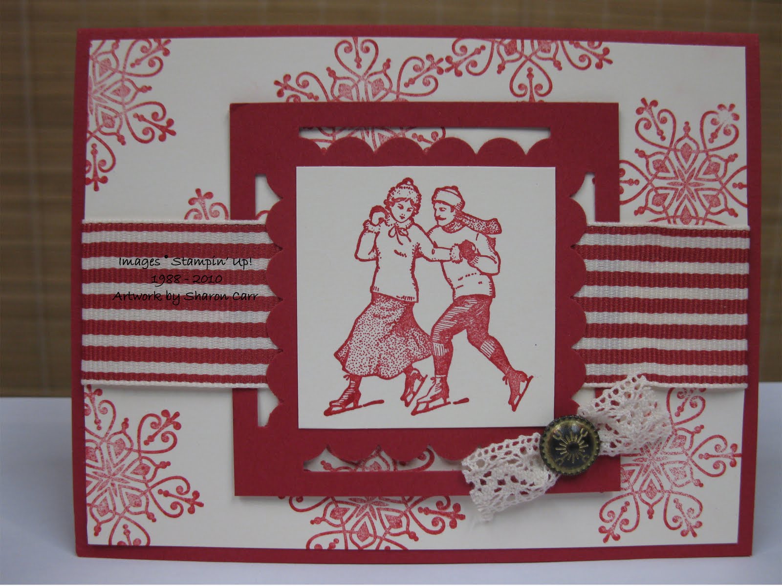
Winter Skaters in Reds

Well, after perusing my stamp shelves, I realized I've have been ignoring many of my Christmas stamps. It was really time to get busy and get them down from those cobwebby shelves. Today's plan was to use the Winter Post set. Ah, yes, those vintage skaters. You remember them, right? I decided to do something simple without a lot of fuss and little touch of the old fashioned to it. Here's what I came up with.....
Stamps: Winter Post
Cardstock: Riding Hood Red, Very Vanilla
Ink: Riding Hood Red
Accessories: Scallop Border Punch, Victoria Crochet Trim, Antique Brads, and Striped Red Ribbon
As you can see, there just isn't too much fussing around with this card. Pretty straight forward, but interesting looking anyway.
Last year a stamping friend, Terry Makelim used this frame idea for a card swap. I thought it was really classy looking and thought I'd use it for this. If you want to make something similar, the biggest challenge is gettting the size of the red frame right so the punching and the stamped image all works together. If you want to try this, the red cardstock measures 3" x 3" and the Vanilla piece is 2" x 2". That simple. Now go out and give this idea a try. It's always a classy look to frame up your main image like this.
Thanks for stopping by today. Hope to be back soon!
Sharon

Monday, October 4, 2010

Comfort Cards

We're back from our wonderful vacation in Tennessee and I'm thrilled to be home. It's funny how excited I get about going away, but I get even more excited about coming home again! There's something so comforting about being home and having everything you need right there where it belongs and having your own bed to crawl into at night. Mmmmm, yeah, it's good to be home. And the best part of home is my stamp cave in the basement! Oh, you don't know how much I've missed my stamps, paper, and other goodies!!! I spent some time this evening working on cards for the soldiers that we'll be stamping tomorrow night at church.
One of the ladies in the group, Diane Wallace, brought me some cute little fabric squares that she had finished with a touch of batting and backing. She wanted me to use them on cards if we could find a way. This is just one example of the ideas I made this evening. It has a homespun quality to it and looks like it was inspired by our trip to Tennessee.
Stamps: none
Cardstock: Naturals Ivory, Garden Green, Brushed Gold
Ink: none
Accessories: Big Shot with Northern Flurry Embossing Folder, Champagne Mist Shimmer Paint, Sponge quarter, and Adhesive
Because of the lovely gold accents on the fabric pieces, I thought the Shimmer Paint lightly sponged on the raised embossed snowflakes would be pretty. Then I tried different colors of cardstock to add some definition under the fabric piece. Unfortunately, none of the reds seemed to be the right color for it and really clashed. After some consideration, I remembered we had a Brushed Gold cardstock. I added a layer and it showcased the fabric accent very nicely.
I'm hoping that the soldiers choosing this card will be reminded of maybe a grandmother or favorite auntie that quilted and feel the cozy comfort of a homemade quilt around them.
Thanks Diane for these wonderful little bits of homespun Christmas that we can share with others. Hope you enjoyed this slightly different idea for a Christmas card. In the coming months, I'll have more ideas using these mini quilt blocks. Diane made well over 60 of these with a Christmas theme, plus a big bunch of them with hearts that we'll be using for valentines.
Thanks for stopping by today. Hope you enjoyed this slightly different idea for Christmas.
Sharon

Friday, September 24, 2010

Candy Cane Christmas

Ok, this is the last fabulously gorgeous card I have for you. I wish I had lots more, but alas, you'll just have to look at what I create after today, not what my talented friends whip up in their spare time! lol Unfortunately it's true, I hang out with people that are so much more creative than I am. And I keep hoping some of it will rub off on me. It's bound to soon, don't you think? Osmosis or something like that??

Anyway, here's the last card of the talented ladies that I was stamping with last Saturday. This card was designed by Kendra Diserens. When I first saw it, candy canes jumped to my mind so that's the title I gave it. I just wish there was some little girl I could send this to on Christmas. Wouldn't it be perfect for a little rosy-cheeked darlin'? Well, since I have a cute little BOY grandbaby, I'll have to think of someone else to treat with this little Victorian snowgirl.


Stamps: Greeting Card Kids, Season of Joy
Cardstock: Blushing Bride, Cherry Cobbler, and Whisper White with Candy Cane Christmas Designer Series Paper
Ink: Stazon Jet Black, Cherry Cobbler, Marina Mist, Wild Wasabi, Soft Suede pads, and Daffodil Delight Marker
Accessories: Big Shot with Square Lattice Embossing Folder, Real Red Satin Ribbon, Aqua Painter, 2-Way Glue Pen, Dazzling Diamonds Glitter, and Coluzzle (retired)


Isn't she just the cutest little girl? And can't you just about feel the cold breezes and pepperminty goodness? It makes me want to check the stores for candy canes! I just love peppermint candy canes, and this card makes me think I can taste them! Thanks Kendra for designing a very special card. I love it!

Well, there you have it. The tri-fecta of awesomely gorgeous Christmas cards. From now on it's back to my quick and easy designs. And yes, I'll be having more to share with you very soon.

Thanks for stopping by today. I really appreciate you taking the time to stop by and I love to read your comments, so keep them coming. Come on back soon, I'll work on getting something new up for you to peruse.
Sharon

Thursday, September 23, 2010

Bells and Boughs Card

Ok, ready for the next installment of some absolutely fabulous Christmas cards? Well, I promised that you wouldn't be disappointed, and I'm pretty sure that is very true. What?
You don't want me babbling on??

Just get on with the card?
Is that what you just said???
My goodness, some of us are getting just a little impatient there, aren't we? All right, here's the 2nd installment of some fabulously awesome Christmas cards. This one was designed by Phyllis Dahlstrom. She almost always has some cut-out layers on her cards that really make them a 'cut above' the rest.
Anyway, it's lovely, isn't it?
Stamps: Bell and Boughs
Cardstock: Always Artichoke, Cherry Cobbler, and Very Vanilla with Deck the Halls Designer Series Paper
Ink: Stazon Jet Black, Cherry Cobbler, Always Artichoke, Crumb Cake, and Soft Suede
Accessories: Aqua Painter, Wide Oval Punch, Always Artichoke Grosgrain Ribbon, Sponge Daubers, and Dimensionals
I love the vintage feel of this card. All the colors and images are working together to make it just gorgeous. And that fabulous Deck the Halls DSP - wow - really makes this card look rich!
Cutting out the bells and ribbon was a bit of work, but so very well worth the time. Having them popped up over the holly sprig really makes them stand out.
If you like the vintage look, consider getting this stamp set, and absolutely get the Deck the Halls DSP! It's a 'must-have' on my list for making cards this Christmas!!!
Ok, are you ready for one more fabulous Christmas design? Come on back tomorrow for the last of the awesome, gorgeous cards we made last Saturday. Have a terrific evening...
Sharon

Thursday, August 26, 2010

Another Butterfly Redo

Hey peeps! Hope you're having a terrific week! The weather has been a bit cooler and more comfortable this week. (great sleeping weather!!) It's been wonderful having the windows open and feeling the fresh air flowing through the house again. Yesterday I shared a CASEd card of a butterfly that my Hostess Club wanted to make. Since we were doing butterflies, I just stuck with the theme and CASEd a card from the Summer Mini that's only going to be around another few days. It's a simple card with nice clean lines. Of course, I did my usual changes to fit what I wanted to use that evening. And here's what I did..... (You can look for the original on page 19 of the mini.)

Stamps: Elements of Style, Tea House background, and Extreme Elements
Cardstock: Crumb Cake, Very Vanilla, Old Olive, and More Mustard
Ink: Crumb Cake, Early Espresso, and VersaMark Pads, Poppy Parade and Old Olive Markers
Accessories: Vanilla and Gold Glow Smooch Spritz, Big Shot with Beautiful Butterflies Die, Old Olive Grosgrain Ribbon, Mat Pack and Piercing Tool, and Square Fire Rhinestone Brads
Have you checked the original card yet? One of the biggest changes I made was using the Tea House background stamp on the main card. I love how this gives a subtle difference to the background instead of the plain background on the original. Isn't this a lovely vintage looking stamp? It's turning into one of my favorites! I chose that stamp to coordinate with the swirls on the butterfly and More Mustard layer too.
The next change was not using Crystal Effects on the butterfly. With the number of ladies making the card, I was worried that the Crystal Effects would get smudged on the butterflies before they dried enough to put on the cards. There's no reason to set the stage for failure, so I changed it to the two spritzes instead. With the heavier spraying, we still got a little of the marker colors bleeding that we tried to match on the original card. Plus we got a lovely shimmery sheen on the butterflies. How pretty!
Well, that's it for today. Short and sweet without too much rambling on for you. Hope I can get back to the stamp cave and get a few more ideas to share with you tomorrow. Have a great day!
Sharon

Tuesday, July 13, 2010

Class by Flashlight

Hey, I've got something new and different for you to try sometime. Last night was class night here at the stamping dungeon. And the weather has been a bit hot and muggy for awhile. So I guess the 'powers that be' needed to cut back on the overuse of power in the Detroit area last evening. They were so kind to wait til most business people were home before cutting back on the power. But, they forgot to let me know it would be a bad night to hold a class in my basement. The ladies came and all got settled in to making their projects nicely, when the fluorescent lights quit, the incandescent lights all dimmed, and the air conditioning quit!! They wanted to know if I'd forgotten to pay my electric bill! lol We decided it was really quite romantic, but didn't work too well for a bunch of ladies that were stamping! You should have seen us trying to read directions and see how dark we were sponging the new Crumb Cake ink onto the project. Oh my..... it was quite funny, but thoroughly frustrating for me. Thank God the ladies took it all in stride and we joked about it all evening. By the time they were making the last two projects, my hubby had strung up his large flashlight from the ceiling over the work area so we could see a bit. By then any light coming in the small window at the end of the room was pretty much history so it was a great big help having the flashlight to work by. After thinking it over, I would strongly suggest not trying this idea out at your next class unless you like keeping your customers in the dark. Of course, we will have something to joke about for months to come I'm sure! LOL


So I guess you'd like to see one of the projects the ladies were working on. Looking at the card, you can see it would be hard to tell what you're doing in the semi-dark. But the ladies all were troopers about it. Hope you give this idea a try - but make sure you leave the lights on!


Stamps: Friends 24/7 and Tiny Tags

Cardstock: Cajun Craze, Crumb Cake, Old Olive, and Very Vanilla

Ink: Crumb Cake, Basic Brown, Old Olive, Cajun Craze

Accessories: Big Shot with Vintage Wallpaper Embossing Folder, Extra-Large Scallop Circle Punch, 1 3/4" Circle Punch, Old Olive 5/8" Grosgrain Ribbon, Mini Vintage Tags, Brights Brads, White Gel Pen, Sponge quarter, and Dimensionals


I just love how the embossing matches the stamp on the main image. Stampin'Up! does a terrific job of matching up stamps and accessories so you have no trouble pulling together a lovely card. The white gel pen was a good accent to bring a bit more brightness to the focal image. And don't you love those cute little tags? They make it so easy to just tuck in a little accent.

Hope you give this idea a try. The card is so versatile, you could use it for a multitude of ideas. In fact, I left mine blank inside so it will be easy peasy to stamp a sentiment and get it in the mail as soon as it's needed. If I remember to send it, that is......

Oh well, on that note, I'm praying for better lighting for tonight's class. Right now it's pouring outside, so I don't think they'll be cutting the power tonight. At least they better not, because we might need our sump pump working if the rain doesn't let up! lol Have a good day!

Sharon

Sunday, June 27, 2010

Stormy Sunday

This has been quite a month around here. Today we had our 3rd tornado watch for the month. Quite incredible. Thank God that the storms went farther south from us and we just got rain and high winds. Another branch came down today. That's one way of thinning out the dying branches from our maple tree. I just feel so bad for the families 1/2 hour south of us that have gotten slammed each time. Don't know what's going on with the weather this summer, but I do know it's been really intense!

Since it's been so stormy, I thought today would be a good day to share a card that seems very serene. This should combat all that wildness outside! Does the card look familiar? It should because it's showcased on the front cover of the Summer Mini. My Hostess Club ladies wanted to recreate the card, so we did our best to come up with something similar. They all were very happy with the results and are actually going to make more of them!


Stamps: Elements of Style, Charming
Cardstock: Whisper White, Melon Mambo, Bashful Blue, and Presto Patterns Specialty Designer Paper
Ink: Sahara Sand, Basic Brown (retired), Melon Mambo, Old Olive, Bashful Blue
Accessories: Aqua Painter, Mostly Vintage Stencil, Sponge quarter, Vanilla Hodge Podge Hardware, Pretties Kit (retired), Small Oval Punch, Butterfly Punch, Distressing Tool, Log Cabin and Vanilla Shimmer Smooch Spritzes, Bashful Blue Mini Brads, Bashful Blue Taffeta Ribbon, white crochet cotton, and Dimensionals.


hmmm... I think I remembered all the tools and accessories we used to make this card. Seems like we had a huge pile of 'stuff' on the table when we were finished. But it really did turn out lovely, so it was worth all the time and effort that went into it! The stencil sponged on the background is what really pulls it all together. It's just a soft filler, but how cool.
And did you notice where the Charming set was used? It's that little piece of cardstock tucked in behind the ripped edge on the top. I couldn't figure out what was actually used on the original, so we improvised a bit. Some of the ladies also took a sliver of those words and tucked it under the torn bottom corner too. By that time I had already stopped working on my card, but they were on a roll and continued playing with it til they were happy. That's what I call real dedication! Or maybe it's really obsessiveness!! Either way, we all had fun making this card.

Hope you enjoy it and find time to create (or recreate!) something today too!
Blessings,
Sharon

Monday, June 7, 2010

Truly Elegant Elements of Style

I usually try to come up with my own ideas to share with you here, but sometimes I see something that just speaks to me. Sometimes it's the colors, sometimes the layout, and sometimes it's the whole package that just draws me in and won't let go. Barb Mullikin had such a card. I fell in love with it and had to make it my own. After drooling over her lovely creation, I got out my stamps and supplies and made my own. As usual, it didn't turn out like hers, but I'm still mighty happy with my results!
Stamps: Elements of Style
Cardstock: Rich Razzleberry, Elegant Eggplant, Certainly Celery, Whisper White
Ink: Stazon Jet Black, Rich Razzleberry, Elegant Eggplant, Crushed Curry, Certainly Celery
Accessories: Scallop Trim Border Punch, Double Rectangle Punch, Certainly Celery Satin Ribbon, Aqua Painter, Vanilla Smooch Spritz
Didn't I tell you it was very elegant and gorgeous? For some reason I can never get the shimmer to show up nicely in my pictures, so you'll have to take my word that it is stunning! And no, I'm not exaggerating either!!! lol For those of you lucky people that take classes with me, this will be one of your projects this month. Aren't you happy you'll get to make your own?!
Did you go check out Barb's card? Hope you enjoyed my version too, and will try to make your own version of mine. I'd love to see what you come up with - we'll just keep making changes to her idea until we come up with something totally different. I suppose that's what happens most of the time anyway.
Looking forward to seeing all my class people this week! It's always fun reconnecting with friends and hearing about what they've been doing. Throw in some creative stamping and you're sure to have a great time! Wish you could be here too.....
Hugs,
Sharon

Tuesday, May 25, 2010

Another Toile Look

First I have to make a comment or two about yesterday's sample. If you went to the Stamping 411 site, you saw a sample that had the same set, colors, and dsp print that I used. I guess great minds think alike. I try very hard not to look at the samples posted before I work on my card. I was sort of shocked after I posted and then looked around. There seem to be alot of us out there that really like the Tropical Party stamp set, 'cuz there were lots of samples using that set.

That said, on with the newest card idea. I wanted something for my Hostess Club ladies that would be feminine but not too frilly. Plus we needed to work with some new products, of course! hehe I had just gotten the Vanilla Smooch last week and hadn't used it yet - it would be perfect for what I had in mind. And as usual, it has an texture-embossed layer for extra interest. Hope you like it and try this one out for yourself!

Stamps: Elements of Style
Cardstock: Creamy Caramel, Close to Cocoa, and Very Vanilla
Ink: Creamy Caramel, Close to Cocoa
Accessories: Big Shot used with Square Lattice Textured Embossing Folder and Lots of Tags Sizzlits, Chocolate Satin Ribbon, Aqua Painter, Vanilla Smooch Spray, Sponge quarters, and Dimensionals


I'm still learning about using the Smooch Spritz. The major thing I've found is that you shouldn't shake the vial unless you want a splotchy spray. It seems to spray much finer when you don't shake it up. Now I've got to go back and try it out with the Log Cabin Smooch. When I tried it earlier, it was heavily splotched and not what I wanted for that card. Ah well, that's what you have me for! I do it wrong, figure it out, and let you know how to use it the rightway and save you all the headaches! Oh well, as long as I'm having fun, who cares!! LOL

Ok, I've got to get ready for my ladies tonight. Maybe I have time to make some goodies for them. yummmmm...
Sharon

Sunday, May 23, 2010

Totally Toile

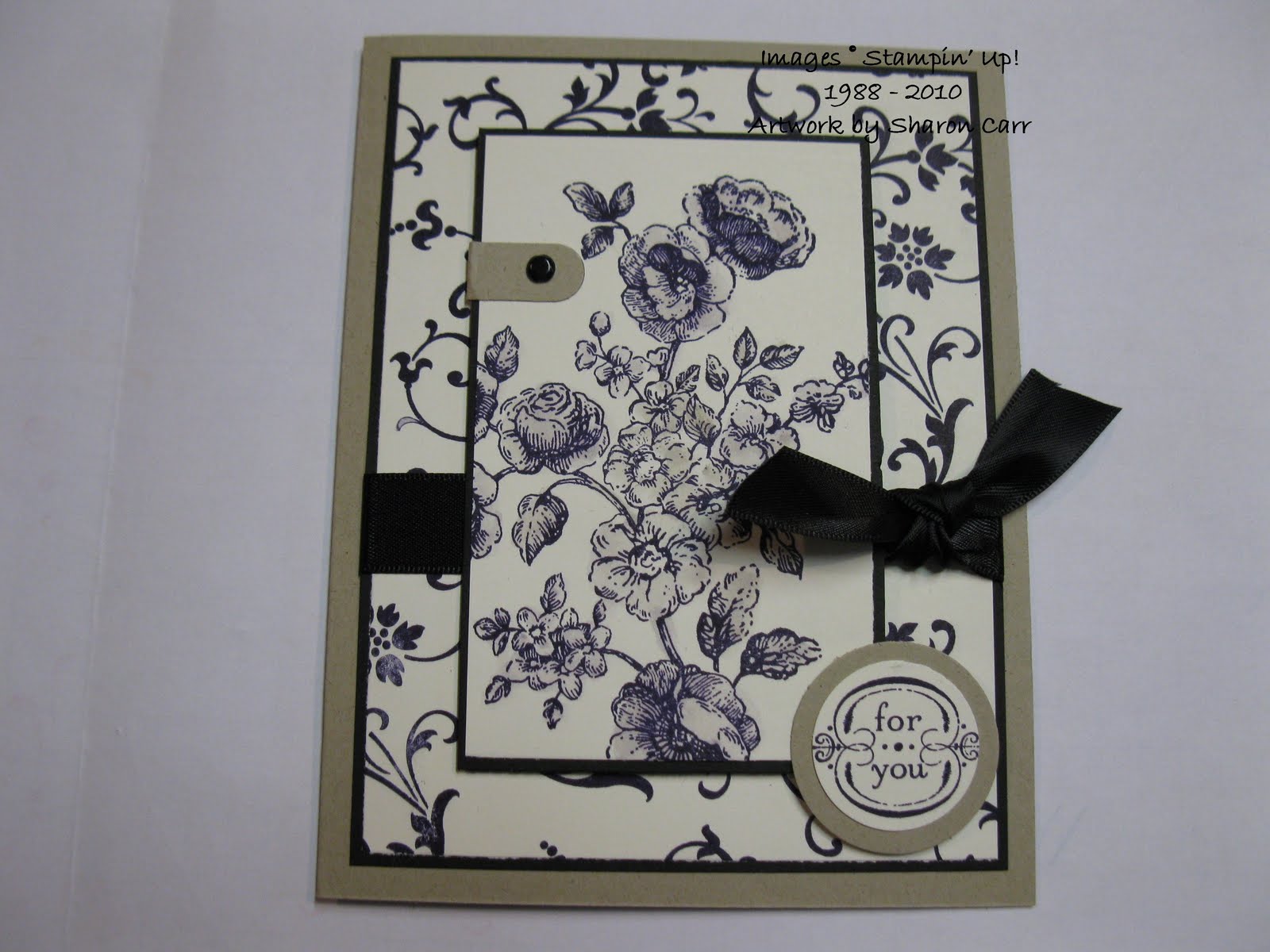
Back a few years, my daughter had a beautiful black and cream toile bedroom set. Along with that, she had painted her bedroom walls a lovely taupe color with black accents. She has superb taste in decorating, and it was gorgeous and very elegant. That look she acheived was the impetus for the card I'm sharing today. First I chose the new stamp set Elements of Style - what a vintage looking set! The artwork on it is just perfect for the look of toile.
I think she would like my interpretation of her bedroom. Instead of taupe, I used the Kraft cardstock for a neutral accent. Of course, I had to add skinny layers of black to mimic her skinny trim near the top of her walls. She loves crown moldings, but this time instead of something thick and substantial, she used skinny trim molding. It was a nice touch and not too heavy and dark at the top of the walls. That was the look I wanted to acheive here, and I think it came out great!
Stamps: Elements of Style
Cardstock: Kraft, Basic Black, Very Vanilla
Ink: Basic Black, Sahara Sand
Accessories: 1" and 1 1/4" Circle Punches, Word Window Punch, AquaPainter, Basic Black Satin Ribbon, Vintage Brads, and Dimensionals
Hope you like this idea today. It's fun to look around and find something to inspire a color combo or style of card. If you use this idea, share your version with me. I'd love to see it!
Yes, I'm off to see the grandbaby now. Today the schedule was first church, then lunch and blog, then play with grandbaby. Yup, I'm in heaven!! Have a great day and make sure you find time to do something you really love!!!
Sharon