Showing posts with label punches. Show all posts

Thursday, June 19, 2014

Work of Art #5 Birthday

Ok, last one of the series.  And I'm so tired right now that this post is going to be very short and sweet.  Let's get right to it.....

Stamps:  Work of Art, Gorgeous Grunge, and Endless Birthday Wishes
Ink:  Crushed Curry, Melon Mambo, and Bermuda Bay
Paper:  Whisper White, Melon Mambo, Crushed Curry, and Bermuda Bay
Accessories:   Big Shot with Starburst Framelits, Itty Bitty Accents Punch (star), 2 3/8" Scallop Punch, 1 3/4" Circle Punch, Rhinestones Basic Jewels, and Dimensionals
I kept the colors all bright and happy for this birthday celebration card.  The colors carry through on both the inks and cardstock pieces.  The stars punched from each of the colors add a festive touch.  And who doesn't like the touch of sparkle from the rhinestones on each star?

Have you seen this new birthday photopolymer stamp set yet?  Both the cake image and the sentiments are from the Endless Birthday Wishes set.  It's going to be one of those sets that gets used over and over again because of all the mix & match sentiments in it.  Love it!!!

The layering of the main image was finished off with the starburst in Crushed Curry. It just made the scalloped Melon Mambo layer stand out even more.

Don't you love the addition of the bits of speckles from the Gorgeous Grunge tying all the components together?  It reminded me of confetti at a party.  I had thought to add bits of the other two colors, but that seemed too much.  So this is it - 3 stamp sets and 3 colors to make the card.  Fun, fun, fun.  And that's it for me tonight.  I'm off to bed to get rewound and we start it all over again at 6am.  Ta ta...       Sharon

Sunday, June 15, 2014

You are a Work of Art

 If  you are looking for the most versatile set in the new Stampin' Up! catalog, check out Work of Art.  I think this stamp set will be my new go-to set for the next few months.  I've already made 5 totally different cards using this stamp set.  And I'll be sharing them with you for the next 5 days.  Sound like a good idea to you?  Hope so, 'cuz that's what I'll be doing.  So here's the first one. 

Stamps:  Work of Art
Ink:  Old Olive, Pumpkin Pie,
Paper:  Old Olive, Rich Razzleberry, Very Vanilla, and Pumpkin Pie
Accessories:   Elegant Butterfly and Bitty Butterfly Punches, 1 1/4" Scallop Circle Punch, Lg Corner Rounder(ret), Very Vintage Designer Buttons, Old Olive 1/8" Taffeta Ribbon, Brights Candy Dots, and Glue Dots
This card was so much fun to make!  The flower is made from a squiggle stamp that is stamped repeatedly.  Just keep one end of the stamp centered and stamp around in a circle.  How simple is that!  Depending which end of the stamp is in the center, you get a totally different looking flower.  With stamping the other end out, the flower has a very feathery look to it. 

The stamp set has several different sentiment to it, so I didn't need a separate sentiment set to make this card.  Easy peasy when it's all right there in the set for you!

The only really addition to the card were the different punches used.  I chose two of the card colors to make a layered butterfly for the corner where it looked a  little bare.  Butterflies are always a nice addition.  I also added a Razzleberry scallop of cardstock underneath the button accent to make it stand out more.  And that's about it.  Quick and simple, but fun with an artistic flair from the loosely stamped flower.

Thanks for sliding by to see what I've been stamping today.  I'll have another card for you tomorrow that uses the same set with totally different look to it.  Come on back and check it out.  See you soon,     Sharon              
ps - Happy Father's Day,  honey!

Friday, June 13, 2014

Almost Father's Day

Yes, the time keeps right on moving along whether I'm keeping up with it or not.  It's shocking to see that Father's Day is coming up this weekend already.  Where has the time gone?  Since it's time to consider all the wonderful things our dads and grandpas have done for us over the years, I thought it was appropriate to share a Father's Day card that I'll be giving to my hubby this year.

Stamps:  The Open Seas and Teeny Tiny Wishes
Ink:  Night of Navy and Cherry Cobbler
Paper:  Night of Navy, Cherry Cobbler, and Whisper White
Accessories:  Big Shot with Arrows TIEF, Word Window Punch, Cherry Cobbler Baker's Twine, and Dimensionals
 Yes, this stamp set has been around awhile, but it's still a go-to set when I need something masculine.  And what could be more masculine than a Father's Day card I ask you!?  The layout I chose to use is very basic with a good number of layers.  With using Night of Navy and Cherry Cobbler  colors, we ended up with a clean and crisp look to the card.  Just right for the stamp set I used.

The tiny Night of Navy layer under the sentiment was embossed with the Arrows TIEF to give just a little more interest and texture to the card.

And what would I ever do without the Teeny Tiny Wishes little sentiment?  Those little sentiments are just the perfect size to add on just about any card, and they cover just about any sentiment you might need.  Definitely a must-have stamp set.

Well, that's it for today.  Just wanted to say hi to my sister Connie for telling me to get back to my blogging.  Thanks for the push and if I fizzle out again (or is that 'when'), make sure you give me a nudge back into it again.  Alright?  Thanks for stopping by today.  I always appreciate hearing from you.   Happy weekend!          Sharon

Friday, May 23, 2014

Yellow and Gray CAS Card

I'm thinking that one of my new favorite color combos is that of Daffodil Delight and Smoky Slate or Basic Gray.  They are so clean and crisp together and can fit any kind of card.  The card layout I've used today is very versatile, but with these colors and the pretty embossing it's very feminine.

Stamps:  Yippee Skippee
Ink:  Basic Gray
Paper:  Smoky Slate, Whisper White, Daffodil Delight, and Basic Gray with Watercolor Wonder Designer Series Paper
Accessories:   Big Shot with Delicate Designs TIEF, Daffodil Delight Seam Binding, Bitty Butterfly and Elegant Butterfly Punches, Rhinestone Basic Jewels, and Glue Dots
I just love how pretty this card came out!  So feminine and sweet looking.  The Delicate Designs lace embossing along the top is such an elegant touch to this simple card, and really makes it special.

I had planned on using either Flower Shop or Petite Petals as the accent on the card.   But on further review, I decided the butterflies were a better fit with the overall card look. 

Changing up the sentiment could lend this card to many different uses.  If you have the components to make this, try it with other colors of cardstock and designer papers to get something altogether different.   Just a really nice and happy card style to have on hand.  Give it a try and let me know what you think.  Happy stamping,    Sharon

Thursday, May 22, 2014

Patriotic Stars for You

Again I have used a retired stamp set that I will miss a lot.  The Simply Stars stamp set was such a basic set to add stars to a project whenever needed.  Today's card is very patriotic with it's red, white, and blue theme.  It kind of shouts out - God bless America!

 Stamps:  Simply Stars, and Gifts of Kindness
Ink:    Night of Navy and Cherry Cobbler
Paper:  Very Vanilla, Night of Navy, and Cherry Cobbler
Accessories:  Big Shot with Stripes TIEF, Large and Small Star Punches(both retired), Word Window Punch, and Dimensionals
I used the Stripes embossing folder to go with a stars and stripes theme.  The colors of Night of Navy and Cherry Cobbler gave the card a slightly more vintage feel instead of a brighter red and blue.

Some of the stars are raised with Dimensionals, but not all of them.  I liked the differences of height to give it more interest.

With all the national holidays coming up, I thought it would be good to have a few of these on hand.  Hope you like this clean and simple idea.  Very quick to do when you're in a time crunch.  Thanks for stopping in again.  Have a great week!        Sharon

Wednesday, May 21, 2014

Happy Congratulations card

Today's card reminds me of outdoor parties in the summer with the pretty paper lanterns hanging from the fence and shining in the dark.  The set used is from the Occasions Catalog that will be retiring from Stampin' Up! on June 1st.  So there's a few more days left to get this happy stamp set that's waiting to help you get the celebration underway.


 Stamps:  Happy Congratulations
Ink:  Island Indigo, Calypso Coral, Pool Party, Strawberry Slush, Pistachio Pudding and Baked Brown Sugar, with Early Espresso marker
Paper:  Whisper White, Coastal Cabana, and Baked Brown Sugar
Accessories:  Big Shot with Woodgrain TIEF, 3/4" Circle Punch, Gold Baker's Twine, Paper Snips, and Dimensionals

Isn't this great?  It looks like the decorations are all ready for a luau.  The fence is made by making lines with a marker on a piece of Baked Brown Sugar cardstock, embossing it with the Woodgrain TIEF, then snipping each 'board' with a pointy top to look like a privacy fence.

The party lanterns are stamped with different colors of ink onto Whisper White cardstock then punched out with the 3/4" Circle Punch.  A length of Gold Baker's Twine was attached to the fence, then the lanterns were attached with a Dimensional under each.


The inside of the card was stamped to mimic the card front.  And the wording that is part of the set would work well for a graduate, Father's Day, or maybe even a retirement party.  This is one set that is a lot more versatile than you  think when you first see it.

Thanks for coming by to see what's going on here.  Hope you liked this idea and give it a try.  You can always change up the lanterns to fit any color scheme you might need.  Happy stamping,    Sharon


Tuesday, May 20, 2014

Rev Up

It's the last time to share a card using the "Rev Up The Fun" stamp set that is retired.  I'm so sorry to see it leave the line-up as it's a great card both for men and teens.  My 4 year old grandson likes it too.  He stamped up a few sheets of paper for his own race cars!  The card I have to share with you is from last week's class.  It was pretty much a class to say goodbye to colors and stamps that would no longer be available.   So here goes...

 Stamps:  Rev Up The Fun
Ink:  Real Red and Basic Gray pads, Real Red and Bermuda Bay markers
Paper: Real Red, Bermuda Bay, Basic Gray, and Whisper White, with I Am Me Designer Series Paper
Accessories:  Big Shot with Circle Collection Framelits, 2 1/2" Circle Punch, Neutrals and Brights Candy Dots, and Paper Snips
 I used the colors from the DSP to decide the card colors.  I loved all the arrows in the DSP to suggest movement on the card.  The tire tracks fit nicely on the punched white layer and the sentiment fit perfectly underneath them.  The Candy Dots were just added for fun.

Everyone seemed to like this card even though they had to cut out the card!  Yes, I know we're all getting spoiled by all the wonderful punches and framelits that do all the work for us!!  But sometimes you just need to get out those snips and do some fussy cutting to make the card perfect.

This card was made earlier in the month when we got together to make cards for the military.  I chose to use a combination of Whisper White,  Pacific Point, and Smoky Slate.  The Arrows Textured Impressions Embossing Folder was used to give the background some interest.  (Guess I really like arrows and Candy Dots with this stamp set, don't I ?)

Anyway, there you go for today's share - and it's a two-fer-one deal at that!  Hope you have this set already because it's totally sold out.  Bummer!   Thanks for stopping in today to see what's new.  (or old, I guess)  I have more coming up later in the week, so come on back again.        Happy stamping,   Sharon

Wednesday, April 16, 2014

Lovely Blue Floral

Hey, this makes 3 days in a row!!  Woo Hoo!  Are you sitting down, or did this knock you off your feet?  Don't expect this too often cuz it probably won't happen all that often.  But since you're here, let's get another card posted.  Ok?  Today's card features a blue and white theme with a touch of green added in.  These colors always have such a fresh feel and are very appealing.

Stamps:  Flower Shop and Express Yourself
Ink:  Island Indigo
Paper:  Whisper White, Garden Green, Island Indigo, and Pool Party cardstock with Gingham Garden Designer Series Paper
Accessories:   Big Shot with Beautifully Baroque TIEF, Little Leaves Sizzlit, Pansy Punch, Large Oval Punch, Scallop Oval Punch, Itty Bitty Shapes Punch Pack, Brights Candy Dot, AquaPainter,  2-Way Glue Pen and Dazzling Diamonds Glitter, and Dimensionals


Isn't this pretty and fresh looking for spring?  I really do love this color combo.  And in case you can't tell, I really, really love the Flower Shop stamp set and punch combo.  It makes it so easy to do a card like this.  Just stamp, punch, and layer up.  Can't get too much easier than that!

I wanted to keep the cards somewhat white, so I did a little watercoloring to soften the look.  Of course, the flower centers needed the glitter to finish them off and add some sparkle.

The sentiment looked a little plain compared to the rest, so I punch one bitty flower in Pool Party and added it.  Then added the Turquoise Candy Dot to accent it.  (It's fun to use similar colors on the card, instead of everything matching perfectly)  The embossing on the white background gives the card even more texture besides all the flowers and leaves. 

This is one of my most favorite cards lately.  Especially when you've got gray skies outside and the weatherman is warning of freezing temps and more snow!   Yuck!!  Remind me again when spring is getting here?!  Hope you're having a great day and thanks for stopping in to see what's new. 
Happy stamping - Sharon

Tuesday, April 15, 2014

Punchy Owl Birthday Card

Today's tax day - uuuugh!!!!  And to make matters even worse, we woke up with snow!!  Oh my!  We really need to do something fun to offset the snowy, tax grumpies I have.  So let's have a little fun focusing on a kid's card.  We haven't done one of those in awhile.   Since we're running into a bunch of birthdays around here for kids in the 2-5 age range, I've been doing a bit of brainstorming to come up with different ideas.  One of my class ladies asked me to come up with something using the Owl Builder Punch, so this was made with her in mind.

Stamps:  Woodgrain, Teeny Tiny Wishes
Ink:  Early Espresso, Wild Wasabi pads, and Basic Black marker
Paper:  Wild Wasabi, Soft Sky, Soft Suede, Baked Brown Sugar, Daffodil Delight, Real Red, Pacific Point, and Whisper White
Accessories:  Owl Builder Punch, 1  3/4"Scallop Circle Punch, 3/4" Circle Punch, Small Oval Punch, Word Window and Modern Label Punches, White Baker's Twine, sponges, and Dimensionals


 The tree was slightly shaped by cutting along one of the growth lines.  The outfit and heart were punched from a left-over piece of Brights DSP that was sitting around getting in the way.  It could be switched to use the back side to look more girlie.  

I cut and knotted the Baker's Twine and attached it to the wing with a glue dot.  The balloons were just attached over the ends of the twine with either glue dots or a Dimensional.

The eyes of the owl had the pupils colored in with Basic Black marker.  The added wing was punched with the 1 3/4" Scallop Circle Punch and trimmed to be a good size for this little owl.  I thought he looked cute peeking out from behind the tree. 

That's it for today's card.  Just a cute little card for a kid for you.  Some of the ladies were already talking about changing the colors to be more girlie for their other grandkids - you know, the little girls!  Thanks for stopping in today.  Hope you're having a great day and getting in a little stamping too.     Sharon

Monday, April 14, 2014

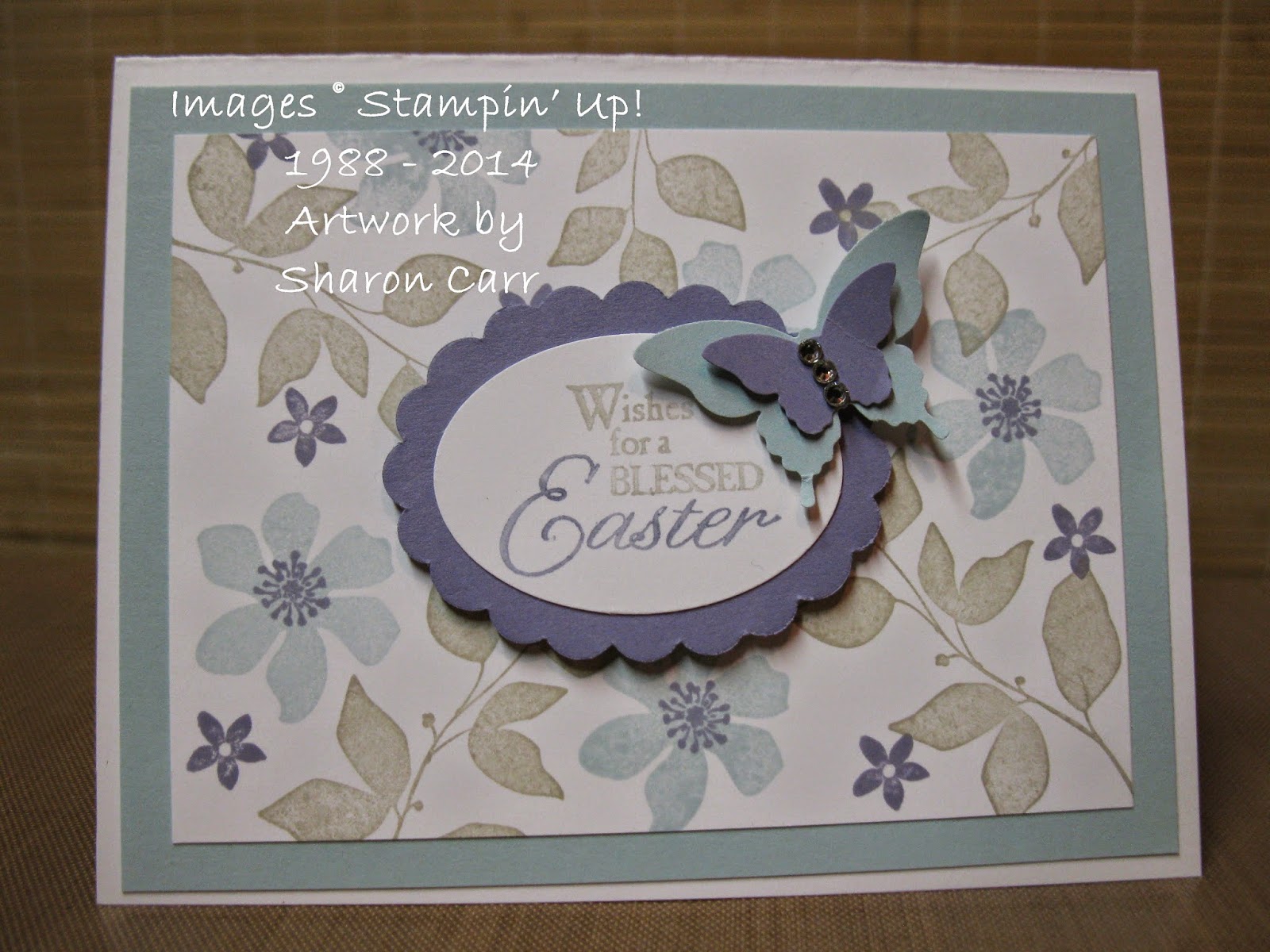
Easter Blessings Card

Have you ever had a week (or longer) that was crammed to the max with deadlines and you swore you couldn't fit another thing into your schedule?  But then there was something else that needed doing, and then another thing, and still another!!  That's the way it's been going for the last 14 days and I don't think I can hold out too much longer!  There are so many cards I wanted to share with you that I hardly know where to start.  Considering Easter is less than a week away, I guess we'll start with one of those cards today.  Here's a simple card that I think is truly beautiful.  Everyone in class just raved about it.  So if you've got the 'ingredients' to make it, you might want to sit right down and make one for someone you care about.

Stamps:  Blessed Easter, Summer Silhouettes
Ink:  Soft Sky, Wisteria Wonder, and Sahara Sand  pads, Sahara Sand and Wisteria Wonder markers
Paper:  Whisper White, Soft Sky, Wisteria Wonder
Accessories:  Elegant Butterfly and Bitty Butterfly Punches,  Extra Large Oval Punch, Scallop Oval (non-SU!) punch, Rhinestone Basic Jewels, and Dimensionals


The pictures really don't do justice to the card.  The colors are so soft and gentle-looking that it just makes you want to go ahhhhh.  Changing the background layer to the Wisteria Wonder gives it a much more substantial look, but I really liked the airy look obtained with the Soft Sky layer. 

Adding the two layers of butterfly in the same colors really makes it stand out. And of course, the rhinestones go with just about anything to give it a more elegant look.

Like I mentioned earlier, the ladies that made this in class last week were raving about the card, so it's really a winner in my book.  I even went ahead and made a few more to get these in the mail to family members.  I hope they like it as well.  Enjoy your week ahead.  Hope you find time to get everything done that you need done (without pulling out your hair in the process!!). Oops, I think I hear the little one.   Break time must be over, so it's back to taking care of the grandkids.  See you soon!       Sharon

Thursday, March 27, 2014

More from the Flower Shop

Yep, we're back at the flower shop again.  I really can't seem to leave this stamp set alone.  Again I've paired it with the Petite Petals stamp set and a few other goodies to round it out.  I keep hoping that spring really is right around the corner here.  No matter what the calendar says, when it's freezing or below outside and there's snowflakes fluttering around, it's not spring yet.  So here's my happy spring-colored version of these stamp sets in action.  Maybe it'll prod the weather outside to play nice and get warmer!

Stamps:  Flower Shop, Petite Flowers, and Delightful Dozen
Ink:  Primrose Petals, So Saffron, Blushing Bride
Paper:  Whisper White, Pistachio Pudding, Garden Green, Primrose Petals, and Raspberry Ripple
Accessories:   Big Shot with Hexagon TIEF, Circles Collection Framelits, Little Leaves Sizzlit,  Pansy Punch, Petite Petals Punch, Itty Bitty Shapes Punch Pack, Tea Lace Doilies, Glue Dots, and Dimensionals
 I really love adding the Tea Lace Doilies (or parts of them) to my cards lately.  They give such a delicate, old-fashioned look to a card with very little effort.  For this card, I just cut one of them in half and attached it to the Pistachio Pudding layer.  I thought about adding a ribbon at the cut edge, but really didn't like any that I had on hand, so I went without.  This look reminds me of a lace tablecloth hanging over the edge of the table and all you can see is the side of it.  So we'll just go with that idea!

After adding the stamped flowers and the die-cut leaf sprays, it still needed a little more contrast in the colors used.  After trying out several different ones, I tried the Raspberry Ripple Itty Bitty flowers and they were perfect.  Just enough contrast without overpowering all the more pastel flowers.  Don't you just love having so many colors to choose from that it's easy to come up with just the right one for any need?!

Ok, that's it for today.  Still hoping for spring around here.  I think I'd even be happy if the temperatures got up into the 40's!  So longing for some sunshine!!  Have a fabulous day.  If it's cold where you are, try bringing a little spring into your life by stamping!  It's sure to cure those winter blahs!  Sharon

Friday, March 14, 2014

Little Lamb for Easter

I ordered this cute little Easter set called Eggstra Spectacular, then couldn't figure out what to do with it.  All the stamps in the set are pretty small, so I couldn't make something splashy and bright with it.  So it sat for a couple weeks.  :(  sooo sad...  Then I got an inspiration when I was sleeping and had to get up to make it right away!  Now that it's finished, I'm just tickled pink with it.  It uses several new items in the Occasions Mini Catalog that were not intended for the purpose I planned for them.  But that's what makes creating really fun!  Have a look and let me know what you think...

Stamps:  Eggstra Spectacular
Ink:  Basic Gray, Smoky Slate, Island Indigo, Calypso Coral, So Saffron, and Pink Pirouette
Paper:  Soft Sky, Wild Wasabi, So Saffron, Whisper White, Calypso Coral cardstock with Sweet Sorbet and Watercolor Wonder Designer Series Papers
Accessories:  Big Shot with Word Bubbles Framelits, Starburst Framelits, Extra Large Oval Punch, Itty Bitty Shapes Punch Pack, Fringe Scissors, AquaPainter, Glue Dots, and Dimensionals
 Can you find all the items that were used?  The obvious first - the eggs were punched from cute pastel Designer prints with the Extra Large Oval Punch.  And it was just big enough to fit the little lamb and Easter basket stamp too!  The cloud was made from the puffy word bubble die.  I'm so happy I came across that idea.  Then the genius idea that woke me up in the morning was using the smallest Starburst Framelit die to make the sun peeking out behind the cloud.  It was just perfect in both size and shape!  Woo Hoo!!
 The new Fringe Scissors worked great to cut all those blades of grass and then I trimmed them at angles to make it more interesting.  The grass looked boring by itself, so it needed a few flowers growing added for spring.

There was very little stamping or coloring on this card.  The DSP prints and all the punched and die-cut pieces were all that were needed.  This card is going to be sent to my grandsons next month.  I think they'll like the little lamb for Easter! 

Thanks for stopping by to see what's new here.  It still looks like winter outside, but I'm trying to create my very own spring inside!  Enjoy!!
Sharon

Thursday, March 13, 2014

Sweet Sorbet Sweetie

I'm having so much fun using the Sweet Sorbet Designer Series Paper that is one of the free items you can get during Sale-A-Bration.  This is a wonderful set of prints to make cards and other paper projects because they're so sweet!  Yes, it's very aptly named and is one of my very, very favorite items in the Sale-A-Bration flyer!  Today I've used just a couple 1 1/4" strips on the front of the card as a softly printed background.  Here's the card for you...

Stamps:  Mixed Bunch and Petite Pairs
Ink:  Calypso Coral, Pool Party, and Basic Black
Paper:  Sahara Sand, Basic Black, Pistachio Pudding, and Whisper White cardstock, with Sweet Sorbet Designer Series Paper
Accessories:  Big Shot with Decorative Dots TIEF, Little Leaves Sizzlit, Blossom Punch, 1" Circle Punch, Corner Rounder Punch, Simply Pressed Clay and Buttons & Blossoms Clay Molds, Pool Party Seam Binding Ribbon, Glue Dots, and Dimensionals
Whew!  It didn't seem like I had used so many items until I started typing them all out.  Most of them were already out on my worktable and were handy, so why not make the most of what's lying around, right?

I chose the flower color to match the DSP and added the stamped and punched center to give it some pop.  The flower still looked too flat for me so I added a little clay button that I had made.  It was tinted with the Calypso Coral refill ink so it matches perfectly. 

I used the Decorative Dots embossing folder to continue the dotty theme in the flower and DSP prints.  I think the background layers almost always look better with some texture added.  The Pool Party ribbon was added to make it look even more feminine.  There's really a lot going on here, but it all coordinates nicely.

Thanks for stopping in today.  Hope you're staying warm and toasty...  Tell me, is spring ever going to get here???  I feel like it's been winter forever - or almost!
Happy stamping,             Sharon

Tuesday, February 25, 2014

Geometric Fun

When the Occasions Mini Catalog came out, I wasn't sure whether I liked the Geometrical stamp set or not.  Well, that's sure changed a lot! (grin)  Today I have two different styles of card using both sentiments and shapes from the set, but they look really different.  It's so much fun taking the same (or similar) stamps and create something really different by changing colors and adding different accessories.  This way, there's always something to like about a stamp set!!  Here's what I mean....

Stamps:  Geometrical
Ink:  Smoky Slate, Calypso Coral, Soft Sky, and Basic Gray
Paper:  Basic Gray, Calypso Coral, and Whisper White
Accessories: Big Shot with Arrows TIEF, Basic Gray Stitched Ribbon, and Triangle Punch
 I worked with darker colors here and kept it really basic so it could be a masculine card.  Love the arrows embossing for the background.  I find I'm using that very often because it fits so well on so many applications.

The triangle punch was a life saver for me on this card.  First attempt, I just tried stamping straight across.  How silly of me!  It worked out so much better (and easier too!!) by punching the triangles and just attaching them in a straight line.  Love, love, love it when SU! makes life simpler for me!  (grin)

Here's another style of card that used the same stamp set, but with different stamps used and totally changing the color.

Stamps:  Geometrical
Inks:  Bermuda Bay, Strawberry Slush, Crushed Curry, and Stazon Jet Black
Paper:  Whisper White
Accessories: Triangle Punch, Daffodil Delight Stitched Ribbon, and Brights Candy Dots

The color change is the biggest difference here I think.  This card is so bright and cheerful - it almost makes you feel happier just looking at it.  The dots were just stamped randomly with the sentiment stamped right over them.  The arrow was just a fun little addition. 

The ladies at my workshop last Saturday made this card for their make & take.  It was interesting to see all the different ways they attached their flags.  They also chose which sentiment from the set to use and which color Candy Dots they wanted.  This was an easy card to make the changes on and each one was cute as could be when they were finished.

Hope you enjoyed these ideas.  Thanks for stopping by to see what's new.  Sharon

Saturday, February 1, 2014

Happy Birthday Arrow Card

I shared a card made with the Good as Gold card as part of the card layering the other day.  I've been playing with the left over printed cardstock - you know it's too pretty not to use it!!  I love the cards I've been making with this and can't wait to share them with you.  Here's the 2nd of 3 cards made with 1 of the cards from the kit.  Hope you like it as much as I do!

Stamps:   Label Something, Remembering Your Birthday, Perfect Pennants, and Hello Lovely
Ink:  Bermuda Bay, Pistachio Pudding, and Basic Gray pads with Calypso Coral and Bermuda Bay markers
Paper:  Bermuda Bay, Basic Black, Whisper White with Good As Gold SAB Card Kit
Accessories:  Big Shot with Hearts A Flutter Framelits, Chevron Punch, Artisan Label Punch, Basic Black 1/8" Taffeta Ribbon, and Dimensionals

 Yes, I know - I used a ton of different products on this one card.  But they were pretty much all strewn across my worktable from other projects and I just kept adding little bits to the card.  Dropping any of the items just makes the card droop.  Like adding the Chevron Punch pieces to the front of the card just made it pop.  I had been trying different ideas, but when I added these - wow!!

One thing I learned with this card is that my Bermuda Bay ink pad is quite a bit lighter in color than the marker and cardstock.  That makes it frustrating to really get things to match.  Bummer.  Maybe I could get a refill and it might darken up.  At least that's my plan right now.

Ok, hope you liked this card.  I love it and I'm so happy with how it turned out.  There's just something about the print of the Good as Gold card that makes me want to keep creating with it.  The colors are so fresh and fun I can't help it!!  It makes me remember that we won't have snow and freezing temps forever.  Thank God!  It's been snowing heavily ever since I got up this morning and we've already got at least another 3" so far.  (I haven't been outside to measure, so it might be more)  Wonder when it's gonna let up?  Oh, well, might as well stay in and do a little more stamping!  Have a great Saturday.  Stay warm and cozy...        Sharon

Thursday, January 30, 2014

Tag Topper Card

I spent time last night hanging out with some friends on the internet.  First time for that experience, and it went pretty well.  At least until my internet provider kept losing a connection.  Oh well, sometimes technology is fabulous, and sometimes not so much.  Last night was a bit of both.  But it was absolutely fabulous to 'see'  some of my stamping friends that I haven't seen in two years.  We had a lot of sharing and fun together.  And that brings me to my card today.  One of my friends shared with us a Tag Topper card and gave us instructions on how to make one.  So I got busy and tried it before I forgot how she said to do it.  (It's tough getting old when the memory is shot!!)  I loved how different the card is and wanted to share with you right away.

Stamps:  Perfect Pennants
Ink:  Bermuda Bay, Pistachio Pudding, and Calypso Coral
Paper:  Coastal Cabana, Whisper White, and Sahara Sand with SAB Good as Gold Card Kit
Accessories:   Scallop Tag Topper Punch, Big Shot with Deco Labels Framelits, Whisper White 3/8" Taffeta Ribbon,  Sponge quarters, and Dimensionals
I wish you could see this in person.  The gold dots on the paper really don't show here at all, but are so pretty with this fresh color combo.  I figured I could make 3 cards using just one of the printed cards from the kit, so why not try it.

I didn't have any ribbon that I liked with the colors on the card, so I used an ink pad and sponge to color the white ribbon.  It's a pretty soft Calypso Coral color now.

I love the Perfect Pennants stamp set - quite versatile.  That little sentiment has been punched or die-cut using at least 3 different shapes on cards in the last week.  Wonder how many of those dies will actually fit this one stamp??  Did you notice the little striping of dots on the white layer inside the card?  It is also from the Perfect Pennants stamp set and is a perfect accent for this card with all the other dots going on.

Ok, my break from the grandkids is just about up.  I hear some rustling going on in the bed where the little one is napping.  Hope you enjoy this card.  I had fun making in and will definitely make more of this style soon.  Have a great day today.  Stay warm and have some fun!      Sharon


Wednesday, January 29, 2014

Flowers and More Flowers

Who says I don't need any more flower stamps?  Certainly not me!  Of course I needed to get the new Petite Petals flower stamp and the coordinating flower punch when the new Mini Catalog came out earlier this month!   Who doesn't love flowers especially when there's a punch to match so you don't have to cut out any accent flowers you want to use?!  That's almost a no-brainer for me!!  Last night my hostess club ladies made this card - well, at least the 2nd version of it.  After making the first card, I thought it needed a little more contrast, so came up with the 2nd version.  I'll share both with you so you can see the difference.

Stamps:  Flower Shop, Petite Petals, and Really Good Greetings
Ink:  Crisp Cantaloupe and Calypso Coral
Paper:  Whisper White and Crisp Cantaloupe
Accessories:  Pansy Punch, Petite Petals Punch, Calypso Coral Baker's Twine, Rhinestone Basic Jewels, and Dimensionals

This is the first version of the card I made.  I only used the Calypso Coral ink on the sentiment.  All the flowers were stamped with Crisp Cantaloupe ink.  Even with popping up the flowers, it still looked a little boring to me.  Soooo.....
On the second version, I added some of the flowers with Calypso Coral ink.  Right away there was more contrast and interest to the card.   It's interesting what the addition of just a little darker ink can do to a simple card.  This version is much more visually appealing.  I like making monochromatic cards using just one ink color, but this needed an added boost to suit me. 
Hope you like the card idea today.  With the freezing tempuratures and more snow predicted, I thought a little spring floral was a good idea.   Hope you're staying warm and getting some time to stamp.  Since Sale-A-Bration started yesterday, I hope you have time to check out the deals.  Remember for any $50 order, you can choose one of the Sale-A-Bration items for free!  And who doesn't love free?!  If you're having trouble ordering on-line, feel free to email me at sharoncarr50@mgail.com  I'd be happy to help you get your order placed so you can get your free goodies!  Have a happy day...   Sharon

Sunday, January 26, 2014

Versatile Strawberry Slush Card

Today's card is another one that has a springtime feel to me.  I love the Strawberry Slush color - it's just the right amount of warm pink.  It reminds me of popscicles (or a Strawberry Slushie) on a hot summer day.  If it wasn't so cold out today, I might even wish I had one!  Then add the Baked Brown Sugar into the mix and it's like a cookie to go along with the slushie for a snack.  hmmm, must be getting on supper time if I'm talking food here!  Ok, let's get this show on the road and see what we've got today...

Stamps:  Love You to the Moon, Hello Lovely, and Yippee-Skippee!
Ink:  Strawberry Slush and Baked Brown Sugar
Paper:  Whisper White and Baked Brown Sugar, with 2013-2015 Designer Series Paper Stack
Accessories:  Big Shot with Arrows TIEF, Chalk Talk Framelits, Dotted Scallop Ribbon Border Punch, Whisper White Taffeta Ribbon, and Dimensionals
I love the new Arrows embossing folder.  It's a good versatile background generally, and when you want to emphasize an arrow on the card, it's just perfect. Plus it's fun using new toys, I mean tools.  The arrow comes in handy to emphasize a special word or sentiment on your card.  In this case, I wanted to emphasize 'you'.

The dotted ribbon punch coordinated nicely with the dotted DSP to tie those in together.  And I liked the Taffeta Ribbon kind of tying the whole card together.


Here's another version of the card using the sentiment from  the Yippee-Skippee! stamp set to make a Valentine card.  I've also done a version using the 'make a wish' stamp from the Perfect Pennants stamp set and another using the little cake stand from the Best of Birthdays stamp set.  It's fun seeing what different stamps will fit into the Chalk Talk Framelits die to easily change the card to fit what you're looking for.

Ok, I need to get started on supper.  It's that time of day and for some reason I always like to eat meals.  Hope you've had a blessed and relaxing Sunday.  I'm hoping to do a little more stamping this evening so I've got more ideas to share with you.  Happy stamping, Sharon

Saturday, January 25, 2014

Busy Bee Card

Ok, before I get going on this card posting, I have to put in a disclaimer.  I saw a card that used the Bug Me stamp set and thought it was the cutest idea I'd seen in a long time.  I knew I had the set so I got all the cardstocks assembled and cut, started out stamping, then went to find my bug set.  Oh my!  Talk about frustrating!  I figured out I've actually had the set on my order several different times and then kept taking it off when I needed something else more.  (you know how you really can't afford everything you'd like to buy!!)  I'd done this so many times now, that I really did think that I already owned it.  How funny was that?!  So I rummaged around and struggled to find another bee stamp that would fit the card and went back to stamping.  Ok, now that the stage is set, here's the card......

Stamps:  Six-Sided Sampler, and random retired bee
Ink:  Stazon Jet Black pad, Basic Black and Daffodil Delight markers
Paper:  Whisper White and Basic Black, with Brights Designer Series Paper Stack
Accessories:  Hexagon Punch, 2 Way Glue Pen, Dazzling Diamonds Glitter


This card is so bright and happy-looking that I thought it would be perfect for the kind of January we've been having this year with record cold temperatures and lots of snow.  Doesn't it make you feel the sunshine even though it's 6 degrees outside right now??  It was easy to punch the honeycomb-looking hexagons to go with the bees.  What I need to figure out is how to tell exactly where the bottom 2 punches are so I can easily line up the one punched down from the top.  Maybe I need to invest in the Hexagon Hive Thinlits Die in the Occasions Catalog and see how that would work with this card idea.  That'll be on my next order.  (or maybe the one after that - giggle)

The coloring on this was so simple - just use the Daffodil Delight marker to color in the bee's bodies, then dot in the 'flight line' for each of the bees with the Basic Black marker.  The finishing touch is adding the Dazzling Diamonds on the bee's wings to make them shimmer in the sunlight. 

There you have it - a super quick, 10 minute card.   That's all for today.  One more class card left to share with you.  Hopefully that one will get posted on Sunday.  That's the plan anyway.  We'll see how that works out!  Hope you're enjoying your weekend,   Sharon

Friday, January 24, 2014

Watercolor Tag Card

Here's the next card the ladies made in January's class.  I know I saw several cards that were similar in the last couple weeks on Pinterest.  I was doing some surfing when I was down and out sick and wasn't really paying attention.  Just filing the colors, layout, or whatever caught my eye, and just let it all percolate til needed.  So anyway, here goes....

Stamps:  Happy Watercolor
Ink:  Crisp Cantaloupe, VersaMark
Paper:  Very Vanilla, Gold Foil
Accessories:   Heat Tool, Gold Embossing Powder, Scalloped Tag Topper Punch, Gold Baker's Twine, Watercolor Wonder Washi Tape, Bitty Butterfly Punch, Sponge Dauber, and Dimensionals 
 
This card epitomizes feminine to me on so many different levels.  Starting with the colors - love, love, love that Crisp Cantaloupe, Vanilla, and all that gold together.  Oh, yummy!!  And any card with all those different types of gold is going to look really rich and over the top.  I got to use the Gold Foil paper, gold embossing powder, and the 3 new gold Watercolor Wonder Washi Tape prints.  Don't you just love them??  They add so much soft elegance to the card.

Next, let's talk about the stamp set - isn't it great?  I love having the sentiments added to the set so you don't have to look for another set to work with it.  And the ...happy... sentiment can be used for so many different types of cards.   The 2 flower choices in the set are both pretty line art that can be stamped plain as I did here, or can be watercolored very easily.  I know this is a set I'll be reaching for very often!

Lastly, the tag and butterfly punches make it easy to add embellishments to this card.  Have you seen the new Tag Topper punches?  They're great and you can make your tag any length you need to fit whatever you're making.  Now, that's handy.  Then I punched out 2 butterflies to embellish the card from the center of the gold foil layer.  Since you can't see where I punched them out, you'd never know if I didn't tell you.  All that lovely paper is just wasted behind the next layer, so why not make use of it?

Ok, that's it for this card today.  I'm going to get a head start on tomorrow's post by doing it now and schedule the post for tomorrow.  So make sure you check back soon!  Thanks for stopping by - Sharon