Every year I try to make at least one fall card with multiple leaves swirling around just like they are outside my window. This year is no exception, and this is one of the cards I've made. We got some pumpkins from the pumpkin patch and they looked so nice on the front porch. Then came the attack of the hungry squirrels! Oh my, what a mess! Maybe I should make a card that's half eaten like the real pumpkins on my porch - NOT.
Stamps: Fall Fest, Good Greetings
Ink: Mossy Meadow, Pumpkin Pie, Cajun Craze
Paper: Crumb Cake, Soft Suede, Pumpkin Pie, Whisper White with Color Me Autumn DSP
Accessories: Big Shot with Fun Fall Framelits, Decorative Dots TIEF, Extra Large Oval Punch, Mossy Meadow Stitched Ribbon, Sponge quarter, and Dimensionals
This is an easy card to make because of the stamp set and Framelits that coordinate so you don't have to hand-cut all the fun leaves. That makes it so easy to have those leaves swirling about in the wind.
For this card I punched three ovals, embossed them, sponged them, then made them into a pumpkin. Just love these types of pumpkins! So fun and simple. The stem on this pumpkin isn't a bit of cardstock like I normally would use. Instead it's a short length of ribbon knotted and tucked under the pumpkin. Easy peasy with a little added interest.
The sentiment is from the Good Greetings set that Hostesses can earn free with a $300 party. This is above and beyond the regular benefits. But there's a catch - the offer is good only until the end of October. Let me know if I can help you plan a quick party, even a book party, so you can take advantage of this offer!
Thanks for stopping by today. Hope you liked this clean and simple card idea. Sharon
Showing posts with label TIEF. Show all posts
Tuesday, October 14, 2014
Monday, September 29, 2014
White Christmas
Ok, here we are with a Christmas card idea. I loved the White Christmas stamp set as soon as I laid eyes on it. Of course it didn't hurt that I loved each of the ideas shared with this set in the Holiday Catalog either! So I went with those same soft colors from the Catalog and made my first card with this set. Here's what I came up with. What do you think??
Stamps: White Christmas and Good Greetings
Ink: Stazon Jet Black, Soft Suede, Real Red, Pool Party, and Sahara Sand
Paper: Whisper White and Pool Party
Accessories: Big Shot with Lucky Stars TIEF, AquaPainter, Glue Dots, Frosted Sequins, and Dimensionals
This turned out to be a soft and serene winter scene. The color washed into the background is so delicate. I kept the color softer on the trees and bird too. All the sequins are attached with Glue Dots. That seems to be the easiest way to attach them.
This set is so easy to use because it's made from photopolymer. That way you can easily see where you're placing different items, like the bird and bear. So simple - wish we'd had photopolymer to work with years and years ago!! Hope you give this set a try - it's fabulous!!
Thanks for stopping by again. I want to wish you all a fantastic fall! Sharon
Stamps: White Christmas and Good Greetings
Ink: Stazon Jet Black, Soft Suede, Real Red, Pool Party, and Sahara Sand
Paper: Whisper White and Pool Party
Accessories: Big Shot with Lucky Stars TIEF, AquaPainter, Glue Dots, Frosted Sequins, and Dimensionals
This turned out to be a soft and serene winter scene. The color washed into the background is so delicate. I kept the color softer on the trees and bird too. All the sequins are attached with Glue Dots. That seems to be the easiest way to attach them.
This set is so easy to use because it's made from photopolymer. That way you can easily see where you're placing different items, like the bird and bear. So simple - wish we'd had photopolymer to work with years and years ago!! Hope you give this set a try - it's fabulous!!
Thanks for stopping by again. I want to wish you all a fantastic fall! Sharon
Labels:
Big Shot,
Christmas,
Stampin'Up!,
TIEF,
Winter
Friday, June 13, 2014
Almost Father's Day
Yes, the time keeps right on moving along whether I'm keeping up with it or not. It's shocking to see that Father's Day is coming up this weekend already. Where has the time gone? Since it's time to consider all the wonderful things our dads and grandpas have done for us over the years, I thought it was appropriate to share a Father's Day card that I'll be giving to my hubby this year.
Stamps: The Open Seas and Teeny Tiny Wishes
Ink: Night of Navy and Cherry Cobbler
Paper: Night of Navy, Cherry Cobbler, and Whisper White
Accessories: Big Shot with Arrows TIEF, Word Window Punch, Cherry Cobbler Baker's Twine, and Dimensionals
Yes, this stamp set has been around awhile, but it's still a go-to set when I need something masculine. And what could be more masculine than a Father's Day card I ask you!? The layout I chose to use is very basic with a good number of layers. With using Night of Navy and Cherry Cobbler colors, we ended up with a clean and crisp look to the card. Just right for the stamp set I used.
The tiny Night of Navy layer under the sentiment was embossed with the Arrows TIEF to give just a little more interest and texture to the card.
And what would I ever do without the Teeny Tiny Wishes little sentiment? Those little sentiments are just the perfect size to add on just about any card, and they cover just about any sentiment you might need. Definitely a must-have stamp set.
Well, that's it for today. Just wanted to say hi to my sister Connie for telling me to get back to my blogging. Thanks for the push and if I fizzle out again (or is that 'when'), make sure you give me a nudge back into it again. Alright? Thanks for stopping by today. I always appreciate hearing from you. Happy weekend! Sharon
Stamps: The Open Seas and Teeny Tiny Wishes
Ink: Night of Navy and Cherry Cobbler
Paper: Night of Navy, Cherry Cobbler, and Whisper White
Accessories: Big Shot with Arrows TIEF, Word Window Punch, Cherry Cobbler Baker's Twine, and Dimensionals
Yes, this stamp set has been around awhile, but it's still a go-to set when I need something masculine. And what could be more masculine than a Father's Day card I ask you!? The layout I chose to use is very basic with a good number of layers. With using Night of Navy and Cherry Cobbler colors, we ended up with a clean and crisp look to the card. Just right for the stamp set I used.
The tiny Night of Navy layer under the sentiment was embossed with the Arrows TIEF to give just a little more interest and texture to the card.
And what would I ever do without the Teeny Tiny Wishes little sentiment? Those little sentiments are just the perfect size to add on just about any card, and they cover just about any sentiment you might need. Definitely a must-have stamp set.
Well, that's it for today. Just wanted to say hi to my sister Connie for telling me to get back to my blogging. Thanks for the push and if I fizzle out again (or is that 'when'), make sure you give me a nudge back into it again. Alright? Thanks for stopping by today. I always appreciate hearing from you. Happy weekend! Sharon
Friday, May 23, 2014
Yellow and Gray CAS Card
I'm thinking that one of my new favorite color combos is that of Daffodil Delight and Smoky Slate or Basic Gray. They are so clean and crisp together and can fit any kind of card. The card layout I've used today is very versatile, but with these colors and the pretty embossing it's very feminine.
Stamps: Yippee Skippee
Ink: Basic Gray
Paper: Smoky Slate, Whisper White, Daffodil Delight, and Basic Gray with Watercolor Wonder Designer Series Paper
Accessories: Big Shot with Delicate Designs TIEF, Daffodil Delight Seam Binding, Bitty Butterfly and Elegant Butterfly Punches, Rhinestone Basic Jewels, and Glue Dots
I just love how pretty this card came out! So feminine and sweet looking. The Delicate Designs lace embossing along the top is such an elegant touch to this simple card, and really makes it special.
I had planned on using either Flower Shop or Petite Petals as the accent on the card. But on further review, I decided the butterflies were a better fit with the overall card look.
Changing up the sentiment could lend this card to many different uses. If you have the components to make this, try it with other colors of cardstock and designer papers to get something altogether different. Just a really nice and happy card style to have on hand. Give it a try and let me know what you think. Happy stamping, Sharon
Stamps: Yippee Skippee
Ink: Basic Gray
Paper: Smoky Slate, Whisper White, Daffodil Delight, and Basic Gray with Watercolor Wonder Designer Series Paper
Accessories: Big Shot with Delicate Designs TIEF, Daffodil Delight Seam Binding, Bitty Butterfly and Elegant Butterfly Punches, Rhinestone Basic Jewels, and Glue Dots
I just love how pretty this card came out! So feminine and sweet looking. The Delicate Designs lace embossing along the top is such an elegant touch to this simple card, and really makes it special.
I had planned on using either Flower Shop or Petite Petals as the accent on the card. But on further review, I decided the butterflies were a better fit with the overall card look.
Changing up the sentiment could lend this card to many different uses. If you have the components to make this, try it with other colors of cardstock and designer papers to get something altogether different. Just a really nice and happy card style to have on hand. Give it a try and let me know what you think. Happy stamping, Sharon
Thursday, May 22, 2014
Patriotic Stars for You
Again I have used a retired stamp set that I will miss a lot. The Simply Stars stamp set was such a basic set to add stars to a project whenever needed. Today's card is very patriotic with it's red, white, and blue theme. It kind of shouts out - God bless America!
Stamps: Simply Stars, and Gifts of Kindness
Ink: Night of Navy and Cherry Cobbler
Paper: Very Vanilla, Night of Navy, and Cherry Cobbler
Accessories: Big Shot with Stripes TIEF, Large and Small Star Punches(both retired), Word Window Punch, and Dimensionals
I used the Stripes embossing folder to go with a stars and stripes theme. The colors of Night of Navy and Cherry Cobbler gave the card a slightly more vintage feel instead of a brighter red and blue.
Some of the stars are raised with Dimensionals, but not all of them. I liked the differences of height to give it more interest.
With all the national holidays coming up, I thought it would be good to have a few of these on hand. Hope you like this clean and simple idea. Very quick to do when you're in a time crunch. Thanks for stopping in again. Have a great week! Sharon
Stamps: Simply Stars, and Gifts of Kindness
Ink: Night of Navy and Cherry Cobbler
Paper: Very Vanilla, Night of Navy, and Cherry Cobbler
Accessories: Big Shot with Stripes TIEF, Large and Small Star Punches(both retired), Word Window Punch, and Dimensionals
I used the Stripes embossing folder to go with a stars and stripes theme. The colors of Night of Navy and Cherry Cobbler gave the card a slightly more vintage feel instead of a brighter red and blue.
Some of the stars are raised with Dimensionals, but not all of them. I liked the differences of height to give it more interest.
With all the national holidays coming up, I thought it would be good to have a few of these on hand. Hope you like this clean and simple idea. Very quick to do when you're in a time crunch. Thanks for stopping in again. Have a great week! Sharon
Wednesday, May 21, 2014
Happy Congratulations card
Today's card reminds me of outdoor parties in the summer with the pretty paper lanterns hanging from the fence and shining in the dark. The set used is from the Occasions Catalog that will be retiring from Stampin' Up! on June 1st. So there's a few more days left to get this happy stamp set that's waiting to help you get the celebration underway.
Stamps: Happy Congratulations
Ink: Island Indigo, Calypso Coral, Pool Party, Strawberry Slush, Pistachio Pudding and Baked Brown Sugar, with Early Espresso marker
Paper: Whisper White, Coastal Cabana, and Baked Brown Sugar
Accessories: Big Shot with Woodgrain TIEF, 3/4" Circle Punch, Gold Baker's Twine, Paper Snips, and Dimensionals
Isn't this great? It looks like the decorations are all ready for a luau. The fence is made by making lines with a marker on a piece of Baked Brown Sugar cardstock, embossing it with the Woodgrain TIEF, then snipping each 'board' with a pointy top to look like a privacy fence.
The party lanterns are stamped with different colors of ink onto Whisper White cardstock then punched out with the 3/4" Circle Punch. A length of Gold Baker's Twine was attached to the fence, then the lanterns were attached with a Dimensional under each.
The inside of the card was stamped to mimic the card front. And the
wording that is part of the set would work well for a graduate, Father's
Day, or maybe even a retirement party. This is one set that is a lot more
versatile than you think when you first see it.
Thanks for coming by to see what's going on here. Hope you liked this
idea and give it a try. You can always change up the lanterns to fit any
color scheme you might need. Happy stamping, Sharon
Stamps: Happy Congratulations
Ink: Island Indigo, Calypso Coral, Pool Party, Strawberry Slush, Pistachio Pudding and Baked Brown Sugar, with Early Espresso marker
Paper: Whisper White, Coastal Cabana, and Baked Brown Sugar
Accessories: Big Shot with Woodgrain TIEF, 3/4" Circle Punch, Gold Baker's Twine, Paper Snips, and Dimensionals
Isn't this great? It looks like the decorations are all ready for a luau. The fence is made by making lines with a marker on a piece of Baked Brown Sugar cardstock, embossing it with the Woodgrain TIEF, then snipping each 'board' with a pointy top to look like a privacy fence.
The party lanterns are stamped with different colors of ink onto Whisper White cardstock then punched out with the 3/4" Circle Punch. A length of Gold Baker's Twine was attached to the fence, then the lanterns were attached with a Dimensional under each.
Monday, May 12, 2014
Daughter's Mothers Day Card
Hope you enjoyed your Mother's Day yesterday. My daughter and I decided that we'd postpone our celebration for a couple of weeks as the entire weekend was spent getting started on this huge playscape they are building in our backyard. I'll try to get some pics to show you the project! The neighbors have all been by to comment on it and wonder when we're moving into our new house! Did I mention that it's huge!? Anyway, we'll get to our special dinner in the future, but we did exchange cards, so I can share with you the card I made for her.
Stamps: Wildflower Meadow, and non-SU! sentiment
Ink: Calypso Coral
Paper: Calypso Coral, Basic Black, and Naturals White
Accessories: Big Shot and Wildflower Meadow Embossing Folder, Sponge Dauber, Dimensionals, and retired fabric brad from previous catalog
I haven't shared anything using this coordinating stamp and embossing folder yet. But that doesn't mean I don't like them, or use them! In fact I made some cards for the military using the combo just recently. Since the stamp is so large, it's easy to make a bundle of cards very quickly and easily. Just stamp the full image, line it up in the embossing folder, and voila! It looks fabulous! The skinny layered black is a great accent to give the card a little contrast from all the Calypso Coral.
I didn't have a Mother's Day stamp that I liked for this card, so I borrowed one from a friend that fit perfectly. And the little fabric brad was just the right finishing touch for the card. It was fancier than a button, so it even dressed up the card a little bit more.
Thanks for stopping in to see what's new. Hope to have more to share tomorrow. Sharon
Stamps: Wildflower Meadow, and non-SU! sentiment
Ink: Calypso Coral
Paper: Calypso Coral, Basic Black, and Naturals White
Accessories: Big Shot and Wildflower Meadow Embossing Folder, Sponge Dauber, Dimensionals, and retired fabric brad from previous catalog
I haven't shared anything using this coordinating stamp and embossing folder yet. But that doesn't mean I don't like them, or use them! In fact I made some cards for the military using the combo just recently. Since the stamp is so large, it's easy to make a bundle of cards very quickly and easily. Just stamp the full image, line it up in the embossing folder, and voila! It looks fabulous! The skinny layered black is a great accent to give the card a little contrast from all the Calypso Coral.
I didn't have a Mother's Day stamp that I liked for this card, so I borrowed one from a friend that fit perfectly. And the little fabric brad was just the right finishing touch for the card. It was fancier than a button, so it even dressed up the card a little bit more.
Thanks for stopping in to see what's new. Hope to have more to share tomorrow. Sharon
Wednesday, April 16, 2014
Lovely Blue Floral
Hey, this makes 3 days in a row!! Woo Hoo! Are you sitting down, or did this knock you off your feet? Don't expect this too often cuz it probably won't happen all that often. But since you're here, let's get another card posted. Ok? Today's card features a blue and white theme with a touch of green added in. These colors always have such a fresh feel and are very appealing.
Stamps: Flower Shop and Express Yourself
Ink: Island Indigo
Paper: Whisper White, Garden Green, Island Indigo, and Pool Party cardstock with Gingham Garden Designer Series Paper
Accessories: Big Shot with Beautifully Baroque TIEF, Little Leaves Sizzlit, Pansy Punch, Large Oval Punch, Scallop Oval Punch, Itty Bitty Shapes Punch Pack, Brights Candy Dot, AquaPainter, 2-Way Glue Pen and Dazzling Diamonds Glitter, and Dimensionals
Isn't this pretty and fresh looking for spring? I really do love this color combo. And in case you can't tell, I really, really love the Flower Shop stamp set and punch combo. It makes it so easy to do a card like this. Just stamp, punch, and layer up. Can't get too much easier than that!
I wanted to keep the cards somewhat white, so I did a little watercoloring to soften the look. Of course, the flower centers needed the glitter to finish them off and add some sparkle.
The sentiment looked a little plain compared to the rest, so I punch one bitty flower in Pool Party and added it. Then added the Turquoise Candy Dot to accent it. (It's fun to use similar colors on the card, instead of everything matching perfectly) The embossing on the white background gives the card even more texture besides all the flowers and leaves.
This is one of my most favorite cards lately. Especially when you've got gray skies outside and the weatherman is warning of freezing temps and more snow! Yuck!! Remind me again when spring is getting here?! Hope you're having a great day and thanks for stopping in to see what's new.
Happy stamping - Sharon
Stamps: Flower Shop and Express Yourself
Ink: Island Indigo
Paper: Whisper White, Garden Green, Island Indigo, and Pool Party cardstock with Gingham Garden Designer Series Paper
Accessories: Big Shot with Beautifully Baroque TIEF, Little Leaves Sizzlit, Pansy Punch, Large Oval Punch, Scallop Oval Punch, Itty Bitty Shapes Punch Pack, Brights Candy Dot, AquaPainter, 2-Way Glue Pen and Dazzling Diamonds Glitter, and Dimensionals
Isn't this pretty and fresh looking for spring? I really do love this color combo. And in case you can't tell, I really, really love the Flower Shop stamp set and punch combo. It makes it so easy to do a card like this. Just stamp, punch, and layer up. Can't get too much easier than that!
I wanted to keep the cards somewhat white, so I did a little watercoloring to soften the look. Of course, the flower centers needed the glitter to finish them off and add some sparkle.
The sentiment looked a little plain compared to the rest, so I punch one bitty flower in Pool Party and added it. Then added the Turquoise Candy Dot to accent it. (It's fun to use similar colors on the card, instead of everything matching perfectly) The embossing on the white background gives the card even more texture besides all the flowers and leaves.
This is one of my most favorite cards lately. Especially when you've got gray skies outside and the weatherman is warning of freezing temps and more snow! Yuck!! Remind me again when spring is getting here?! Hope you're having a great day and thanks for stopping in to see what's new.
Happy stamping - Sharon
Thursday, March 27, 2014
More from the Flower Shop
Yep, we're back at the flower shop again. I really can't seem to leave this stamp set alone. Again I've paired it with the Petite Petals stamp set and a few other goodies to round it out. I keep hoping that spring really is right around the corner here. No matter what the calendar says, when it's freezing or below outside and there's snowflakes fluttering around, it's not spring yet. So here's my happy spring-colored version of these stamp sets in action. Maybe it'll prod the weather outside to play nice and get warmer!
Stamps: Flower Shop, Petite Flowers, and Delightful Dozen
Ink: Primrose Petals, So Saffron, Blushing Bride
Paper: Whisper White, Pistachio Pudding, Garden Green, Primrose Petals, and Raspberry Ripple
Accessories: Big Shot with Hexagon TIEF, Circles Collection Framelits, Little Leaves Sizzlit, Pansy Punch, Petite Petals Punch, Itty Bitty Shapes Punch Pack, Tea Lace Doilies, Glue Dots, and Dimensionals
I really love adding the Tea Lace Doilies (or parts of them) to my cards lately. They give such a delicate, old-fashioned look to a card with very little effort. For this card, I just cut one of them in half and attached it to the Pistachio Pudding layer. I thought about adding a ribbon at the cut edge, but really didn't like any that I had on hand, so I went without. This look reminds me of a lace tablecloth hanging over the edge of the table and all you can see is the side of it. So we'll just go with that idea!
After adding the stamped flowers and the die-cut leaf sprays, it still needed a little more contrast in the colors used. After trying out several different ones, I tried the Raspberry Ripple Itty Bitty flowers and they were perfect. Just enough contrast without overpowering all the more pastel flowers. Don't you just love having so many colors to choose from that it's easy to come up with just the right one for any need?!
Ok, that's it for today. Still hoping for spring around here. I think I'd even be happy if the temperatures got up into the 40's! So longing for some sunshine!! Have a fabulous day. If it's cold where you are, try bringing a little spring into your life by stamping! It's sure to cure those winter blahs! Sharon
Stamps: Flower Shop, Petite Flowers, and Delightful Dozen
Ink: Primrose Petals, So Saffron, Blushing Bride
Paper: Whisper White, Pistachio Pudding, Garden Green, Primrose Petals, and Raspberry Ripple
Accessories: Big Shot with Hexagon TIEF, Circles Collection Framelits, Little Leaves Sizzlit, Pansy Punch, Petite Petals Punch, Itty Bitty Shapes Punch Pack, Tea Lace Doilies, Glue Dots, and Dimensionals
I really love adding the Tea Lace Doilies (or parts of them) to my cards lately. They give such a delicate, old-fashioned look to a card with very little effort. For this card, I just cut one of them in half and attached it to the Pistachio Pudding layer. I thought about adding a ribbon at the cut edge, but really didn't like any that I had on hand, so I went without. This look reminds me of a lace tablecloth hanging over the edge of the table and all you can see is the side of it. So we'll just go with that idea!
After adding the stamped flowers and the die-cut leaf sprays, it still needed a little more contrast in the colors used. After trying out several different ones, I tried the Raspberry Ripple Itty Bitty flowers and they were perfect. Just enough contrast without overpowering all the more pastel flowers. Don't you just love having so many colors to choose from that it's easy to come up with just the right one for any need?!
Ok, that's it for today. Still hoping for spring around here. I think I'd even be happy if the temperatures got up into the 40's! So longing for some sunshine!! Have a fabulous day. If it's cold where you are, try bringing a little spring into your life by stamping! It's sure to cure those winter blahs! Sharon
Tuesday, February 25, 2014
Geometric Fun
When the Occasions Mini Catalog came out, I wasn't sure whether I liked the Geometrical stamp set or not. Well, that's sure changed a lot! (grin) Today I have two different styles of card using both sentiments and shapes from the set, but they look really different. It's so much fun taking the same (or similar) stamps and create something really different by changing colors and adding different accessories. This way, there's always something to like about a stamp set!! Here's what I mean....
Stamps: Geometrical
Ink: Smoky Slate, Calypso Coral, Soft Sky, and Basic Gray
Paper: Basic Gray, Calypso Coral, and Whisper White
Accessories: Big Shot with Arrows TIEF, Basic Gray Stitched Ribbon, and Triangle Punch
I worked with darker colors here and kept it really basic so it could be a masculine card. Love the arrows embossing for the background. I find I'm using that very often because it fits so well on so many applications.
The triangle punch was a life saver for me on this card. First attempt, I just tried stamping straight across. How silly of me! It worked out so much better (and easier too!!) by punching the triangles and just attaching them in a straight line. Love, love, love it when SU! makes life simpler for me! (grin)
Here's another style of card that used the same stamp set, but with different stamps used and totally changing the color.
Stamps: Geometrical
Inks: Bermuda Bay, Strawberry Slush, Crushed Curry, and Stazon Jet Black
Paper: Whisper White
Accessories: Triangle Punch, Daffodil Delight Stitched Ribbon, and Brights Candy Dots
The color change is the biggest difference here I think. This card is so bright and cheerful - it almost makes you feel happier just looking at it. The dots were just stamped randomly with the sentiment stamped right over them. The arrow was just a fun little addition.
The ladies at my workshop last Saturday made this card for their make & take. It was interesting to see all the different ways they attached their flags. They also chose which sentiment from the set to use and which color Candy Dots they wanted. This was an easy card to make the changes on and each one was cute as could be when they were finished.
Hope you enjoyed these ideas. Thanks for stopping by to see what's new. Sharon
Stamps: Geometrical
Ink: Smoky Slate, Calypso Coral, Soft Sky, and Basic Gray
Paper: Basic Gray, Calypso Coral, and Whisper White
Accessories: Big Shot with Arrows TIEF, Basic Gray Stitched Ribbon, and Triangle Punch
I worked with darker colors here and kept it really basic so it could be a masculine card. Love the arrows embossing for the background. I find I'm using that very often because it fits so well on so many applications.
The triangle punch was a life saver for me on this card. First attempt, I just tried stamping straight across. How silly of me! It worked out so much better (and easier too!!) by punching the triangles and just attaching them in a straight line. Love, love, love it when SU! makes life simpler for me! (grin)
Here's another style of card that used the same stamp set, but with different stamps used and totally changing the color.
Stamps: Geometrical
Inks: Bermuda Bay, Strawberry Slush, Crushed Curry, and Stazon Jet Black
Paper: Whisper White
Accessories: Triangle Punch, Daffodil Delight Stitched Ribbon, and Brights Candy Dots
The color change is the biggest difference here I think. This card is so bright and cheerful - it almost makes you feel happier just looking at it. The dots were just stamped randomly with the sentiment stamped right over them. The arrow was just a fun little addition.
The ladies at my workshop last Saturday made this card for their make & take. It was interesting to see all the different ways they attached their flags. They also chose which sentiment from the set to use and which color Candy Dots they wanted. This was an easy card to make the changes on and each one was cute as could be when they were finished.
Hope you enjoyed these ideas. Thanks for stopping by to see what's new. Sharon
Friday, November 1, 2013
Easy Christmas #6
Yes, it is really November 1st already and that means the Christmas craze has officially started. So let's get going! Okay, continuing on with our Christmas ideas, I have another quick card for you today. This card uses the lovely colors Pool Party and Smoky Slate together along with the Winter Frost Specialty Designer Paper. These colors are so soft and pretty together. They remind me of the cool, crisp winter days with a bit of snow thrown in for good measure. Here's what I mean.....
Stamps: Festive Flurry and Christmas Messages
Ink: Smoky Slate
Paper: Whisper White, Smoky Slate, Pool Party, and Winter Frost Specialty Designer Series Paper
Accessories: Big Shot with Festive Flurry Framelits, Stylish Stripes TIEF, Decorative Label Punch, Rhinestone Basic Jewels, and Dimensionals
Doesn't this have the look of a cool, crisp, winter day? When you have all the tools to make this card, it's so easy to put it together. I don't know what I would have done this fall without having the Festive Flurry stamp set and coordinating Framelits set. And on top of that you get a discount when you get them together in a bundle. Now, that's the way to shop!!
I debated about using the Northern Flurry TIEF for the Pool Party layer, but liked the look of the diagonal stripes better. You could also use more rhinestones on the die-cut snowflake, but I liked the clean and simple look with just the single rhinestone in the center of the snowflake. I think this would fall under the 'less is more' theory here. But if you go for this idea, you can make any changes you would like. That's the fun of making your own cards, right?!
That's it for today. There's more to come, so check back in soon. Hope you're having a great week. And yes, I think I need to say TGIF!! Have a good one... Sharon
Stamps: Festive Flurry and Christmas Messages
Ink: Smoky Slate
Paper: Whisper White, Smoky Slate, Pool Party, and Winter Frost Specialty Designer Series Paper
Accessories: Big Shot with Festive Flurry Framelits, Stylish Stripes TIEF, Decorative Label Punch, Rhinestone Basic Jewels, and Dimensionals
Doesn't this have the look of a cool, crisp, winter day? When you have all the tools to make this card, it's so easy to put it together. I don't know what I would have done this fall without having the Festive Flurry stamp set and coordinating Framelits set. And on top of that you get a discount when you get them together in a bundle. Now, that's the way to shop!!
I debated about using the Northern Flurry TIEF for the Pool Party layer, but liked the look of the diagonal stripes better. You could also use more rhinestones on the die-cut snowflake, but I liked the clean and simple look with just the single rhinestone in the center of the snowflake. I think this would fall under the 'less is more' theory here. But if you go for this idea, you can make any changes you would like. That's the fun of making your own cards, right?!
That's it for today. There's more to come, so check back in soon. Hope you're having a great week. And yes, I think I need to say TGIF!! Have a good one... Sharon
Friday, October 25, 2013
Christmas Card #2
Ok, today's card is the 2nd in my quick and easy Card Make-a-thon series. Again if you're interested in making these cards yourself and you're not in the area, I'd be happy to sell you the cut cardstock and embellishments needed to make 10 cards at a reasonable price. All you'd need would be the stamps, punches etc, and adhesive. Contact me if you are interested. OK, enough of the commercial, today I'm sharing a lovely card in navy and white. That's always a beautiful and serene color combo, so it's perfect for Christmas cards in my humble opinions. Here you go.....
Stamps: Christmas Collectibles, and Joyful Christmas
Ink: Night of Navy
Paper: Whisper White, Night of Navy
Accessories: Big Shot with Delicate Designs TIEF, Silver 1/8" Ribbon, Christmas Ornament Punch, and Dimensionals
In spite of being a simple card, I think it looks very elegant and is just the style of card I like to make for Christmas myself. It has a crisp, clean look to it, but it's really not too plain. Just my speed and easy enough to make multiples quickly when you're under a deadline to get all those cards in the mail!
I love the combo of navy and white with just a smidgeon of silver to fancy it up. And I think the embossed lace across the card is the perfect touch. Again, rhinestones, glitter, extra layers could all be added, but that's not my aim with this card.
Hope you're enjoying my quick and easy Christmas ideas so far. Check in tomorrow for the next one in the series. Happy stamping! Sharon
Stamps: Christmas Collectibles, and Joyful Christmas
Ink: Night of Navy
Paper: Whisper White, Night of Navy
Accessories: Big Shot with Delicate Designs TIEF, Silver 1/8" Ribbon, Christmas Ornament Punch, and Dimensionals
In spite of being a simple card, I think it looks very elegant and is just the style of card I like to make for Christmas myself. It has a crisp, clean look to it, but it's really not too plain. Just my speed and easy enough to make multiples quickly when you're under a deadline to get all those cards in the mail!
I love the combo of navy and white with just a smidgeon of silver to fancy it up. And I think the embossed lace across the card is the perfect touch. Again, rhinestones, glitter, extra layers could all be added, but that's not my aim with this card.
Hope you're enjoying my quick and easy Christmas ideas so far. Check in tomorrow for the next one in the series. Happy stamping! Sharon
Tuesday, October 8, 2013
Hot Cider
One of the things I love about autumn is getting out to a cider mill and getting some fresh cider and a hot donut. Didn't have a donut stamp, so today we have to just settle for the hot cider instead. Such a hardship! lol This card is my first attempt at using 2 new stamp sets. At least they're new to me. I thought the 'Perfect Blend' would be right up my alley because I love my coffees and Chai teas. But since it is this time of year, we're changing things up a bit and going with hot cider.
Stamps: Perfect Blend, Teeny Tiny Wishes, and Designer Typeset Photopolymer Stamp
Ink: Soft Suede
Paper: Soft Suede, Pumpkin Pie, Crumb Cake, and Very Vanilla cardstock, Sweater Weather Designer Series Paper
Accessories: Big Shot with Houndstooth TIEF, Large Oval Punch, Modern Label Punch, Brights Candy Dots, Sponge quarter, and Dimensionals
I chose my colors to go with the season. All the warm Pumpkin Pie and Soft Suede are perfect at this time of year. And you know the Sweater Weather DSP prints are all fabulous! The Houndstooth embossing folder was chosen to mimic the DSP print. I sponged all of the pieces with Soft Suede ink to keep it more like the cider color as well.
This is the first time for using my Designer Typeset stamps. These photopolymer stamps are wonderful and easy to work with. The lettering was small enough for me to stamp cider on the cup sleeve. I just lined up all the letters on the block and stamped them all at once. It's great being able to do it all at once instead of trying to line each letter up while stamping.
Hope you liked this idea. You really need to try the Photopolymer stamps if you haven't yet. Really cool and easy to use. That's it for today. This is class week here, so my ladies will be busy making cards tonight. 3 Christmas and a Thanksgiving flip card. Think they'll love them and I'll be sharing them with you very soon. Thanks for stopping here to see what's new in my stamping world. Sharon
Stamps: Perfect Blend, Teeny Tiny Wishes, and Designer Typeset Photopolymer Stamp
Ink: Soft Suede
Paper: Soft Suede, Pumpkin Pie, Crumb Cake, and Very Vanilla cardstock, Sweater Weather Designer Series Paper
Accessories: Big Shot with Houndstooth TIEF, Large Oval Punch, Modern Label Punch, Brights Candy Dots, Sponge quarter, and Dimensionals
I chose my colors to go with the season. All the warm Pumpkin Pie and Soft Suede are perfect at this time of year. And you know the Sweater Weather DSP prints are all fabulous! The Houndstooth embossing folder was chosen to mimic the DSP print. I sponged all of the pieces with Soft Suede ink to keep it more like the cider color as well.
This is the first time for using my Designer Typeset stamps. These photopolymer stamps are wonderful and easy to work with. The lettering was small enough for me to stamp cider on the cup sleeve. I just lined up all the letters on the block and stamped them all at once. It's great being able to do it all at once instead of trying to line each letter up while stamping.
Hope you liked this idea. You really need to try the Photopolymer stamps if you haven't yet. Really cool and easy to use. That's it for today. This is class week here, so my ladies will be busy making cards tonight. 3 Christmas and a Thanksgiving flip card. Think they'll love them and I'll be sharing them with you very soon. Thanks for stopping here to see what's new in my stamping world. Sharon
Monday, October 7, 2013
Festive Flurry Snowflakes
Have you used the Festive Flurry snowflakes and the coordinating Framelits and Designer Paper that Stampin' Up! has in the Holliday Catalog? If not, you really don't know what you are missing out on! I love how it all comes together and you really don't have to fret about what will go with what else at all. Just grab those few items and sit down to stamp. I guarantee you'll come up with something lovely! Here's one of the first cards I made using just some of the coordinating items.
Stamps: Festive Flurry
Ink: Pool Party and Smoky Slate
Paper: Pool Party, Whisper White cardstock with Winter Frost Specialty DSP
Accessories: Big Shot, Northern Flurry TIEF, Magnetic Platform, Festive Flurry Framelits Die, Rhinestone Basic Jewels, and Dimensionals
I love the pretty, soft colors for this Christmas card. Definitely not traditional at all, but quite lovely just the same. I used two sizes of snowflake stamps to layer up and give more dimension to the card. The rhinestones were added to the center of the snowflake and the center of each of the embossed snowflakes too.
Two small strips of the Winter Frost DSP worked out to balance the card. Actually the strips are the same paper, just different sides showing.
This is a really quick card to make multiples for sending out at Christmas. At this time of year, I'm always looking for a card that looks a lot more involved than it really is - and this card really fits that criteria. Hope you like this idea. I got on a roll making other cards with these same components and colors. I'm not tired of them yet. I hope you'll like to see more of these colors and snowflakes together too.
Happy stamping - Sharon
Stamps: Festive Flurry
Ink: Pool Party and Smoky Slate
Paper: Pool Party, Whisper White cardstock with Winter Frost Specialty DSP
Accessories: Big Shot, Northern Flurry TIEF, Magnetic Platform, Festive Flurry Framelits Die, Rhinestone Basic Jewels, and Dimensionals
I love the pretty, soft colors for this Christmas card. Definitely not traditional at all, but quite lovely just the same. I used two sizes of snowflake stamps to layer up and give more dimension to the card. The rhinestones were added to the center of the snowflake and the center of each of the embossed snowflakes too.
Two small strips of the Winter Frost DSP worked out to balance the card. Actually the strips are the same paper, just different sides showing.
This is a really quick card to make multiples for sending out at Christmas. At this time of year, I'm always looking for a card that looks a lot more involved than it really is - and this card really fits that criteria. Hope you like this idea. I got on a roll making other cards with these same components and colors. I'm not tired of them yet. I hope you'll like to see more of these colors and snowflakes together too.
Happy stamping - Sharon
Tuesday, September 17, 2013
A Little Halloween Happiness
Even though I love autumn, I'm not too crazy about all the spooky stuff of Halloween. If you've seen my Halloween cards over the years, you know that. If it's cutesy, I think it works, but none of the ghoulish type stuff. So today's card definitely fits in with that category of cutesy. I'll probably send this one off to one of my sisters or a friend. I think any of them would like this cute little card too.
Stamps: Halloween Happiness
Ink: Pumpkin Pie, Tangerine Tango, Cajun Craze, Old Olive, and Chocolate Chip markers
Paper: Very Vanilla, Pumpkin Pie, Chocolate Chip, and Sweater Weather Designer Series Paper
Accessories: Big Shot with Perfect Polka Dots TIEF, Ovals Collection Framelits, Magnetic Platform , Dimensionals, and a retired ribbon
These pumpkins are just too stinkin' cute! I love all the different texture and patterns here and just followed through on enhancing that with different markers to color them. To stick with the textured look, I chose the Polka Dot TIEF to give the background some texture too.
I love, love, love that Sweater Weather DSP and wanted to show it off a little. The colors and prints are just so yummy! So I off-set the oval instead of plunking down in the middle as usual. After trying several different ideas for an accent on the card, I raided my stash of retired ribbon and found just the right one. It has the texture of the grosgrain ribbon in the chocolate chip color with the added stitching in white to make it stand out. All in all, I love how the card turned out and can't wait to send it off..
Thanks for stopping in today. Hope your day is fabulous and you find time for stamping! Hugs, Sharon
Stamps: Halloween Happiness
Ink: Pumpkin Pie, Tangerine Tango, Cajun Craze, Old Olive, and Chocolate Chip markers
Paper: Very Vanilla, Pumpkin Pie, Chocolate Chip, and Sweater Weather Designer Series Paper
Accessories: Big Shot with Perfect Polka Dots TIEF, Ovals Collection Framelits, Magnetic Platform , Dimensionals, and a retired ribbon
These pumpkins are just too stinkin' cute! I love all the different texture and patterns here and just followed through on enhancing that with different markers to color them. To stick with the textured look, I chose the Polka Dot TIEF to give the background some texture too.
I love, love, love that Sweater Weather DSP and wanted to show it off a little. The colors and prints are just so yummy! So I off-set the oval instead of plunking down in the middle as usual. After trying several different ideas for an accent on the card, I raided my stash of retired ribbon and found just the right one. It has the texture of the grosgrain ribbon in the chocolate chip color with the added stitching in white to make it stand out. All in all, I love how the card turned out and can't wait to send it off..
Thanks for stopping in today. Hope your day is fabulous and you find time for stamping! Hugs, Sharon
Tuesday, September 3, 2013
Too Kind Thank You
It just drives me crazy when I see a gorgeous card and it sticks in my head until I sit down and do something about it. Unfortunately, most of the time I don't save the link or pay attention to where I'm seeing this card. So I've just spent half an hour trying to find the original that I CASEd. Well, at least I think I followed what I saw. If you know who is responsible for the original idea, please let me know so I can give credit where credit is due. Now, all that said, let's look at the card...
Stamps: Too Kind and Another Thank You
Ink: Wisteria Wonder, Elegant Eggplant, and Old Olive
Paper: Wisteria Wonder, Elegant Eggplant, and Whisper White
Accessories: Big Shot with Fancy Fan TIEF, Apothecary Accents Framelits, Bitty Butterfly Punch, Smoky Slate Chevron Ribbon, Pearls Basic Jewels, Sponge Dauber, and Dimensionals
First of all, I remembered the embossed layer of white behind the die-cut layer of white on the original card. Usually I love white-on-white cards. But after looking at my card pieces for awhile, I decided I'd like a touch of color sponged onto the main layer. There's just a bit of Wisteria Wonder sponged around the edge to make it stand out a little more.
I don't remember what sentiment the original card had, but I thought this tiny thanks from my new Photopolymer set called Another Thank You fit perfectly. If you haven't tried any of these new sets from Stampin' Up!, you really should. They're so easy to use and cling to our blocks like crazy. Plus you can see exactly where you're placing the stamped image which is an awesome help!!
The other thing I think I added to the CASEd card is the butterfly and pearls. I really don't remember seeing them. But I could be wrong on that, don't quote me! I just thought the added color and dimension of the butterfly was a great accent.
Thanks for coming over again today. Leave a message - I'd love to hear your comments! Sharon
Stamps: Too Kind and Another Thank You
Ink: Wisteria Wonder, Elegant Eggplant, and Old Olive
Paper: Wisteria Wonder, Elegant Eggplant, and Whisper White
Accessories: Big Shot with Fancy Fan TIEF, Apothecary Accents Framelits, Bitty Butterfly Punch, Smoky Slate Chevron Ribbon, Pearls Basic Jewels, Sponge Dauber, and Dimensionals
First of all, I remembered the embossed layer of white behind the die-cut layer of white on the original card. Usually I love white-on-white cards. But after looking at my card pieces for awhile, I decided I'd like a touch of color sponged onto the main layer. There's just a bit of Wisteria Wonder sponged around the edge to make it stand out a little more.
I don't remember what sentiment the original card had, but I thought this tiny thanks from my new Photopolymer set called Another Thank You fit perfectly. If you haven't tried any of these new sets from Stampin' Up!, you really should. They're so easy to use and cling to our blocks like crazy. Plus you can see exactly where you're placing the stamped image which is an awesome help!!
The other thing I think I added to the CASEd card is the butterfly and pearls. I really don't remember seeing them. But I could be wrong on that, don't quote me! I just thought the added color and dimension of the butterfly was a great accent.
Thanks for coming over again today. Leave a message - I'd love to hear your comments! Sharon
Monday, September 2, 2013
Autumn Accents
Wow! Can you believe it's September already? We're getting our oldest grandson ready for preschool starting on Thursday. Oh my, I'm not sure I'm ready for that! Didn't think this would be a problem with grandkids, since I'd already done all this before with my own kids. But it's funny how this is dredging up those memories and I feel I'm reliving them all over again. Those grandkids are sure growing up fast! But I guess that's what it's all about. And since it's autumn time again, I've been focusing on Thanksgiving for the cards the ladies will be making tomorrow night for our soldiers. Since Thanksgiving is one of my very favorite holidays, it hasn't been a problem coming up with ideas. Thought I'd share with you...
Stamps: Tags for You
Ink: Pumpkin Pie, Cherry Cobbler, Always Artichoke, and Gold Encore
Paper: Really Rust(retired), Always Artichoke, Daffodil Delight, Pumpkin Pie, Cherry Cobbler, and Very Vanilla
Accessories: Big Shot with Autumn Accents Bigz Die, Holiday Frame TIEF(retired), Label Bracket Punch, Corrugator(retired), Champagne Shimmer Mist Paint(retired), Sponges, Copper Cording(retired), and Dimensionals
Did I ever mention how much fun it is to design these cards because I can use all kinds of current and retired materials together. Just play around with whatever looks good together and not worry about whether it's current or not. It's good to get out the retired items that I couldn't bear to part with and give them a new chance to be special again.
On this card, I love the leaf accents that are corrugated and then sponged to bring out the texture. And with this card, it seems to be all about texture with the embossed layer, the leaves, and the punched sentiment with a tiny bow embellishment.
Hope you enjoyed this look at some current items and a little blast from the past. Thanks for stopping in today. Come back soon. There's more I'd love to share with you. Sharon
Stamps: Tags for You
Ink: Pumpkin Pie, Cherry Cobbler, Always Artichoke, and Gold Encore
Paper: Really Rust(retired), Always Artichoke, Daffodil Delight, Pumpkin Pie, Cherry Cobbler, and Very Vanilla
Accessories: Big Shot with Autumn Accents Bigz Die, Holiday Frame TIEF(retired), Label Bracket Punch, Corrugator(retired), Champagne Shimmer Mist Paint(retired), Sponges, Copper Cording(retired), and Dimensionals
Did I ever mention how much fun it is to design these cards because I can use all kinds of current and retired materials together. Just play around with whatever looks good together and not worry about whether it's current or not. It's good to get out the retired items that I couldn't bear to part with and give them a new chance to be special again.
On this card, I love the leaf accents that are corrugated and then sponged to bring out the texture. And with this card, it seems to be all about texture with the embossed layer, the leaves, and the punched sentiment with a tiny bow embellishment.
Hope you enjoyed this look at some current items and a little blast from the past. Thanks for stopping in today. Come back soon. There's more I'd love to share with you. Sharon
Thursday, August 29, 2013
Country Cozy Card
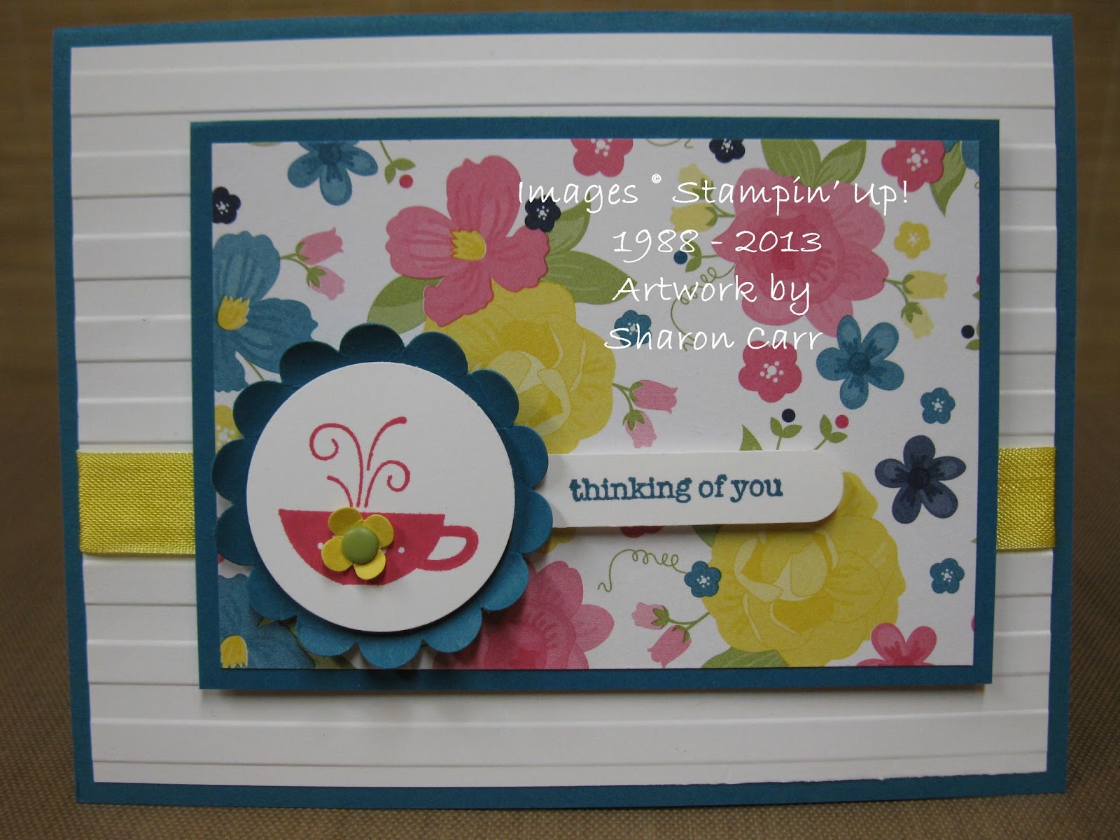
Hello there. Today I've got a simple cozy little card for you. The sketch layout is very simple and I've used it often because it's so easy to get the components to work together. There's something good about a sketch that works every time you try it. And this is definitely one of the good ones.

Stamps: Kind & Cozy, and Teeny Tiny Wishes
Ink: Island Indigo and Melon Mambo
Paper: Island Indigo, Daffodil Delight, and Whisper White cardstock with Gingham Garden Designer Series Paper
Accessories: Big Shot with Stripes TIEF, Word Window Punch, 1 3/8" Circle Punch, 1 3/4" Scallop Circle Punch, Itty Bitty Shapes Punch Pack, Subtles Candy Dots, Daffodil Delight Seam Binding Ribbon, and Dimensionals
The colors of the Gingham Garden Designer Paper were my guide for the colors used here. I love how crisp and clean the colors of the print paper are, so everything was left plain without any sponging to soften the layers.
The scallop circle of Island Indigo were curled up with my bone folder, then the teacup layer was added with a Dimensional under to raise it up.
The little flower doodad was added to inject a softer color onto the Melon Mambo teacup. Then I debated about using a rhinestone for the flower center, but decided I liked the touch of green with the Candy Dot. (If you haven't gotten any of the Candy Dots yet, what are you waiting for? They are sooooo much fun!)
Hope to see you back again soon. I've definitely got more ideas to share with you! Thanks for stopping by. Sharon
Monday, July 29, 2013
Sneak Peek Thankful
I'm not sure why some weekends I just need to veg out and don't have an ounce of ambition to me at all. Last weekend was one of those times and I feel like I missed an opportunity to get lots of things done. Instead I only got around to doing the basics of some laundry, dishes, and picking up. Most of the time I should have been creating, I was sitting and staring into space or wandering around trying to think of something fabulous and coming up with a big, huge blank. Yuck!! I finally made one card that I think is worthy of attention. It was made with one of the new sets from the Holiday Catalog that you'll be able to order from in just a few more days (August 1st)!! Here's the sneak peek for you...
Stamps: Harvest of Thanks
Ink: Cajun Craze pad, Cajun Craze, Always Artichoke, and Crushed Curry markers
Paper: Naturals Ivory, Cajun Craze, Crushed Curry, Always Artichoke, and Very Vanilla
Accessories: Big Shot with Apothecary Accents Framelits, Square Lattice TIEF, Early Espresso 1/8" Taffeta Ribbon, Piercing Tool and Essentials Paper Piercing Pack, and Dimensionals
Thanksgiving is a favorite holiday of mine because the idea of taking time out to thank God for all the blessings He has given us is very important. I know I get easily caught up in all the busyness of life and get lax in giving thanks, so this is a great reminder to be grateful. So it's no surprise that this was the very first stamp set I purchased from the Holiday Catalog. I wanted to have lots of texture and layers on the card without it being too overdone, and I think that worked out with the embossed Crushed Curry layer tucked between the other differently shaped layers.
I love how the main image looks colored in with the markers to enhance it. I didn't really work on getting shading on the image because the way it's made the highlights happen automatically. I also decided not to give it lots of sponging like I normally do for autumn cards, but kept it clean and simple.
Hope you like this idea and give it a try. I've got to get my creative juices going and come up with more ideas using this set. Thanks for stopping by to see what's new. Remember, ordering from the Holiday Catalog starts on August 1st! See you again soon! Sharon
Stamps: Harvest of Thanks
Ink: Cajun Craze pad, Cajun Craze, Always Artichoke, and Crushed Curry markers
Paper: Naturals Ivory, Cajun Craze, Crushed Curry, Always Artichoke, and Very Vanilla
Accessories: Big Shot with Apothecary Accents Framelits, Square Lattice TIEF, Early Espresso 1/8" Taffeta Ribbon, Piercing Tool and Essentials Paper Piercing Pack, and Dimensionals
Thanksgiving is a favorite holiday of mine because the idea of taking time out to thank God for all the blessings He has given us is very important. I know I get easily caught up in all the busyness of life and get lax in giving thanks, so this is a great reminder to be grateful. So it's no surprise that this was the very first stamp set I purchased from the Holiday Catalog. I wanted to have lots of texture and layers on the card without it being too overdone, and I think that worked out with the embossed Crushed Curry layer tucked between the other differently shaped layers.
I love how the main image looks colored in with the markers to enhance it. I didn't really work on getting shading on the image because the way it's made the highlights happen automatically. I also decided not to give it lots of sponging like I normally do for autumn cards, but kept it clean and simple.
Hope you like this idea and give it a try. I've got to get my creative juices going and come up with more ideas using this set. Thanks for stopping by to see what's new. Remember, ordering from the Holiday Catalog starts on August 1st! See you again soon! Sharon
Thursday, July 18, 2013
Serene Sandpipers
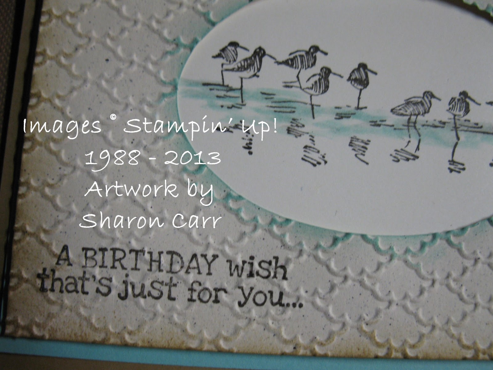
Okay, so I'm not at convention with my friends and I'm a little bummed out. So I need to think happy thoughts. And that makes me think of spending time with family at the ocean. When I saw the Wetlands stamp set, the line of sandpipers reminded me of wonderful times visiting the ocean with my family. I knew this would be one of the sets I needed to get. This is a simple design that would work for many occasions, and for either male or female. Just change up the sentiment on the card for whatever occasion you might need.
Stamps: Wetlands and Remembering Your Birthday
Ink: Early Espresso, Baked Brown Sugar, and Coastal Cabana pads, Coastal Cabana marker
Paper: Baked Brown Sugar, Cabana, Very Vanilla, and Naturals Ivory
Accessories: Big Shot with Ovals Framelits, Fancy Fan TIEF, Aqua Painter, Sponge Daubers, and Dimensionals
I knew I wanted the sandpipers on an oval piece, but changed my mind and stamped it through the die-cut oval instead. I chose the Fancy Fan TIEF because it reminded me of waves. If it was embossed the other way, it reminded me of sea shells, so either way it was perfect.
The new In Colors used here are just too yummy! I love how they go together nicely and give such a serene feeling to the card. Fits right in with beach colors.
On this card I used an Aqua Painter to add just a bit of color to the water's edge where the birds are walking. I thought of adding more color, but we'll just save that for another card on another day. This has such a clean and simple look, I didn't want to spoil it with anything else.
Thanks for stopping by today. If you're like me and not at convention right now, let's not feel sorry for ourselves, but get out our stamps and paper and create anyway! Hugs, Sharon
Stamps: Wetlands and Remembering Your Birthday
Ink: Early Espresso, Baked Brown Sugar, and Coastal Cabana pads, Coastal Cabana marker
Paper: Baked Brown Sugar, Cabana, Very Vanilla, and Naturals Ivory
Accessories: Big Shot with Ovals Framelits, Fancy Fan TIEF, Aqua Painter, Sponge Daubers, and Dimensionals
I knew I wanted the sandpipers on an oval piece, but changed my mind and stamped it through the die-cut oval instead. I chose the Fancy Fan TIEF because it reminded me of waves. If it was embossed the other way, it reminded me of sea shells, so either way it was perfect.
The new In Colors used here are just too yummy! I love how they go together nicely and give such a serene feeling to the card. Fits right in with beach colors.
On this card I used an Aqua Painter to add just a bit of color to the water's edge where the birds are walking. I thought of adding more color, but we'll just save that for another card on another day. This has such a clean and simple look, I didn't want to spoil it with anything else.
Thanks for stopping by today. If you're like me and not at convention right now, let's not feel sorry for ourselves, but get out our stamps and paper and create anyway! Hugs, Sharon
Subscribe to:
Posts (Atom)