Thursday, April 28, 2011

Heart Warming

Oh boy. Sure looks like this is going to be one of those days I'd like to forget ever happened. I was woken up at 5:18 this morning by the sound of the sump pump. That doesn't usually bother me, especially not during the last week anyway. Because of all the rain we've had for the last week or so, the ground is so saturated and the pump has been running alot and doing a fine job. But this morning it was going on every 6 seconds - not a good thing. It looked like the water was winning the war at the pump! At least it woke me up so things could be taken care of. My hubby hooked up the hose to flush the water out through the window instead of the drain pipe. As of this point in time it looks like things are under control. Except the water is still being pumped out of the window, so the basement is freezing. So it's looking up right now. And all I can say is, "Thank you God for waking me up when you did!" Oh, and did I mention today's my birthday?? It's the big 60. Does that mean I'm officially old now? Happy birthday to me....

Ok, on to the good stuff. Last night I was playing around with some cardstock that was already cut. My hostess club ladies wanted to make the card on the SU! website that was advertising the sneak peak products that are available in April. I always cut an extra set or two because we often have 'visitors' join our club night. I didn't want to make the same card over again, so instead I started playing with the components that were already cut and came up with a different card. Here it is....

Stamps: Filled With Love (retired)
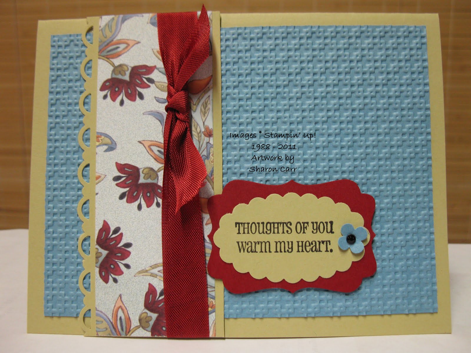
Cardstock: River Rock, Marina Mist, and Cherry Cobbler along with Paisley Petals (sneak peak) Designer Series Paper
Ink: Basic Black
Accessories: Big Shot with Square Lattice Embossing Folder, Decorative Label Punch, Scallop Oval Punch, Itty Bitty Shapes Punch Pack, Scallop Trim Border Punch, Cherry Cobbler Seam Binding, and Dimensionals


Here's a close up of the detail items. I was really surprised after listing all the punches. It never seems like very many when you're using them all. But when you start listing them, whew! There were alot!

Oh yes, I forgot to mention the little black rhinestone (or whatever it's called) that I used. It's back from the Holiday Mini Catalog and I used them for halloween. There were a few left and I liked it better than anything else I had for this card.

Actually this card was supposed to fit the sketch from the Stamping 411 Operators for last weekend. But a funny thing happened. When the card was finished, it really didn't look like the sketch anymore at all! Don't you hate when that happens??

Gotta run. The grandbaby is awake and wants out of his crib. Have a splendid day. And try to stay warm and dry!
Sharon

Monday, April 25, 2011

Vintage Caring

Hope all of you had a glorious Easter yesterday! The services leading up to Easter were so meaningful and touched me deeply. And the celebration service on Sunday was so exciting and joyful! How inspiring!! Even the weather cooperated and was actually nice most of the day so it was all around a great weekend. Ok, the celebrating is now past and it's time to get back to normal - whatever that is! Since the month is coming to a close, I just needed to get in one last hurrah with the lovely Springtime Vintage DSP. I have loved using it these last few months and I'm soooo sorry to see it go. Wouldn't it be lovely if it would be in the next catalog? Yeah, but that probably isn't going to happen. So that means there's only 5 more days left to order this or anything else from the Occasions Mini Catalog (like the Thanks for Caring set too!). Maybe I need to get myself just one more package that I can get out when I want to make something with a real vintage feel. Just saying....


Stamps: Thanks for Caring and Four Frames (sneak peak til the end of the month too!!)
Cardstock: Very Vanilla and Rose Red with Springtime Vintage Designer Series Paper
Ink: Basic Gray, Rose Red, and Wild Wasabi
Accessories: Rose Red Seam Binding, Aqua Painter, Decorative Label Punch, and Dimensionals


This is really a simple card and the design was decided for me. I had some strips of the Springtime Vintage Paper left over from several other projects. So I just played around with them til I found a way to make them fit together.

I love the new set Four Frames. Hmm, think I might have mentioned that before, but that doesn't change how I feel about the set. It's fun to see how many different sets have a sentiment that will fit inside these frames. And with four different styles of frames, there's just about one for any card you want to make. Definitely a must have for me!

One last thing I need to mention is the Thanks for Caring set. The images in this set are really nice and make it easy to put together those harder kinds of cards we all need to make at one time or another. I guess looking at the set, the word I'd use to describe it is gentle. The images and sentiments are very gentle and can be made into lovely caring cards.

Well, that's it for today. If you'd like to order any of the sets or DSP used here, you have until the end of the day on April 30th to add these to your collection. Don't miss out! You can click on the order now button and get it ordered in just minutes. Thanks so much for stopping by, and make sure you come back again soon....
Sharon

Monday, April 18, 2011

Paisley Prints Thanks

Is it really April 18th? I wasn't sure, because when I got up at 6:15 this morning it was snowing outside. Yes, you read that right - snowing!!! I could hardly believe my eyes! And it was still snowing at 2pm! And it left a whole inch of snow covering my car - bummer!! The calendar says it's spring, but I'm not too sure about that right now. Anyway, I've been doing some more creating with the Four Frames stamp set and Paisley Prints Designer Paper that are available in the sneak peak promotion for another 12 days. If you haven't gotten them yet, you can click on the order now button on the side and take care of that right away! Ok, back to the card I designed. Looking over the pretty prints available, I was drawn to the soft daisy-looking floral. Whatever I came up with for that paper, I knew I wanted to keep the design very soft and gentle looking. So here's what I came up with today.... Stamps: Four Frames (sneak peak) and Fabulous Phrases Cardstock: River Rock, Marina Mist, and Very Vanilla with Paisley Petals Designer Series Paper Ink: Marina Mist Accessories: Eyelet Border Punch, Decorative Label Punch, Basic Pearls, and Dimensionals The label is one of the new Four Frames set, and I love all four of them. They each have their own style so it's easy to find just the perfect one to fit your design. I chose this one with the birds 'cuz it reminded me of the robins that I've been seeing outside again. When I see them, they are the real promise of spring to me. And with the snow today, I have my doubts that spring is ever getting here! I'd been having trouble figuring out where to use those teeny tiny pearls from the Basic Pearls set. I tend to choose the medium and larger sizes for my projects. On this one I decided the tiny pearls looked like a perfect match for the white dots on the floral print paper. Don't they fit together nicely? Well that's it for today. Thanks for stopping by to see what's new. Have a great week and try to stay out of the snow! Sharon

Sunday, April 17, 2011

Palm Sunday Thoughts and Thanks

Hope you're enjoying this Sunday and taking time to reflect on the events that happened so long ago on this Holy Week. It's been a quiet day today and I've been working on getting my Easter cards finished and addressed. If I'm lucky, my friends and family will actually get their cards on time this time around! Hooray! So thought I'd share this card with you before the stack gets in the mail tomorrow. Here's my card idea. Hope you like it!


Stamps: Something to Celebrate and God Bless 2 (retired)

Cardstock: Perfect Plum, Pink Pirouette, and Whisper White

Ink: Perfect Plum

Accessories: Big Shot with Lattice Die and Square Lattice Embossing Folder, 1" Circle Punch, Boho Blossoms Punch, Modern Label Punch, Basic Pearls, Sponge Dauber, and Dimensionals


I've been hearing about making a cross from the Lattice Die, but hadn't tried it yet. My downline Phyllis came to the rescue. She borrowed my Lattice Die and then showed my how to cut out the cross. Thanks Phyllis!! The die-cut lattice is held diagonally and then it's easy to see the cross design. As soon as you know where to look, it just jumps out at you. At least it did for me. If you have any problems figuring it out, email me and I'll email you .


I wanted to keep the card design very simple with the empty cross as the focal point. This fit exactly what I had in mind.


When you trim the cross, you end up with extra pieces and I just couldn't bear to throw them all away. So I trimmed one up to make the open leaf design on the inside of the card. Hope this gives you some ideas. I love how this card turned out and I'm thrilled to be sending them on to those I love and care about.


Thanks for stopping by today. All comments are so very appreciated. It's nice to know what you think of my creations. Have a blessed, peaceful Sunday!


Sharon

Saturday, April 16, 2011

Nature Walk 411 Challenge

Oh my, I'm having such a great time today. It's rainy and chilly outside so I didn't want to get out there and do some cleanup in the yard. So what should I do instead? Yah, yah, the normal laundry and such, but I found time for stamping too! And since it's Saturday, I had to check in with Stamping 411 for their weekend sketch challenge. It looked to be a great basic sketch and I was just itchin' to give it a try. Since I had been drooling over the new sneak peak Paisley Petals Designer Series Paper that just came yesterday, that's what I decided to start with. Then it was just a matter of finding stamps that would work with the print I chose to use. Here we go...


Stamps: Nature Walk and On Your Birthday

Cardstock: Very Vanilla, Cherry Cobbler with Paisley Petals Designer Series Paper (yummy!!)

Ink: Always Artichoke ink ,and Cherry Cobbler and Always Artichoke markers

Accessories: Always Artichoke Seam Binding, Scallop Trim Border Punch, 1 3/4" x 7/8" Oval Punch, Sponge Dauber, and Dimensionals


I love how the colors work together and especially love the mini print from the Paisley Petals DSP. Yes, I did change up the dimensions of the sketch somewhat. It just needed more of the Cherry Cobbler cardstock showing both above and below the focal point. And the sentiment was added onto a separate layer instead of being part of the main layer. But I guess that's what sketches are for - as a jumping off place to get you started. Sometimes that's all you need to get the creative ideas going. And the 411 Operators do such a great job coming up with these creative sketches to get us started. Go on over and check them out. And then play along with your very own ideas! You'll haave fun - I guarantee it!!


Thanks for stopping over today! Leave a comment and let me know what you think.

Sharon

Thursday, April 14, 2011

Birthday CASE

Yes, I admit it. I do copy ideas when they fit the bill, and this one designed by my downline Phyllis was quick, easy, and a masculine card to boot!! That means there's 3 things going for it that make it a winner as far as I'm concerned. Of course, making a few color changes could turn it into a card perfect for anyone on your card list!! Thanks for the fabulous idea, Phyllis! Here you go....


Stamps: Bring on the Cake (Occasions Mini - only 15 more days to order this set!!)

Cardstock: Crumb Cake, Soft Suede, So Saffron and Naturals Ivory with Elegant Soiree Designer Series Paper

Ink: Soft Suede pad and Basic Black marker

Accessories: 2-Step Bird Punch (for wings), Marina Mist 1/4" Grosgrain Ribbon, Vintage Mini Brads, 2-Way Glue Pen and Dazzling Diamonds Glitter, and Dimensionals


I'd like to say the card is cute, but that spoils that masculine feel. lol Can't you just see this design made up in any one of our great DSP packs that have a striped design? I'm thinking of bright primary colors for kids, any pastels for girls of any age, even black and white for something a little more mature - like in over-the-hill maybe?? Sorry, that one got me giggling! Just let your imagination run wild with the color choices and have some fun!


Thanks for stopping by today. Give this idea a try. Trust me, you'll love it!

Sharon

Tuesday, April 12, 2011

Luncheon Favors

Today I want to share with you some pictures of the favors I made for our Ladies Spring Luncheon at church last Saturday. It started out small and about a week before the date the numbers of attendees rose to about 90. Whew - time to start cranking out those favors that I was asked to make. We had decided on what they would be and how they'd be filled. Now it was just a matter of getting them all made - all 92 of them! Here's a picture of the boxful - at least one layer of 30 of them. Don't they look pretty, feminine, and definitely ready for spring? Stamps: none Cardstock: assorted Designer Series Papers that were in yummy spring colors Ink: none Accessories: Big Shot with Large Scallop Circle Die, retired Double Rectangle Punch, lots of ribbons that were in my stash, cello bags for suckers, and tons of pastel M&M candies to fill them Here's a better shot of a few of them to get a general idea of the way they looked. I used so many different colors and prints of retired papers from many different packs including: Tea Party, Bashful Blue, Apricot Appeal and Regal Rose Pattern Packs, Petals and Paisley, Delicate Dots, and many more that I can't even remember the names anymore. Such a pretty collection they made! Thought I'd share a few pics of the rest of the table decoration so you could see how pretty it all looked together. This set-up looked like going to one of the lovely tea rooms in the area for high tea which I love to do. One of the ladies made up the all-in-one menu and program. They were so cute that many of the attendees took them home with them. Here's a quick look at the appetizer table. The veggies were so fresh and colorful - yummy too. And I'm still waiting for a copy of the spread for the crackers. It had cream cheese, pineapple, and green onions with some other goodies - so scrumptious! I forgot to take a pic of our plates when they came. Chicken Almond Salad, with orange slices, fresh pineapple chunks, grapes, and a flaky croissant. It was plenty filling, but not heavy. Just perfect. Lastly, I thought I'd share a picture of the center piece which also featured our desserts. These perfect little cupcakes were so cute we hated to bite into them! Each of the cakes were baked into these floral paper holders. There was a choice of lemon, strawberry, or raspberry. Each of them had a fruit jelly type of filling and a swirled buttercream frosting with delicate pastel sprinkles. And I can't forget that each of them had an edible little candy bug at the top. Aren't they just adorable? For our speaker, we had a comedian by the name of Evelyn Smallbladder. I have to tell you I was laughing so hard my sides hurt afterwards and I was mopping up the tears! Check her out on Google if you'd like to hear more about her and listen to a little clip. She is just hilarious!! Well, hope you enjoyed hearing about our luncheon. Wish you could have been there to share the day with me. It was such a fun way to spend an afternoon with friends. Thanks for letting me share it with all of you! Happy spring! Sharon

Monday, April 11, 2011

Hooray for Cheers!

As I mentioned last post, the time has come to work on those masculine cards we all need. We always need birthday cards and now it's getting time to think about Father's Day cards too. So that's what I've been working on lately. The card today could be used for either, depending on the sentiment used on it. So let's get started right away! I had this idea floating around in my head for awhile, but just hadn't put the ink to the rubber so to speak. Time to give it a try. This one is my first try. It's ok, but seems a little too plain. I had been thinking monochromatic, but now I'm not too sure. Stamps: Cheers to You and Party Hearty Cardstock: Old Olive and Very Vanilla Ink: Stazon Jet Black, Old Olive Accessories: AquaPainter with bleach, Black Hemp Twine, Tag Punch, Word Window Punch, Old Olive 5/8" Satin Ribbon, 2-Way Glue Pen, Dazzling Diamonds, Sponge quarter, Paper Snips, and Dimensionals
Things I like about the card - definitely bleaching the foamy beer, the hanging tag, the tone-on-tone layering. But the total amount of the olive color seemed just too much. I also debated about the 'party hearty' sentiment. Wasn't sure I liked it. So I was off and running on the remake before the bleach could dry out in my painter


This is my final take on the card. A few changes were made and the look seemed much more eye-catching to me. Hope you like it too.


Here are the major changes - ribbon color and type (major difference - more manly!), Ticket Corner Punch corners added, changed the hemp twine to a natural color, and lastly I left off the sentiment. Instead I might add either a Father's Day or birthday sentiment.


Well, there you have the two versions, similar but quite different in the total look. One of the quirky things about making this card was the additional beer mug. Seems like I had to make about 4 of them before the bleached out color was the same. Different dye lots of cardstock really do give a different finished look - everything from a golden yellow, to cream, to purplish white. Crazy!! But it was fun to do, and now I've got a few more beer mugs all set to put on another card! Maybe I'll stamp the background on Vanilla and watercolor the beer mugs with Old Olive the next time. We'll see how that would work out!!


Thanks for stopping by today. Hope you're in the mood to party with your stamps!!

Sharon

Saturday, April 2, 2011

High Flying Father

Wow, posting three times this week! Yah!! Hope I can keep this going for awhile before I run into another 'speed bump' in life. Next Tuesday the ladies are meeting back at church to make the cards for the "From Our Hearts" group to send to our soldiers. With being sick lately, I'm so very far behind in the planning for this month. We need to make some Father's Day cards, so that's what I was working on today. And since masculine cards are my biggest challenge style, it's been slow going today. But these cards are important, so let's hit it! The card I'm sharing today has a little bit of everything - old, new, and contraband - ooops! One of the ladies was kind enough to bring me some neutral cardstock and matching envelopes to use. It was interesting finding colors that worked together with this. The card base is one of the colors she brought. It's a nice neutral tan sort of similar to Crumb Cake. Then I raided some of my old, retired colors of ink to use with it. And then threw in a new (first time used!) stamp set. You just never know what's going to go great together! Stamps: Plane & Simple and Itty Bitty Backgrounds (retired) Cardstock: Early Espresso and Very Vanilla with unknown tan cs Ink: Really Rust, Creamy Caramel, Close to Cocoa, and Bermuda Bay (all retired) Accessories: 1/2" Circle Punch, Sponge Dauber, Piercing Tool and Mat Pack, Sending Love Epoxy Brad (retired), and Dimensionals I love the look of a stamped border along the side of the card instead of using ribbon. Ribbon is just too girlie, so I thought this border would be just a perfect touch. After stamping the items with all earthtone ink, it just called out for a pop of turquoise to liven in up. Hope the ladies enjoy making a dozen of these cards. They should stamp up quickly using this collage look. A couple ladies had ordered this stamp set last month at a workshop one of the ladies held and were asking for an idea for using it. This might be just what they've been looking for. Thanks for stopping by today. Enjoy your weekend! See you in church tomorrow!! Sharon

Friday, April 1, 2011

My Thoughts - Eggsactly

Good morning! I seem to have a few 'eggstra' minutes on my hands this morning. Can you guess why? It's because grandpa and grandson fell asleep on the lazy boy recliner just a bit ago. How very sweet they look napping together. Anyway, that means I have about 30 minutes to get this blog posted and back on the job, so here goes... Here's the other card the ladies made at Hostess Club in March. Since we're getting near the Easter season, it's time to think of those Easter cards we want to send out. Usually I go for a more Christ related theme, but thought this one would be fun and 'eggsactly' right. Stamps: Easter Blossoms Cardstock: Crumb Cake, Confetti White, with Springtime Vintage Designer Series Paper Ink: Soft Suede, Daffodil Delight, Marina Mist, and Pretty In Pink Accessories: choices of Very Vanilla Seam Binding Ribbon or 5/8" Satin Ribbon, Basic Pearls or Rhinestones, Subtle Collection Designer Buttons, Hemp Twine, and Mini Glue Dots Oops, looks like I messed up and took a pic of my sample for the 'before' choices and not the finished one. Each of the ladies used either rhinestones or pearls in the center of their eggs. Really cute, but you'll just have to imagine them on my sample card! Then there was the choice of ribbon. With the seam binding ribbon being fairly new, I wanted to use it on this card. After this one was made, I got the idea for the Vanilla Satin Ribbon. Oooh, so much more rich and elegant looking. And with it being a little wider and heavier, it scrunches up in the middle nicer than the seam binding. There was a choice of the blue or rose buttons also. Both looked very nice with the card. It was a hard choice. I wish I would have taken a picture of the ladies' cards when they were all finished. With the many options and how the 'eggs were laid' out, I don't think any two cards were totally alike! One of the ladies even made her card a landscape style and moved the components all around. So I guess you could say this card has the possibility to be 'eggstraordinarily' different! And that's enough egg jokes for today. Happy April 1st! Don't get fooled too much. Have a fabulous day! Sharon